Nau mai, haere mai, welcome to eyeCONTACT, a forum built to encourage art reviews and critical discussion about the visual culture of Aotearoa New Zealand. I'm John Hurrell its editor, a New Zealand writer, artist and curator. While Creative New Zealand and other supporters are generously paying me and other contributors to review exhibitions over the following year, all expressed opinions are entirely our own.
Showing posts with label Christchurch Art Gallery. Show all posts

Wednesday, March 31, 2010

Andrew Paul Wood tries to get provoked by Christine Webster


Provocations: The work of Christine Webster
Curated by Anne Kirker
Christchurch Art Gallery
26 March – 7 June 2010

No one could deny that the time for a Christine Webster survey and reconsideration is well and truly due – though just as one shouldn’t presume that David Bain’s acquittal equates with innocence, one shouldn’t automatically think that a big survey sets a reputation in stone. One of the difficulties in assessing the overall effect is that because in the successive decades her tropes and influences have become very familiar through the work of other artists and popular culture, and this must be taken into account when assessing Webster’s position in New Zealand (and Australian) art history.

There has, for instance, been a revival of burlesque performance, Mikhail Bakhtin’s notion of the Carnivalesque has become widely familiar, plastic breasts tend to make us think of Cindy Sherman, feather boas and recherché historicism have returned to fashion design and the World of Wearable Art. There are echoes of Pierre et Gilles, Cocteau and others – even Picasso. Does subversive voyeuristic and fetishistic eroticism really have any currency in a world that since the 1980s has quite honestly seen everything? In fact, we really must struggle to distance ourselves from the expectations of a mass of intervening culture in order to give Webster’s body of work its impartial worth, without larding it with second wave feminist and French post-structuralist theory.

Visually the photographic prints are not as shocking to us as they once were, and a younger audience is unlikely to experience any of the frisson the works once held, especially when the art world was smaller and the models were frequently known to us socially. Indeed, the Black Carnival aesthetic in particular has become the commonplace of advertising and marketing. But this gives us greater opportunity to interrogate the images unfettered by novelty and prurience.

For me, some of the most interesting work is the earliest in the show, Albert Park (1983) and the self-portrait Devouring a Persimmon in the Back Yard (1985) with their energy and expressive camera distortions. Also of this period is Craigwell House where the artifice starts creeping in – a made up ephebe, pretty in a tawdry way, emerging from what looks like the (yellowed and cracked) tiled plunge pool of a disused hospital. The light is the rich amber of electrical light, reminiscent of Fassbinder’s film Querelle. There is a sort of Ovidian beauty to this – an inverted Narcissus picked up on a street corner or low rent Hylas abducted by the nymphs.

Then we hit the middle period, the best known series: Black Carnival, Possession and Mirth, Circus of Angels, all the way through to Serious Dolls House. I want to like them, but I can’t work up the enthusiasm. Firstly, the work suddenly becomes formulaic and repetitive: models, performers and art worlders posed stiffly in tableaux vivant, flashing their pink bits like they’ve just been mugged by a tag team of Donna Demente and Trelise Cooper, and plunged into a Caravaggio-inspired chiaroscuro. Secondly this sameness lingers on for far too long, literally decades, with only minor variations.

Possession and Mirth from the early 1990s, represented here by Vein (1992), takes up the trope drawing on historical paintings and subverting the details. Vein, for instance, would appear to be based on seventeenth century Italian painter (and one of the few women) Artemisia Gentileschi’s Judith and Holofernes (itself in the typical chiaroscuro of the Caravaggisti – the followers of Caravaggio). But again, comparisons with Cindy Sherman are unavoidable as she also exploited the idea (as did many, many other contemporary photographers). Without wall labels it would be difficult to determine which series individual works would belong to, and the lack of any hard edge or realism (here I’m thinking of milder Mapplethorpe) leaves me feeling ambivalent about the image.

It’s a bit like a sandwich that you've put so many condiments in that you don’t notice that the meat or cheese or whatever has fallen out, and then all those ingredients give you indigestion. I am not convinced that the middle period rises to an exceptional point above the international average, however in a local context it shook things up enough to spin a number of new directions in New Zealand art – for which Webster earns her laurels. With time and a greater public jadedness, some of the lustre has been lost, but we must place things in context; something that this exhibition should have tackled more directly in the gallery space.

At the far end of the exhibition, the most recent work, things become interesting for me again – although to say that the Quiet series with its fluffy textiles counterpointed in diptych with sweaty male close-ups “addresses masculinity in a way that is counter to that promoted by media representation” (quoted from the wall text) is to suggest that someone has spent the last twenty years in a cave on Mars with their fingers in their ears and their eyes closed. Possibly this might be true if there was a harder, more shocking edge, but the reality is that particular conceit is well-tilled earth as a glance in most photography magazines will confirm. Doug Inglish and Michael Baumgarten come to mind. I could probably pick up any issue of (not only) blue at random and find something similar.

I am much more interested in the most recent work Le Dossier, a series of modestly sized images of details and nudes that have this underlying Bluebeard/120 Days of Sodom theme of sexual violence against women in a French Chateau. I love a bit of Angela Carter/Marquis de Sade tension, provided it is handled as well as it is here. These are beautifully executed as fantasy, but with that essential connection to the real world and natural light that adds the extra tremble. The images are delicate and lyrical – a full circle reminiscent of those fresh early works. After touring the show, I felt reinvigorated by this pot of gold at the end of a slightly exhausting rainbow.

And there is video work – often the last dance of the desperate for senior photographers, but here interesting, intriguing and occasionally risqué. I would have to say, however, not exceptionally so – one gets the feeling, thought, that this is quite a new medium for La Webster, and she’s still feeling it out, though judging from the credits she is keeping to a directorial role rather than getting behind the camera herself. This will be an interesting area to watch, as Webster is nobody’s fool and will fully develop this new arrow in her quiver.

None of this is to condemn the show, because interesting pieces are scattered throughout and it serves an important didactic purpose. I am left wondering, however, whether Christine Webster’s importance lies more in the precedents she set for younger (and particularly female) artists in this part of the world, rather the work as it stands today. Nonetheless it is a visual dialogue well worth having, and will be especially informative to a younger generation of artists for whom the 1980s especially are another country. This is primarily art history, but I’m itching to see where Webster goes next.

The image is Black Carnival #18 1993. Cibachrome. Collection of the Museum of New Zealand Te Papa Tongarewa. Reproduced courtesy of the artist

Thursday, January 28, 2010

Andrew Paul Wood has been squizzing at some nudes in Christchurch

The Naked and the Nude
Curated by Justin Paton
Christchurch Art Gallery Te Puna o Waiwhetu
18 December 2009 - 18 April 2010

Just as once upon a time the conscientious English teachers at my Catholic high school drummed into me the difference between ‘sensuous’ and ‘sensual’ (one is dirty and the other isn’t – but I can no longer remember which is which), there is a difference between ‘naked’ and ‘nude’. One is naked in the bathroom belting out show tunes in the Zen satori of a hot shower, but one is nude when one welcomes the gaze of another on one’s unclothed self. Therefore all works in Christchurch Art Gallery’s skin show The Naked and the Nude must be, by definition, nudes.

Admittedly, from the very beginning, there has been a certain resistance to nudes in art in New Zealand (ithyphallic carvings of Maori ancestors aside). The emphasis was historically on another kind of rapacious, possessive gaze – that of the colonial landscape. One recalls talented Dunedin amateur watercolourist William Hodgkins (father of the infinitely more famous Frances) joined Girolamo Nerli’s lessons in figure painting – but such was his sense of propriety (the model was nude), or else his embarrassment at his inadequate ability, he kept it quiet. Frances wrote to her sister Isabel in April 1894:
For several evenings Father has gone out ostensibly on business but has always returned with a large portfolio which he instantly secreted in the most mysterious manner in his study. I was most curious and yesterday I solved the mystery and I confess it gave me a bit of a shock. It turns out that he is attending a nude class at Nerli’s studio and he is much too ashamed to own it.
Given Frances was twenty-five at the time, her shock is a little difficult to understand – she was hardly unworldly. Perhaps it’s different when it’s your sixty-one-year-old father. His reticence in revealing the lessons might have more to do with Frances’ tendency to be a scathing about his abilities. She must have been a terrible trial for him. When Frances wrote to her mother about her father’s activities, she took a deliberately innocent tone, no doubt to wind her mother up: “Father has developed into quite a figure painter and has actually persuaded Dr Scott to join the life class they are both quite enthusiastic about it”. Bitch.

Even when the western nude crops up in New Zealand art at its most brazen and direct in the first quarter of the twentieth century, it still feels awkward. Louis John Steele was responsible for what is perhaps the earliest example of imaginative Maori-themed cheese-porn, Spoils to the Victor (Auckland Art Gallery, 1908), also after the style of the French Orientalists, depicting a buxom young wahine captive, décolleté fully exposed, bound to column - politically deeply incorrect by today’s standards, and fairly outré then as well.

Hell, I remember being confronted by a wall of roly-poly pinkness in the form of a Reubens hang at the Neue Pinakothek in Munich – and I didn’t know where to put my hands (I had to run outside for a cigarette). Let us, then, examine the CAG show.

It would all be worth it just for the decadent inclusion of dirty old Australian Norman Lindsay, a Picasso etching/drypoint of Minotaur attacking an Amazon (1933, and really that ‘attacking’ should be ‘raping’) and two exquisite Van der Veldens. I didn’t even know Goldie had ever done a nude – evidenced here as a young European women in modest shadows à la Ingres, circa 1898. There is even what can only be described as Swedish postcard porn in the form of the photograph Water nymphs by Anders Zorn (1918).

It is also good to see no less than three works by the much underrated Martin Whitworth – an artist with a deft line and an obvious reverence for Kitaj. And for all of those who always found Richard McWhannell a little on the dull side, there is a major shock as he goes gonzo channelling Francis Bacon and De Chirico in the triptych Holy Holy Holy (1987).

Of course nudes and erotica are not exactly the same thing – although some of the great canonical works are quite capable of inducing discomfort of the trousers. Clearly, though, the nude can also convey a broad gamut of concepts from modesty to vulnerability. Joanna Braithwaite’s monkey-headed victim, Little monkey (1997), crouched in a foetal position in some dark and indefinable place of incarceration, is a quasi-scientific subject – a product of genetic experimentation cast aside. One is reminded of Ursula K. Le Guin’s 1973 short story “The Ones Who Walk Away from Omelas” in which a utopian community’s perfection is leavened by a dear price – every citizen knows that in a windowless, subterranean cell is a single prisoner (one of their number, incarcerated in childhood), whose grim fate is to sacrificially bear the squalid burden of all the community’s wretchedness and suffering. Such is the price of utopia. There is also the fictional city of Perinthia in Italo Calvino’s Le città invisibili (1972): a city built to astrological calculations intended to reflect heaven. The streets are filled with dwarfs, hunchbacks and bearded women, but the worst can only be heard as grunts and growls from cellars and lofts. The astrologers must therefore decide whether to admit that they made a mistake, or that the gods are monsters. Substitute ‘genetic engineer’ for ‘astrologer’ and Braithwaite’s message is much the same.

Far from attractive is Steve Carr’s A Shot in the Dark (The Bachelor) (2008) – bared hairy beer-belly (like those awful, tedious whistling stomachs of Telethons of yore) transformed into a moose face by the placement of hands. I do not particularly care for Carr’s brand of grunge-esque slackerism, but it does demonstrate the versatility of the nude theme. The nude in Grahame Sydney’s etching Evening in the Studio (1987) is virtually invisible in the shadows, but is still demonstrably a nude. For similar reason’s it is not entirely clear as to why our own editor, John Hurrell’s Updike slo-mo (1994) is included – one of his alphabet soup word paintings – except that it reproduces the text of one of John Updike’s cringe-inducing sex scenes (one thing the creator of Rabbit was never very good at). Another of these ‘nude that wasn’t there’ (sort of visual versions of the mystery of the dog that didn’t bark in the nighttime) is Jude Rae’s Clérambault’s dream (1994) – a trompe l’Œil drapery that alludes to the psychologist G. G. de Clérambault (1872-1934), who had a fetish for photographing fabric draped over mannequins.

Then there is the downright odd, like Barry Cleavin’s etching/aquatint Girl with no head on a swing (1971) – which pretty much does what it says on the tin in a ghoulishly Goya-esque way.

Other works like Di Ffrench’s The life-drawing class (1990) and Richard Killeen’s About drawing a woman at the centre (1984) are straightforward responses to the feminist construction of art as primarily concerning the male gaze. The Killeen is a bit of a cheat, because the abstractly represented woman is in fact clothed. Retroactive cultural norms are a bit of a bore. Personally I think the idea of an exclusively male gaze is a laboured one because male artists have never exclusively looked possessively at just women (cf. Michelangelo, Leonardo da Vinci, Caravaggio); and though rare, women artists are historically represented in the record (Artemisia Gentileschi, Angelica Kaufmann); and in many instances that arguably the female nude seems to exert an imperious power over the viewer (and presumably the artist). The latter is very much in evidence in Manet’s Olympia.

It seems everyone has had a revisionist crack at Manet’s reclining courtesan Olympia, itself an ironic paraphrase of Titian’s Venus of Urbino. George Baloghy’s Antipodean Olympia (1981) is merely the artist inserting himself in the family tree of western art. This kind of postmodern magpie pick-‘n’-mixing is very much a product of its time. Leonard Booth’s The awakening (Vanity) (c.1927) likewise represents the self-referential nature of art, though this sumptuous odalisque is much more straightforwardly academic and from life, and owes more to Velázquez than Manet.

There are also the uncomfortable moments of recognition. Anyone familiar with the South Island art world will immediately recognize the subject of Christine Webster’s Blood (1992).

One day, when I have time and patience enough, I intend to write a monograph on the homoerotics of New Zealand art, and certainly some of the works in this show give me pause for thought over my port and stilton.

An obvious example is a Paul Johns contribution of a Warholian prettyboy masquerading as a Flemish dead Christ. There are also the classical allusions in a fragmentary sculpture torso from the Vatican collections, sketched by Bill Sutton. I don’t give a rat’s arse what side Sutton’s bread was buttered – although Pat Unger feels the need to include an appendix on the subject in her third biography of this gentle doge of Canterbury art – but a certain tension in its asymmetrical composition is undeniable.

In the late 1920s and early 1930s, while other Canterbury artists (especially the women) were painting landscapes, Evelyn Polson was painting nudes, moving in the 1940s to cityscapes. Eventually she married the musician Frederick Page. Evelyn Page was a pioneer of the nude in New Zealand, drawing the ire of the prudes in 1926 when Figure Out of Doors was exhibited in Auckland, and arguably Summer Morn (1929) is the most outstanding of these. Although rendered in a French impressionistic manner, there is something of the Victorian painters of classical scenes like Lawrence Alma-Taldema and Lord Leighton. There is something defiantly idyllic – a sun-dappled riverine or lacustrine scene (possibly Karamea) of three healthy young women mucking about. The image is more sensuous (as we were once taught to carefully distinguish at school) than sensual. Eroticism is there, but it is not overt. The viewer becomes a voyeur, an Acteon intruding on Diana’s bath. What a peach.

The style suggests an interest in French Impressionism and post-Impressionism, Monet perhaps. The dominant figure is the female nude, standing on a tree branch, perhaps about to dive into the water for a swim. Her pose – one hand on hip, the other hand holding on to the sparkling green curtain of foliage, probably the willow found on the banks of many South Island rivers, a symbolic nod to the velvet and bullion-fringed drape of the academic study – suggests an invitation or challenge to the two more timid, clothed girls in the boat. It is very much a New Zealand scene, but perhaps with just a barely suggested hint of suppressed Sapphic eroticism which was shocking to audiences at the time. The dominant figure in the composition is an Edwardian Antipodean Venus with intimations of classical statuary.

Even despite our modern ambivalence, this is a fairly brave exhibition for a public gallery, and a highly enjoyable one.

Wednesday, December 23, 2009

Towards a more fluid image


Ricky Swallow: Watercolours
Toured by the University of Queensland
Christchurch Art Gallery
12 December 2009 - 21 February 2010

Australian artist Ricky Swallow is well known for his finely detailed sculpture (made by carving or casting) of everyday or hybridic objects. The forms are astonishingly precise in the exactness of their execution, with much nuance of planular surface and delicate plasticity – along with avoidance of strong chroma. Therefore to see this show of over eighty loosely executed watercolours is a considerable surprise – for they celebrate saturated colour and wrist action as part of drawing with brushed on pigment. They demonstrate a less cerebral and clinical sensibility, being more overtly emotional in mood.

As a body of work they need to be understood as a response to the tightness of the sculpture, a bodily and mental freeing on the part of the artist, a wish to embrace more of the chaotic and unforeseen. Despite Swallow’s interest in science fiction and current technologies that extend or reproduce the body, he is in a sense a mediaeval artist in his themes and visual treatments. A little like say Roger Mortimer with his guild/craft sensibility (or even Parekowhai), and quite unlike say Dan Arps, et al, Peter Robinson and Paul Cullen who seem to be more about exploring trope (as in the hows of meaning construction) not symbol, process not resolved product.

The exhibition shows Swallow beginning to teach himself the skills of watercolour manipulation twelve or so years ago, and slowly but surely becoming more and more proficient in portraiture, copying images that are often corny in their selection - LP sleeves (James Taylor), art reproductions (Goya, Picasso), photos of folk heroes (Ned Kelly), and movie stills (Jagger as Kelly) - until he becomes like Marlene Dumas, an expert at interpreting the physiognomies of the vulnerable, the savage and the tragic; but with traces of Sydney Nolan. Improving the clichéd source material through transmutation.

You could regard Swallow’s sculpture and watercolours as quite separate: totally independent enterprises but with a little overlap in subject matter – as with skulls - or you could speculate about them on another level. Projects that are linked.

Swallow seems to be searching for his own voice, an individuality readily apparent in his sculpture but in my view not detectable here, a quality through which his 3D practice might eventually become more turbulent and immediate. These drawings are interesting on a non-portraiture level, as an attempt to reach beyond themselves, rather than just as illustrations or explorations of technique.

I think (actually I hope) that they might lead to a looser form of sculpture than what he has made so far. They seem to be tools for thinking about plasticity of form and emotional power. In other words, researching sculpture with psychological and physical atmosphere, objects that are partially dematerialised and far less literal. Devices for researching the presence (or lack of) mass, a shift away from obvious narrative. A self-teaching aid for investigating that.

Tuesday, December 15, 2009

Andrew Paul Wood tells us about CAG's newly designed Permanent Collection space in Christchurch


Brought To Light
Christchurch Art Gallery
From 28 November 2009


Earlier in 2009 Christchurch Art Gallery initiated a Dunkirk-scale reconfiguration and redistribution of its long-term collection displays. This is now open under the title Brought to Light: A New View of the Collection. There has been much rummaging and rifling of store rooms and Solander boxes.

The re-hang begins at the top of CAG’s magnificent Mussolini-esque staircase with a wonderful proscenium installation by Joanna Langford. Up from the Plainlands (2009) is a sort of Dr Seuss-like landscape of Astroturf supported by toothpick-like scaffolding, connected by a suspended miniature stairway to heaven – the heaven consisting of inflated cumulonimbus made of plastic shopping bags that reinvent the Baroque festoon. It looks fantastic.

This welcomes us to the upstairs landing and two vitrines of twentieth century and contemporary ceramics, at a cursory glance (not really my thing) mostly of the Bernard Leach and Shoji Hamada school, and from the hands of the usual suspects – Len Castle etc. One does wonder if art galleries are the best place for ceramics – the effect, especially crowded in as they are, is a little like the duty free mall in Hong Kong airport – but that’s just a personal belief on my part that such things are better kept in context with craft and social history of the museum.

Thence into the space proper. Gone is the more elaborate set of divisions – the carefully mediated chronological labyrinth of yore – in favour of more open (with considerably higher walls), more flexible, and above all, more eclectic open-plan spaces (with themes likely inspired by Michael Dunn’s histories of New Zealand painting and sculpture) beginning with “The Treasures of Ngai Tahu from the World of Light”, a celebration of tangata whenua. This is dominated by a safe but still hauntingly beautiful choice in Fiona Pardington’s Mauria mai, tono ano – a Becher-like catalogue series of black and white photographs of hei tiki from the collection of Auckland Museum. Much to my amazement, the CAG collection’s has no early portraits of Ngai Tahu, and the gallery has borrowed in a striking 1855 portrait of an unidentified Ngai Tahu subject by Charles Haubroe from Canterbury Museum, and some Gottfried Lindauer oils. While the Lindauers are taonga because of their ancestral subjects, I can’t say I really understand the widespread admiration for his rather naïf tea-and-beetroot stiff pseudo-academic style.

The “Connoisseurs’ Room” (a pretentious title blowing smoke up collectors and donors, living and deceased) is a salon-style hang where old masters like Gerrit Dou’s 1663 Piskijken, (a ‘physician’ studying a young girl’s urine for signs of love-sickness or pregnancy, a common motif in Dutch Golden Age genre painting) rub shoulders with Steve Carr’s A Shot in the Dark (Bear Rug) of 2008, which is a wooden carving of an old bearskin rug on a low plinth - possibly the most badly-judged juxtaposition since little tambourine-banging Sandi Thom sang “I Wish I Was A Punk Rocker (With Flowers In My Hair).” Personally I don’t like this kind of PoMo anachronistic shuffle in my exhibition experiences for the same reason NASA launched the Hubble telescope into space – less local interference.

I greatly enjoyed the section “Expatriates: Comings and Goings” particularly for the extensive hangs of Sydney Lough Thompson and Raymond McIntyre (as well as Owen Merton, Margaret Stoddard, Frances Hodgkins, Archibald Nicoll, John Weeks, Rhona Haszard and Olivia Spencer Bower, many of whom are still not well known in the North Island). I do think, however, they should have been separated from the influential immigrants (well, really the instigators of professional art in NZ) Van der Velden, Nerli and Nairn. Any mention of Nerli, of course, must lead us to his best-known pupil. Fanny Hodgkins again, this time with her own section, and rightly so, with pride of place going to The Pleasure Garden famously rejected by the Christchurch City Council in 1948 when offered to the gallery as a gift by a group of private subscribers. Hodgkins by this date enjoyed an extraordinarily high reputation in Britain and Europe. All right, I realise that Fanny remains the most internationally important artist New Zealand has ever produced, but I’m not sure she warrants all this attention – more so than say McCahon, Fomison or Sutton, who have arguably more connection to Canterbury.

Another large space is given over to a magnificent (good for being representative, but by no means exceptional) Bill Culbert installation Pacific Flotsam (2007) created from fluorescent tubes like pick-up sticks, and plastic bottles – a reference to the Great Pacific Garbage Patch, a USA-sized Sargasso of trash in the middle of the ocean. Much of the impact comes from the sheer heroic scale of the beast – a massive luminous crystal that also manages to highlight the accidental and imperishable beauty of the twentieth century’s detritus. The effect is awesome.

I was delighted to see four Theo Schoon paintings of Maori “moa hunter” rock drawings on loan from a private collection in the hang. Last time I had seen these sketches on cardboard, they had looked a lot worse for wear with battered corners. Presented in stylish black frames they really come to life and pop off the wall.

Inevitably, particularly giving Canterbury’s strong regional resources and CAG’s limited holdings, a menu touristique of sorts prevails. This impression is even stronger in the late modern and contemporary sections – but then as an educational tool the encyclopaedism is priceless: an exquisite Pat Hanly is positioned next to a superlative (Frankenthalerish) Gretchen Albrecht. Works by Clairmont, Fomison, Trusttum illustrate the phase of neo-expressionism inspired by Rudi Gopas. There are some very nice international pieces as well – I was particularly taken by the pop tarts Warhol (a big blue Mao like an overripe plum after a Long March) and a little Lichtenstein.

The contemporary space has plenty of room for installations – woof! Banzai! Mazel Tov! – with perhaps, dare I say it, a slightly Govett-Brewsterish feeling to it. But why not a section on contemporary Canterbury painting to complement the historical sections? And why is that Julian Dashper so high up on the wall? I get a crick in my neck. Things don’t feel quite so structured here. Colour is far more dominant than in the previous hang. There is a rich trove of stuff here, including a lovely Ann Shelton diptych, some truly delightful Paul Johns works and Frances Upritchard baboon (one of a pair, the other being in the summer kiddie show Blue Planet at the other end of the wavy bridge). There are lots of other magnificent and significant works to choose from, including Michael Parekowhai’s well known sculpture of the seal balancing a Duchamp on its nose, a magnificent Killeen and everything else you might (or might not) expect.

Now I am well known for thinking John Reynolds’ recent habit of doodling lexical scrawls on miniature canvasses is a load of lazy conceptual tosh, but although I am by no means won over by Table of Dynasties dominating the far end of the contemporary space - I find it at least visually a whole lot less offensive to my sensibilities than much of his other work (especially the colossal dud that got him nominated for the 2008 Walters Prize). Regardless, it is still intellectually void, queerly mounted, and I am reminded of the Balzac story “The Unknown Masterpiece” in which the master painter Frenhofer works and reworks a painting for a decade in his obsession to make “the most complete representation of reality”. When two fellow artists are permitted to view the finished canvas, they see only a confused blizzard of piled up random colours and forms. “Ah!” says Frenhofer, misunderstanding their shock, “You did not anticipate such perfection?”

On the whole I am really pleased with the result. I like it that the layout is less claustrophobic and serpentine – now you can more-or-less see from one end to the other without worrying about leaving a trail of breadcrumbs or being pounced on by a minotaur. The curators have managed to balance the familiar favourite icons of the local burghers with a fresh batch of material for the genuine art lovers to ogle. Finally we also get to see some of the collection purchases made in the last few years, and research artefacts we have never seen before. It’s also good to see art galleries working closely with museums – it’s the only way the other centres and regions have any chance of competing with the apocalyptic behemoth of Te Papa. All in all, I give it an A-.

Photos courtesy Christchurch Art Gallery / John Collie

Sunday, November 22, 2009

Neil Pardington in Christchurch: some observations by Andrew Paul Wood


The Vault: Photographs by Neil Pardington
Christchurch Art Gallery
until March 14

Newly arrived and totally ignorant of the Levantine languages, Marco Polo could express himself ... with objects he took from his knapsack – ostrich plumes, pea-shooters, quartzes – which he arranged in front of him like chessmen. ...one city was depicted by the leap of a fish escaping the cormorant’s beak to fall into a net; another city by a naked man running through fire unscorched; a third by a skull, its teeth green with mould, clenching a round, white pearl. The Great Khan deciphered the signs, but the connection between them and the places visited remained uncertain; he never knew whether Marco wished to enact an adventure that had befallen him on his journey, an exploit of the city’s founder, the prophecy of an astrologer, a rebus or a charade to indicate a name. But, obscure or obvious as it might be, everything Marco displayed had the power of emblems, which, once seen, cannot be forgotten or confused. In the Khan’s mind the empire was reflected in a desert of labile and interchangeable data, like grains of sand, from which there appeared, for each city and province, the figures evoked by the Venetian’s logogriphs. ... Perhaps, Kublai thought, the empire is nothing but a zodiac of the mind’s phantasms.
“On the day when I know all the emblems,” he asked Marco, “shall I be able to possess my empire, at last?”
And the Venetian answered: “Sire, do not believe it. On that day you will be an emblem among emblems.” - Italo Calvino, Invisible Cities (1983)


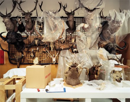
In 2008, as I was wandering the hinterlands of Lower Saxony in the northernmost part of Germany, in the chocolate-box exquisite town of Oldenburg I happened to visit the local museum of natural history. I wanted to gape at preserved bog men and touch base with the bronze age roots of my Pakeha-ness. One room was done out to represent a nineteenth century zoological display, and quite unexpectedly I came eye to eye with three rather forlorn looking stuffed kiwi. I had a sudden pang of home-sickness and identification – I felt very far from home, exotic and somewhat on display. Suddenly being a New Zealander felt concrete for me. The museum’s records revealed nothing of how they came to be there, just the ornithologist’s names, the Linnean Latin and that they came from “Neu-Seeland” in the nineteenth century, but I bring up the story because I get the exact same sensation when looking at Neil Pardington’s exhibition The Vault at Christchurch Art Gallery.

Pardington and his sister Fiona are easily among the most important photographers working in New Zealand today. The images in The Vault are documentary in that they record museum storage areas around the country, much as an earlier series surveyed hospital surgeries. The repetition and archiving are an important artistic strategy – one thinks of the Bechers’ water tower photographs and Warhol’s endless Maos and Marilyns – but beyond that Pardington’s images are rich with mystery and even melancholy. The richness and diversity of colours and textures, and the neat ranked order of things carefully placed seduce the eye. We wonder about the stories behind these boxed and tagged objects (which quite likely have never been on public display).

Museum stores are liminal spaces; unfettered of the need to educate or appeal to an audience, they are beholden only to the economy of space, conservation and efficient retrieval. In essence, we might even describe Pardington’s large, beautiful images are meta-diagrams of Aristotle’s cataloguing and ordering philosophy stripped of the trappings of display. And yet, they are on display in the form of the photographs – the line between display space and back of house is irrevocably blurred, even inverted. The photographs make the racks and boxes exclusively aesthetic – we don’t have to know anything about the habitat of the dead seagulls (forming the sort of “symphony in grey” that would have appealed to Whistler) or the precise ethnographical meaning of the Samoan clubs (perhaps with the faintest suggestion of his sister Fiona’s evocative photographs of Maori taonga), we’re just here for the colours and forms (all masterfully handled). A set of specimen draws is transformed into a cross between Mary Kelly’s Post-Partum Document and a minimalist grid by Donald Judd.

Storage, is by its very nature, a minimalist grid, but the artifacts and fauna stored therein are baroque and luscious and this paradoxical juxtaposition lends an aesthetic frisson to the whole endeavor that was perhaps lacking in the starker images of hospital operating theatres of a few years ago.

More often than not the photographs are testament to the Victorian obsession for collecting and imperial acquisition (the sort of thing that makes modern collections managers twitch for a good de-accessioning). Each image is fundamentally a Wunderkammer (cabinet of curiosities) by proxy, and en masse make me slightly giddy. The vast gallery space becomes a cathedral of curiosities. At the same time there is this delicious frisson of something usually private and unseen made public in a very visual way. Any of these could prove a Proustian Madeleine to trigger a cascade of tiered reverie and semiotic free association of the sort we pointy-headed types are fond of. Indeed, I am reminded of something Proust on the painter Chardin: “Until I saw Chardin’s paintings I never realised how much beauty lay around me in my parents’ house, in the half-cleared table, in the corner of a table-cloth left awry, in the knife beside the empty oyster-shell”. The photographs are the still life equivalent of a found poem or an objet trouvé.

We feel that we are being let in on a secret, a sort of Eleusinian mystery. The act of viewing takes on a slightly sacramental quality and the gallery space does indeed become cathedral like, full of reliquaries; or even slightly tomb-like with the viewer in the position of the archaeologist seeing what has been hidden from public view for centuries.

I have to say I am very much a fan.

(The images above have been sampled from Neil Pardington's The Vault page on his website. They are not necessarily included amongst his 35 images selected for Christchurch.)

Sunday, September 27, 2009

Wadahya?


Ronnie van Hout: Who goes there?
Curated by Justin Paton
Christchurch Art Gallery
4 July - 18 October 2009

This Ronnie van Hout show is an updated extension of the earlier survey I’ve Abandoned Me, also put together by Justin Paton (in 2003) when he worked in Dunedin. That show when it toured, didn’t come to Christchurch, the artist’s home town. (He’d since shifted to Melbourne). This supplement (containing only one work from I.A.M.) is very focused, examining as before the artist’s exploration of interiority, weaving and ducking inside and out his Private Self (or Selves) - and its twin Public Persona. This is exemplified by the artist in an eponymous video knocking on his front door and waiting for himself to answer. Flicking backwards and forwards between public and private.

The similes in this display are quite tight (literally and figuratively). As coverers (or containers) of the van Hout body there are lots of buildings, kennels, doorways, cupboards, box-shaped robots, igloo–shaped museum dioramas, gallery walls and coffins. They have one thing in common. They all use flat wooden sheets that are thin and vulnerable, and that 'skin' provides physical and psychic protection from the invasive machinations of aliens, hostile creatures dwelling inside speaking animals, other van Houts, or perhaps the art public.

Some of most memorable images feature parts of finely detailed, Ronnie van Hout dolls, initially produced for an edition at The Physics Room. Two small robots sitting on giant beds, seem to be waiting for Goldilocks and The Three Bears, while another display of ten identical Ronnies stashed in coffins appears to reference the story of Dracula invading England in a ship.

That’s the wonderful thing about these projects, that nursery-tales, old movies, inner anxieties and prosaic imagery all get jumbled up together. The most normally forgettable event suddenly acquires meaning by being recontextualised.

Sometimes inner and outer elements are not jumbled up but only juxtaposed – like in the Antarctica project where a sculpture of the seated artist makes him look withdrawn and self conscious, similar to a forlorn animal gazed upon in a zoo, whereas the nearby videos show him as gregarious and outgoing, taking an interest in what other people in Scott Base are up to.

Then there is the complicated matrix of various sub-themes, like his digging of escape tunnels as if to get away from his Self, to avoid being spied upon, to also avoid being the subject matter of art and its nosy audience.

A lot of the show makes jokes about gallery strategies of viewer manipulation, and how to thwart the gallery visitor (such as when a electric-eye activated voice warns them not to touch certain exhibits), or perversely to tease her or him with intimate peepshows.

More pronounced are jokes about the activities of gallery education officers striving to get children involved with the exhibits. Many of the wall works and certainly the show’s catalogue duplicate the questions and puzzles teachers give classes when they visit galleries. The enthusiastic art lover is deliberately treated like a child in a manner that just stops short of being insulting.

This aspect ties in nicely with van Hout’s interest in his own education, specifically at Mairehau High in Christchurch. He has a large wooden model of the main classroom, with wee videos of himself peering out the windows restless and irritable as if being a prisoner – while the curious gallery visitor is in turn watched by a surveillance camera (a form of artist’s revenge). Photographs of smaller models of the school and his family home (there is also a bigger wooden model of that) are positioned nearby.

Who goes there? is not as impressive as I’ve Abandoned Me which was much wider in scope (for example it had great embroidery and concrete paintings), and had a superb catalogue of writing from Paton - but it is immensely interesting all the same. It is unusual in the way it examines the art institution from the point of view of an artist normally associated with jokes stemming from a brooding anxiety, who despite his successful career has gnawing reservations about what he is doing there.

The title thus applies to himself. Who goes there? also applies to the gallery visitor whom he treats like an invader. The title asks you to declare your identity, if you are confident you have one, and why have you come. What on earth are you doing in this building?

Saturday, September 26, 2009

Amazing drawing


et al: That’s obvious! That’s right! That’s true!
Curated by Jennifer Hay
Christchurch Art Gallery
23 July - 22 November 2009

Andrew Paul Wood has already contributed a review of this show that has sparked off some excellent discussion involving myself and Ralph Paine – over his comparison of et al. with Richard Rorty. I said that et al. are not extreme antifoundationalists like Rorty, and Ralph replied that Andrew was covered by his discussion of irony.

Irony is not part of et al.’s current game-plan in my view.
Look at the title of this show. I think it is dead straight. No smirks or bulging cheeks anywhere - it is earnest. Why is that? Because though it seems to be a classic et al. installation display it really is about the old-timey skills of drawing. It is a fantastic, virtuoso drawing exhibition – albeit an unusual one. None of the art commentators have noticed this yet.

So the point of that title? What is so damned obvious, correct and truthful? A large suite of framed images - captions pertaining to the global crisis and state of suffering humanity in general – that’s what. Hung from clunky grey screens, these incorporate faked sociological and statistical charts or graphs, culled from enlarged text book pages. Made with a wide range of traditional media, including collage, paint, pencil, ink, tape, charcoal and crayon, they look like very odd archaic posters from some very peculiar ranting institution.

Here are some headings et al. use in the drawings, strung together in a line:

Recent events and the state of the world. Example of continuing conflict. Common misunderstandings, motives and choice. Conflict induced outcomes. One world: keys to the immediate future of humanity. Assimilation: ideology, social position and disposition. Will the matters on hand delay or hasten the process of responsibility and human love?

Not a belly laugh anywhere amidst the dark shadows and lumbering screens. It is an unabashedly community-oriented project. One obviously unorthodox. And in its centre is a small stage on which are stacked free copies of et al.’s publishing venture: The New Zealand Altruism Review (June 2009), designed to encourage constructive and positive social change. In other words, political reform without satire.

One of the ways the show is impressive is its use of height, the way the stud of the exhibition space has been exploited. Signs on towering metal poles like lampposts on street corners, dismantled ventilation chutes, the small stage, four odd projection screens that are a little like flimsy urinals made of canvas: they all condense the cavelike atmosphere to make it intimate and less sprawling. Less like a hangar.

Around the corner far away from the central downstairs CAG corridor, in a row of alphabet-coded fish tanks on trolleys, are cardboard models of rooms. Their rectangular shapes reflect the lifesize floorplan drawn on the gallery floor with thick white tape. These roofless toy sheds seem to be metaphors for individual selves. In isolation and exposed in full view, they are cut off from community links indicated by the joined up tape lines on the floor and the content of the drawings.

Great as That’s Obvious! That’s Right! That’s True! is, it is perhaps too successful – for the drawings are technically too subtle and conceptually welded to the installation to get noticed. That is an odd thing to say I know, and it is perhaps wearingly trivial to suggest that their sophistication will only really be grasped when they are removed from their contextualising project and examined in isolation. Still, the seemingly casual effortlessness of their production I think ensures they will attract a following of new et al. enthusiasts who previously found the work too raw or confrontational. Like Bill Hammond’s practice when his work changed after the Auckland Islands trip, there is a new manual dexterity in this work – an unforseen confidence – matched perhaps by a new optimism in the missionlike subject matter. I’m not sure if it’s my imagination but there seems to be some kind of turning point.

Thursday, September 24, 2009

Eight plus one painters


Cloud 9
Curated by Jennifer Hay
Christchurch Art Gallery
29 August - 29 November 2009

This is a very odd selection of new painters picked from up and down the country, nine as the title says, all apparently sharing a common state of euphoria. Yet Elliot Collins, Mike Cooke, Ruth Thomas Edmond, Georgie Hill, Eileen Leung, Marie Le Lievre, Tim Thatcher, Telly Tu’u and Pete Wheeler collectively make up a very mixed bag. There is little stylistic cohesion.

Looking at the nine artists: Pete Wheeler contributes two vultures whirling in space, snapping at each other in a frenzied duel; Elliot Collins has a large text suspended over a cloudy backdrop; Eileen Leung, some multi-component, coloured Perspex and delicately paint-drawn wall reliefs; and Mike Cooke, pop-arty faces of humans and animals oddly positioned against a top edge. Marie le Lievre has ‘baggage’ paintings of glazed surfaces; Telly Tu’u, abstractions of mechanical shapes and contours floating in fluffy space; Georgie Hill, large drawings of ornate botanical motifs fixed on stark walls; Ruth Thomas Edmond, butted together coloured fields of feathery brush strokes; and Tim Thatcher, vaguely cubist hybrids of architectural and pastoral folk elements.

Of these Marie Le Lievre is probably the most well known, because of her extraordinary ability to manipulate liquid paint into mesmerising sensual surfaces on canvas. Her highly textured, darkly glazed forms are obviously remarkable but she seems compelled to supply a narrative component to her paintings, turning all images to handbags or suitcases, as if obliged to supply a story. To make the identifiable shape she blocks around its edges with a much lighter tone, creating a different sort of surface from the rest of the painting, one that is chromatically comparatively unmodulated. The jump between the two sorts of ‘paint zone’, the lack of integration, seems to be a result of an easy option, rather than resolving compositional problems early on.

The question of a different sort of integration arises with Elliot Collins’ painting, The sparrows. It is really a sort of short story as told by a thinking living canvas, a musing, an address superimposed over images of fluffy clouds in a blue sky. Collins’ text is very long, and when quoted in a blog like this its awkwardness becomes really obvious - but in a painting the words can only be read in short bursts. Reader behaviour is quite different. Thoughts are piecemeal and slowly assembled. Lines get disconnected and mistaken flow-ons occur, creating accidental meanings.

Processes of integration is quite different too, oscillating between mental picturing and ocular picturing – trying to blend the two together, merging imagination with the 'outside' physical environment.

The painting’s rambly but somewhat sweet text says this:

This painting is really very good but only because it loves you and is proud of everything you have achieved so far, and it can’t wait to see what you’ll do next. It’s been hovering over you with the sparrows and dust and oxygen molecules your whole life. It has watched in awe while you were courageous and brave and kind when necessary, and sometimes it is necessary even when difficult. It has seen you reach the outer limits of yourself and watched in wondrous amazement as you fell from the greatest of heights loving you all the more. This painting pines for your love in return. Not in that desperate needy way but in the way you want to be pined for, like the wind for the clouds. Sadly I am the only one who can know this because of my unfortunate ability to see such things. Others will fail to see what I have time to observe, because as you know I will outlive them all and the future seems unsure and distant. But still, I suppose all is not lost, at least we’ll always have each other.

Now you can tell by its earnest, sensitive tone it is the writing of a young person. And of course it does go on far too long. I mean I almost toppled out of my zimmer frame trying to laboriously transcribe the damn thing, but it interests me in the way mental images replace physical ones – outside of its elucidation of the properties of states of mind like love. There is some sort of deferral going on; a delayed anticipation.

Perhaps though, the work might have been better not painted at all. Instead it could have been a typed sheet pinned to the wall, with the above text prefaced by a detailed description of a large canvas covered with clouds on a blue sky, onto which the prepared words were then to be positioned. Or even better, an audio recording of a voice describing a typed piece of paper….

Image by Tim Thatcher.

Monday, September 21, 2009

Understated restraint to histrionic excess


Séraphine Pick
Curated by Felicity Milburn
Christchurch Art Gallery Te Puna o Waiwhetu
23 July - 22 November 2009

Seraphine Pick is a popular and much loved narrative /surrealist painter who reaches a large audience often befuddled by the intellectual complexities of other varieties of contemporary art. A large selection of her varied images, made from the mid-nineties on, has been assembled by Felicity Milburn for this touring survey.

The material is sorted into four large rooms. The first space, an L-shaped gallery, has the oldest examples and contains her best work in my view – scratched or pencilled images on green or buttery-brown monochromatic fields.

These graffiti-style canvases are like Twombly or Beuys or much fifties French painting, and exploit tremulous clusters of scribbled or drawn pencil line that are hard to see. They often portray daily tasks around the house,fantasies of hetero female horniness, and little textual snippets. Pick’s use of scratchy pencil on airily expansive fields brings an affective intestinal nervousness to these paintings, especially when combined with the occasional hovering black silhouette. There are also slightly earlier paintings of rendered items of clothing or objects floating in space at regularly positioned intervals. They hint of other projects to come.

Things get more complicated in later periods with a wider range of painting styles (a lot of portraits) that often mimic influential international role models such as Marlene Dumas and Luc Tuymans or New Zealand art historical figures, Raymond McIntyre and Rita Angus.

The worst of these are dark or Fauvishly garish, and hammily theatrical in their sense of Gothic melodrama. They are akin to Ashley Bickerton’s painting in the first Auckland Triennial, or Phil Judd’s famous Split Enz ‘Mental Notes’ LP sleeve, in their histrionic, highly emotive use of exaggerated gesture or facial expression; and are unabashedly corny – pitched to viewers of X-Files who long to shudder and twitch.

As Pick’s figure drawing is generally weak (human forms tend to look stiff and bodily inflexible) her real talent lies in fantasy portraiture where she is not twee or fey, and doesn’t have to cram entertainingly peculiar props into the background, but can concentrate on a single face – be that human or animal. Her dog visages are remarkable, though you won’t be able to tell from this show because Milburn has hung them too high on an end wall. Pick is a far more interesting animal painter than say Joanna Braithwaite. The canine physiognomies she creates have unnervingly vibrant personalities.

Pick’s liquid acrylic works on paper are also a treat, having an appealing looseness that contrasts with the swoony Pre-Raphaelite rigidity of many of her oil paintings. As an artist she is versatile, while also inconsistent (awful figure posture but extraordinary fabric or clothing detail), so while a show of just portraits would more successfully hide her weaknesses, the range of her work here exposes them. Though I’m not convinced she has the talent or experience to deserve a touring exhibition of this type, it is good to have had the opportunity to think about the pros and cons of her practice in this large, thoughtfully arranged and surprisingly varied, display.

Sunday, September 13, 2009

Here is a review by means of an essay, generously donated by Andrew Paul Wood.


et al: That’s obvious! That’s right! That’s true!
Christchuch Art Gallery Te Puna o Waiwhetu

Non enim excursus hic ejus, sed opus ipsum est.
- Pliny the Younger

And once you have walked the length of your mind, what
You command is as clear as a loading-list
Anything else must not, for you, be thought
To exist.
And what’s the profit? Only that, in time
We half-identify the blind impress
All our behaving bear, may trace it home.
But to confess,
On that green evening when our death begins,
Just what it was, is hardly satisfying,
Since it applied only to one man once,
And that man dying.
- Philip Larkin

Art, by its very nature is a frivolous occupation – much as the poet WH Auden said that “poetry makes nothing happen” – which is to say it just inexplicably is. Beyond existing, the work of et al also has an ironic sense of humour to it – something that has often been misinterpreted and mocked in the long war between Philistia and Bohemia – and which lends itself well to this approach. And as there is a lot of theory that is overly burdened with style and its own pretentious jargon, I will try to keep such terminology to a minimum – as Dr Johnson said to Boswell, “you must clear your mind of cant – you may talk that way in society, but do not think in it”.

Any discussion of et al is not going to be possible without some sort of explanation of postmodernism. Where modernism was all about clean lines, abstraction, elimination of the human from art, a generally patriarchal and humourless worldview, and a faith in utopian scientific social progress, postmodernism got fed up with this in the 1960s. Postmodernism sought to do away with pedestals and picture frames by spreading the art throughout the gallery through installation (the crap on the floor option), bringing the audience into the artwork’s space and not the traditional vice versa. Artists began to reintroduce a human element in art through performance and reference to decay, entropy, the organic and the scruffy. Postmodernism made room for feminism and indigenous cultures in a real and meaningful engagement rather than merely as window dressing.

There are three artists to acknowledge in this change: the German installation artist Joseph Beuys who exploited ritual, performance, social memory and abject materials to heal the post-war wounds of German society, and declared “everyone is an artist”; Andy Warhol, who believed art, like TVs and automobiles, was for everybody – and probably didn’t deserve its elevated status; and French conceptualist Marcel Duchamp, who considered the idea more important than the object, and showed anything could be art if put in an art gallery, before he gave up art to play chess.

Marcel Duchamp had a go at that Cubism stuff at the end of the Nineteenth Century, but he was only going through the motions. He didn’t get it. He suspected it was a con on the part of the galleries. In 1917 Duchamp put an unplumbed urinal in a New York art gallery as a critique of the power of dealers and galleries to dictate trends in art (coinciding with the rise of the avant-garde, cubism etc). He called the urinal Fountain and signed it R. Mutt.

It became the iconic original of all conceptual art – art in which the ideas generated are more important than the object itself. et al’s portaloo Rapture, exhibited in Telecom Prospect 2004, refers back to Fountain. Portaloos suggest a more democratic and Kiwi alternative to the urinal. This is not the work that went to the 2005 Venice Biennale. It has no relationship to the argument . As it happens, Paul Holmes became the subject of an art work after he referred to the then Secretary General of the United Nations as a “Cheeky Darkie”. The work was called “White Drip” by Ralph Hotere. It happens to now be in Paul Holmes’ personal collection.

The donkey braying emanating from the cubicles may represent French intransigence on the issue, but also one of the constituent personae of et al: p. mule – also responsible for That’s obvious! That’s right! That’s true! p. mule is a direct nod to R. Mutt.

As with the enjoyment of a play, a novel, or any fiction, we have a tacit obligation to accept the pretence or pretext – suspend our disbelief and cynicism in order to embrace a metaphorical and metaphysical reality. The same can be said of religion – we must have faith that there is a God in order that we participate in that belief system. It has frequently surprised me how often some very intelligent, worldly people seem to think that art should be any different – that somehow art should be as easily digestible and understood as a soap opera or commercial. There is a reason that high-end food critics do not tend to review family steak houses, and it's because they need to challenge their own sophistication, the public’s sophistication and the restaurant’s sophistication. The critic is not an underfunded extension of any PR and marketing division, regardless of what others may think or desire.

et al installations are obstinately and cussedly difficult things to read, as is et al itself – the trick is not to try so hard. A lot of people have difficulty dealing with the ambiguous nature of et al – is it one person who like Voldemort must not be named (yes), is it a whole bunch of people (yes). The media got their knickers in a twist about this aspect of et al (notably Paul Holmes) because journalists as a species generally default back to black and white worldviews they picked up as court reporters. Their tabloid circuits detected fraud and potential scandal where, of course, there was none. The important thing was that this wasn't actually important – at least, not in a way they understood it.

Portuguese poet Fernando Pessoa, who died in 1935, was probably the greatest poet in twentieth century Portugal – though snubbed for the Nobel Prize for many of the same reasons that hack journalists give et al a hard time. Pessoa liberated his creativity from societal constraints by writing under 72 different names – each a distinct character with a name, a personality and a biography. Pessoa – whose own name translates as ‘person’ or ‘persona’ – called these familiars heteronyms, a word previously used to denote different words for the same thing. For the works he wrote under his own name, he used orthonym – the real name.

Among these diverse entities are included the romantic Bernardo Soares, the modernist Alvaro de Campos, and the romantic Maria Jose – a hunchback girl. Each is substantial, distinct and speaks with a consistent and individual voice, allowing the poet to explore all genres and the various fragments of his psyche.

Another comparison is the scandal that erupted over the Ern Malley/Angry Penguins affair in wartime Melbourne. Two young poets sought to highlight what they saw as the absurdity of emerging (specifically Surrealist and Symbolist-influenced poets like Slessor) Australian modernist poetry and together concocted a late, fake poet – Ern Malley – who apotheosised these mannerisms. The irony was that the Malley poems were far more interesting and alive than any of the serious material either had written individually.

Frequently middlebrow commentators accuse et al and its fans to be elitist. I tend to regard that as a compliment. Surely being an elitist only means being a connoisseur of the best – even if it’s the best kitsch. The nature of elitism. Deception is not always malicious. That’s obvious! That’s right! That’s true! gives the appearance of being some kind of setting for something official, a rally of the New Zealand Communist Party perhaps. It pretends to be something and invites you to participate, whereupon the lack of function and purpose becomes apparent. Only people of monumental stupidity should feel cheated by this, in as much as only the naive would believe that Shortland Street is a documentary about a hospital. This is not a practical joke so much as a superfiction.

A superfiction is a visual or conceptual artwork which uses fiction and appropriation in order to feign the appearance of the corporate and official institutional world. The term was coined by artist Peter Hill in 1989. This is a way of subverting the non-art world, and bring art out of the straightjacket of the art gallery context. Superfictions explore the interaction between the observer's concepts and the actual "objective" evidence that is presented. This is like drawing lines on a piece of paper to create the illusion of perspective. Would you call perspective a lie?

et al/p. mule’s superfiction in That’s obvious! That’s right! That’s true! appears to be a kind of interactive parody of grass roots anarcho-communist socialism that only survives among the earnest and truly naive in New Zealand who failed to learn from the examples of Stalin, Mao, Pol Pot and Fidel Castro. The installation, having learned many of its lessons from Mona Hartoum and Louise Bourgeois, is shabby, utilitarian, and make do – like some sort of community hall in a working class suburb. The viewer – or rather participant – must wind through a labyrinth of meaningless propaganda notice boards, and insubstantial artworld/bureaucratic psychological barriers (tape on the floor) – which I read as a kind of critique of totalitarian mindsets – up to a platform. It’s the sort of scruffy thing Lenin would have spoken from when exhorting the peasants in villages to rise up, not the exquisite constructivist nonsense dreamed up by Tatlin. Also on the platform – which doubles as a bridge connecting the two halves of the labyrinth – are copies of a fictional utopian party agitprop newspaper, completing the content empty illusion.

American philosopher the late Richard Rorty was probably one of the most provocative thinkers of our time. Central to his primary theme was the irrelevance of truth. He argued that the existence of an ultimate ‘Truth’ was almost entirely irrelevant. What is interesting, Rorty suggested, are the almost infinite intellectual and metaphysical strategies people employ in searching for that elusive and probably non-existent Truth. Rorty – as I would suggest et al does – argued that twentieth century philosophy, psychology and politics, Nietzsche, Freud and Wittgenstein have revealed human society as historical contingency rather than a product of underlying human nature or the realisation of a historical/cultural or racial destiny.

The ironic perspective of both Rorty and et al, while enlightening and valuable on the personal level, does not attempt to advance the social and political goals of Rorty’s liberalism, or the philosophies and movements that et al seeks to parody and subvert through shoddy appearances and superficial suggestions.

et al would seem to fit Rorty’s definition of an ironist. An ironist is someone who fulfills three axiomatic conditions, though it might be claimed that the ironist is an elitist, but that presupposes that elitism is a negative quality:

1. Radical continuing doubts about the final vocabulary he/she currently uses because he/she has been impressed by other vocabularies taken as final by people or books he/she has encountered;
2. He/she realizes that argument phrased in her present vocabulary cannot resolve these doubts;
3. Insofar as he/she considers about his/her situation, he/she does not think that vocabulary is closer to reality than others, that it possessed of some kind of authority or power.

Rorty was, in fact, on the side of the artists, believing that art and literature – not philosophy at all – specifically the suitably cynical Orwell and Nabokov (and I would add et al) succeed in the cruelty and humiliation inherent in society and the individual. All express a utopian hope for a liberal culture aware of its own historical contingency, combining ironic and private individual freedom with society’s public goal of human solidarity. That’s obvious! That’s right! That’s true! is relentless in sending up the hollowness of the totalitarian regimes that cannot fuse culture with civilisation, preferring to align zeitgeist with authority. Or at least, that’s how I read it.

As Oscar Jaszi wrote in The Dissolution of the Habsburg Monarchy: “I regard the chief utility of all historical and sociological investigations to be to admonish us of the alternative possibilities of history”. That’s obvious! That’s right! That’s true! suggests what the French Revolution taught us just over two hundred years ago – that the whole social spectrum of institutions and relationships can be overturned almost overnight – consequently European politics became idealistic and utopian, romantic. This Romanticism is a frequent target for et al – but et al is paradoxically Romantic in its own idealism, mixed with an additional heady cocktail of German idealism from Kant and Hegel. Or is that merely what one or other manifestation of et al would have us believe?

et al’s is an art of ideas, and those ideas’ fear of dying, of extinction and the potential liberation of the self from the individual sense of what is possible and what is important. Inevitably et al does this by offering a role model in playful superfiction and heteronym. et al goes to great lengths to achieve a similar liberation in order to be creatively free from what critic Howard Bloom calls “the strong poet’s anxiety of influence ... the horror of finding himself to be only a copy or replica”.

The installation is essentially a theatrical space – a space that is itself the actor. The installation is a ritual place wherein the audience must participate. The function of the installation, like Baroque church architecture or a theatre set, is to pull us out of our everyday worldly thinking and mindsets by creating a new creating a special environment for existential thoughts. As an art gallery to a certain extent already does this, the meditative so-called temple of the Muses model – et al cunningly fashions a second ‘other place’ within the first. This second other place is so mundane and shabby – it is what the French philosopher Baudrillard calls a simulacrum – a hyperreal near parody of the real world but intensified and concentrated. This and bricolage appear to be among the few ways artists make sense of Benjaminian proliferation and Lyotardian fragmentation of signs that represent contemporary life. One suspects someone has been closely reading Pierre Bourdieu and Hans Haacke’s Free Exchange (Stanford University Press, 1995).

And it is political. et al is an Orwell disguising a critique of totalitarianism as dystopian science fiction (and the typical et al installation is frequently dystopian) in 1984 and as a parody of storybook allegory in Animal Farm. et al is Kafka turning bureaucracy into Dante’s Hell, is Dickens on the poverties and miseries of public life, is Charlie Chaplin parodying Hitler in The Great Dictator, is a celebration of the littleness of life, is all of these things and more.

Most of all, this is art.


This essay is based on the lecture “Exploring et. al.” given by the author at Christchurch Art Gallery, August 12, coinciding with the et al exhibition That’s obvious! That’s right! That’s true! until November 22, 2009.


.