Nau mai, haere mai, welcome to eyeCONTACT, a forum built to encourage art reviews and critical discussion about the visual culture of Aotearoa New Zealand. I'm John Hurrell its editor, a New Zealand writer, artist and curator. While Creative New Zealand and other supporters are generously paying me and other contributors to review exhibitions over the following year, all expressed opinions are entirely our own.
Showing posts with label Ivan Anthony. Show all posts

Wednesday, March 31, 2010

Georgie Hill goes mellow - with spring light


Georgie Hill: Cold Shoulder
Ivan Anthony
24 March - 17 April 2010

Georgie Hill has built up quite a following through the intensity of her tortured symbolism and claustrophobic, 3-walled enclosed spaces, as seen in her two previous shows. Those works had a particular kind of ambience with their dominant blood red and dark hues, but with this new exhibition, the mood changes.

Her new works of bedroom interiors are filled with air, more light, less intense and less Gothic. There are lots of pale blues and greys, and the manner of her highly obsessive drawing with watercolour and faint pencil has altered. There is less sense of mass – though there still remains a characteristic tension between geometric control and enclosed, churning wavelike forms.

These works technically seem to defy genres. They look like some odd printing hybrid with sugarlift blended with a lithographic process, but it is nevertheless predominantly watercolour – only more delicate than before.

That is really saying something, because this work is surprisngly much more fanatically precise now in its linear acuity of strictly positioned hair-thin lines. It is so unbelievable that you wonder if she has used computers, but no, it is all watercolour with the characteristic attendant, petal-like unfolding of blossomy gradated arabesques and tiny rivulets.

Hill’s images are also more narrative and less trope-based now. They are not the expected obscure metonymic symbols, but include more easily recognisable female forms (representing herself) with exposed spinal columns encased in what seem to be violet or sweet pea petals. These signs are less inner or private, having more outer natural–world correlations that are easier to decode. They include domestic furniture such as chests of drawers, items of clothing like plaid shirts, toppled horizontal vases, or posters of Rita Angus exhibitions.As with her earlier shows, there are often little roots wiggling skywards out of the ground, seeking sustenance out of the air.

Like Angus, Hill revels in self-portraiture – not that of facial physiognomy but solely chosen objects in a domestic space. They create a sort of declaration of personal identity, using room as metaphor - infused with a warm spring light. While this exhibition rams home Hill’s technical brilliance with tiny marks and fine lines, and I have gone on about it, that alone cannot make memorable art. Technique is only a small part of any art practice – if at all – for assistants with manual skills can be rented. With Hill the ambiguous forms which seem to change each time you briefly look away, maintain an interpretative richness. They are what keep her imagery hauntingly enigmatic and her stagey interiors compulsive viewing.

Saturday, March 13, 2010

Erratic (classically pomo) McLeod


Andrew McLeod
Ivan Anthony
24 February - 20 March 2010

Andrew McLeod is a regular exhibitor at Ivan Anthony and this show is typical – in its varied range of work types. There are large and small digital prints, also the ubiquitous small white stretchers with unravelling orthographic black box shapes, and then there are the big canvases. Plus various smaller painting experiments.

The prints show McLeod at his most inventive and eclectic – today Richard Killeen, tomorrow Peter Madden. The works that reference Durer and Fuseli are particularly rich in their layered complexity, as is another that contains amongst other things, darting squid-girls that glow like jellyfish zigzagging through an undersea murk. The quoting methodology succeeds in the prints but not the paintings because the prints manipulate the space with much more finesse. They make the paintings look oafish.

Painting is obviously not McLeod’s forte. The deliberately incestuous ultramarine and gold Auckland series are coarsely rendered and look like the digitally animated imagery of Cao Fei interpreted by Julian Hooper and Liz Maw. McLeod is not an artist methodically exploring the parameters of painting as a discipline; he is not interested in its materiality or organisation like say Simon Morris, James Cousins or Simon Ingram. There is one Abstract Triptych of black box shapes framed in three wide intricately inlaid frames that has a curiously memorable dynamic with its angular shapes, but few other successes.

Yet for all his faults, there is one work from this ‘non-painter’ that I find remarkable: a large painting called Pink and Green Abstraction with Dragon.

This last work has an intricate rendered surface of horizontal trellislike bars arranged like a wall of stacked up batons with angular ends that look based on Chinese architecture. In the middle of what from a distance seems to be a coloured wooden Venetian blind made by Gordon Walters - but which actually is far more complicated - is a pewterish/bronzy Chinese dragon that is like a jelly-mould. Below it (again in dead centre) is an enigmatic tropical pot plant: a peculiar symbol alluding to the dragon.

The delicate pale green and rosy light flickering through the slats is gorgeous. This is a radiant stunning work, which in the context of his other grosser efforts like the Auckland series, shows his activities with oil to be exasperatingly directionless. McLeod's practice seems so scattershot and unfocused.

So there we have it: the occasional inspired cracker of a painting, surrounded by unresolved experiments that I think should not leave his studio. Usually the best McLeods are the digital prints that pulse with intriguing pockets of spatial depth and resonate with the acuity of photographic – not painterly - detail. They draw your eye in so it doesn’t want to leave - such is their capture of your imagination.

Sunday, February 7, 2010

Anthony shows Graham

Graham (a group show): Tony de Lautour, Rohan Wealleans, Michael Harrison; Yvonne Todd, David Cauchi, Richard Killeen
Ivan Anthony
3 February - 20 February 2010

This six-person group show at Ivan Anthony’s - a suite of mini-exhibitions by artists normally well known to Anthony visitors - is unusual in that it introduces to Aucklanders the work of Wellingtonian newcomer David Cauchi - many of whose wall drawings adorned the public toilet walls of the Adam Art Gallery during Wall Works last September.

Cauchi’s occasionally mock-Mayan graffiti looks best directly on architectural planar surfaces and not on pinned up pieces of white paper but the latter ink drawings are easier to sell and indicate a witty, albeit cynical (realistic?) sensibility. Of the 37 works, my two favourites are: 'The World' with its two percentage bar graphs of ‘good shit’ and ‘bad shit’: and 'The Critic' with one hand on his erect member and the other gouging out his eyeballs with a dagger – the pleasures and dangers (power and self-hatred) of what Martin Jay calls the ‘scopic regime’ of the modernist gaze.

Killeen’s three digital ‘paintings’ around the corner in the hall, though also graphic, are highly patterned and spatial, and less immediate. Surface here is illusionistically sculpted by ink-jet programming and is densely ornamental. In contrast, a line of sixteen raw Tony de Lautour drawings in the office - on scrap paper and card - are very similar to his recent Te Tuhi show and like Cauchi, also satirical, but less about the art world and more about New Zealand history and white working class frustrations.

While de Lautour likes to render brutal, swaggering oafs with coarse scruffy brush marks that hint of incipient violence, Harrison focuses on delicately rendered, ethereal young women in thin acrylic washes that dwell in another more imagined and longed for world of floating forms. De Lautour bruises and shoulder-charges the viewer into entering his imaginary space while Harrison caresses and coaxes.

Rohan Wealleans’ wall work Horrogami is a simplified version of another work of the same name in the Chartwell collection – but without collaged photographic elements this time. It features yellow and orange spiky cut-paper and glued-on slices of blue marbled paint so that the projecting folded image looks part vulva, part sea anemone, part jeweled but prickly bush – in a curved glass case.

Yvonne Todd’s The Menthol Series (1999) is in five identically sized parts, with a cat with peculiarly rounded ears in its centre. Like with Harrison’s images there is a haunting and restrained gravitas, except that Todd uses an approximate symmetry. Her work’s outer extremes have gentle diagonals (manicured hand holding a white die and chain necklace versus a lily-shaped glass vase toppled over a hardened pool of spilt candle wax); those second in have four verticals (white carnations versus white recently snuffed candles); and the sleepy feline in the middle eyes us with amused suspicion.

While much of this show has been displayed before (like all of Todd and some of Harrison) it is still good to revisit. Cauchi though is a refreshingly surprising component. Hopefully his contributions to the Auckland art scene will be now more frequent.

Sunday, November 29, 2009

Les fruits de mer


Julian Hooper: Once Inside
Ivan Anthony
25 November - 23 December 2009

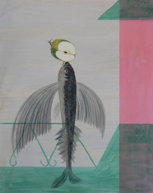
The six Julian Hooper paintings and one drawing shown in the K’ Rd end of the Ivan Anthony premises develop his interest in Surrealism in a more pronounced way than previously – when his method was pitched slightly differently: maybe now they seem an even more quirky version of Archimboldo. As before (as in his ‘K’ Rd’ section last year) these are all portraits. Some large canvases this time.

Usually these standing figures are made up of marine life and fruit: catfish or flying fish balanced vertically on their tails, with split apples or unraveling, peeled oranges or empty seashells balanced precariously on their snouts. The dominant mood is that of Max Ernst, but the references often include Miro, Dali and Magritte.

Sometimes the portraits are a different combination, using decorative motifs of church architecture and voluminous, brightly patterned, peasant dresses. The images seem to be satirical when considered collectively, as if an attack on pomposity but also gender clichés. The men are rendered as rigid and wooden, the women as soft flowing, undulating forms of fabric.

Hooper’s images are very knowing in their eclecticism. They expect you to spot the references, for the hybridity is deliberately not hidden under the mantle of a newly absorbed ‘originality.’ They flaunt their art historical origins openly.

Whether there are metaphoric tropes intended with the rendered objects is another question. Is there a precise Renaissance type of symbolism involved with say the fruit and fish? That seems implausible. More likely they have been chosen for the simplest of reasons - that fish make nice long supple bodies, and fruit make good heads. And that they entertain with their celebration of artifice mixed in with poetic resonance.

There could also be an underpinning, sharply dualist, interpretation going on here - that the contemplative mind (i.e. the exposed fruit-head) is sweet and juicy but the aging or unwashed (fishy) body is repulsive and smelly. Probably though the reasons are morphological, just the pleasures of shape alone, rather than bearing a specific message.

Hooper’s paintings are getting more decisive and confident with their compositional placement and scale now. Yet they have a looseness and lack of spatial density that is an intriguing foil for the Saskia Leek show further up the corridor. If you are the same as me and a bit of a sucker for Surrealism, you’ll like this show.

Thursday, November 26, 2009

After winter comes autumn


Saskia Leek: Yellow is the putty of the world
Ivan Anthony
25 November - 23 December 2009

These ten recent paintings from Saskia Leek show her transition away from paler, more detailed and illustrative imagery towards a more abstract sensibility; an interest in an interlocked picture place – accompanied by a bolder, highly saturated (without being garish) warmer colouration.

She’s turning into a sort of Fauve Charles Tole, using a simplified cubist structure but without being overly concerned with radical spatial depth and perspective – more a Matisselike interest in shape and chromatic chords. With a design sensibility that varies in its flatness, Leek renders buildings, bowls of fruit, a bridge over a moonlit river, and falling autumn leaves. They often have a lyricism through arabesque shapes, especially with the bowls of fruit, where she experiments with volumetric structure, though still clinging mostly to the picture plane.

In many of these works Leek’s palette is dominated by yellow (hence the exhibition’s title) a notoriously difficult colour with which to generate a tonal richness, and not have appear garish. Obviously it alludes to sunlight, and the uplifting, buoyant mood that generates.

In this show Leek often varies her method of mounting, sometimes butting her oil painted board against a gesso painted frame, or having the painting tucked in just under the frame lip, or (most of all) float mounting it away from the frame altogether. Also, with some austere ‘experimental’ works involving stark shapes of buildings, or leaves, she sometimes paints (with thin smudges) onto the frame, extending her pale image and with its unexpectedness, generating an emotional release in its surprise. It seems spontaneous, and quite a contrast to the tighter, more carefully shaped style of most of these images. Other works are very graphic and utilize flat shapes and few colours, as if printed in a book and not painted.

Leek in her current work seems more than ever to be achieving a focused condensation through her manipulation of shape and placement of chroma. There is an articulated awareness of the board’s four edges and an attempt to achieve eloquent density of form. She is quite similar to Isobel Thom and her self portraits because of these concentrated mark/shapes, but much more interested in colour’s play on form – as opposed to that of light – and not prone to grouping separate images together on panels. Both artists make images that have an intimacy and compactness.

The best Leek works have that sense of inevitability that comes from apparently effortless composition, the feeling that only the shapes we are seeing (and their location and alignment) could ever happily describe this arrangement of objects to generate this particular mood. Remove one daub and the image (and its attendant atmosphere) disintegrates.

Essential viewing.

Tuesday, October 13, 2009

Scrapping in the Cosmic Lobby


Matt Hunt: Battle for the World Hotel
Ivan Anthony
30 September - 24 October 2009

Matt Hunt is one of those ‘primitive’ or ‘folk’ painters whose endeavours have been attracting a following for a little over a decade now. He paints in a variety of sizes, exploiting different degrees of initmacy to get his spiritual message (which in essence stays much the same) across.

Hunt can be inconsistent. Sometimes his variety of Gospel Surrealism can be a little too regular in its placement of elements on the picture plane, or over balanced in its symmetry. However his best work is less rigid - more fluid in its composition and use of shape - with less sense of the Christian or science fiction symbols simply being just plonked onto the canvas in psychological isolation. Instead each protagonist in Hunt’s rich narrative contextually interacts with adjacent actors. They seem more aware of each other as living entities - instead of being predetermined symbolic pawns on a cosmic chessboard.

This artist has the persona of an obsessive proselytiser determined to save the souls of his audience. The gallery is his pulpit and his canvases sermons – each one based on a biblical verse quoted in the top right-hand corner. Like a heading in a personal letter. Yet they are also funny and trippily inventive. Otherwise you wouldn’t stick around to look at them. Unless you enjoy being preached at.

Hunt though, has more than Jesus on his mind. His images reflect anxieties about U.S. Foreign policy, cultural imperialism, the global eco-disaster, plus New Zealanders’ mindless consumerism, their sloth and moral decay. His use of science fiction seems to denote the forces of evil. There are definite binary distinctions of good versus bad within all his fanciful imagery: no nebulous qualities common to everybody in different amounts. As on a movie set, everybody is identifiable as hero or villain. It's clearcut.

Because these are quite large panoramas you can stand back to admire them from the other side of the room, or advance in close to read the tiny ranting texts in speech bubbles. Or scrutinise little figures up to no good in distant landscapes. They are functional works designed to serve a purpose as well as entertain. Made to encourage viewer movement: physical bodily action, and mental moral shifting - together.

Thursday, August 27, 2009

What's in a Face?


Yvonne Todd: The Wall of Man
Ivan Anthony
26 August – 26 September 2009

When meeting any stranger for the first time - even before the mandatory handshake and icebreaking vocal greeting - how do we respond during that split-second interaction of eye contact, a flash within which we appraise each other’s facial physiognomy, demeanour, hairstyle and clothing? What preconceived notions kick in to overwhelm us initially, only to then perhaps be gradually adjusted or abandoned over the next few minutes or hours? And can an interpretable face ever be ‘natural’ without extras, cosmetic or surgical, anyway? Does such a ‘pure’ visage exist in reality, ever?

The Yvonne Todd portraits here are unusual in that they are all of men, middle aged to elderly, who are very formally dressed and thus ‘corporate’. To construct the photographs she has picked out models, chosen their clothing and organised various props, like fountain pens or leather sofas. Then she has picked backdrops, considered methods of lighting, and composed ‘career-status’ titles.

Yet these works are in a sense abstractions, formal not just in their tone or degree of solemnity, but also in their manipulation of visual dynamics. Many have strategically placed white hair, white collars and white cuffs, with glowing McCahonesque morning light emanating from behind their hill-like, besuited executive shoulders.

Others are conceptual clichés, Hollywood stereotypes: a Retired Urologist in dark glasses could really be a hitman from The Sopranos; his neighbour, a blue-eyed International Sales Director, is actually a professional gigolo and part-time porn star from Beverley Hills; the wizened ‘Mr. Magoo’ Hospital Director is in fact a fiendish Nazi medical ‘experimenter’ hiding in Argentina.

Apart from facial templates that could be fancifully derived from the entertainment industry, or more prosaic business models ubiquitous downtown, you can tell Todd has had fun picking out accoutrements like gorgeous silk ties and heavy shirt fabrics. She seems to enjoy the sensuality of these materials, almost for their own sake and not for sociological coding. And everything is believable - there is no satirical excess as is often found in her use of women models wearing voluminous apparel, oddball make-up or excessive wigs.

Perhaps though, the believability of these male business portraits is a problem. Even though some are large and unusually detailed compared to other studio photographs, chances are most people, even art lovers familiar with Todd’s practice, wouldn’t be able to pick her examples out from a selection of ‘normal’ images taken of prosperous individuals by other professionals. Her images of selected models blend so well into a pool of documented ‘authentic’ subjects that Todd seems to be shooting herself in the foot in this project. The work seems excessively bland. Unless she wants to be a hard-core conceptualist where the idea has priority over visual attributes, and optical qualities are not of value. That is a possibility, but one that I think – from looking at her track record - is highly unlikely.

Friday, July 31, 2009

Joys of diluted acrylic


Harrison paintings
Michael Harrison: Sun Square Saturn
Ivan Anthony
30 July - 22 August 2009

Harrison’s nine works here are characteristically small and intimate, yet varied in tonal mood. Most are works on paper, using diluted acrylic with a little pencil, though there is one work on canvas. There is not so much positive/negative interaction of form this time around.

The darker works on paper have more presence, exuding nuances of moodiness and greater spatial depth. The Devil Reversed is the exhibition’s peak, composed a little like a movie or video poster, with the male and female stars in the background and a very odd leaf-nosed bat head hovering in the middle of the foreground. This could also be mistaken for the foreshortened head of an old bearded Chinese gentleman.

Probably Harrison likes to tease his audience, so they speculate on how such an image might be connected to the main protagonists that inhabit his devised ‘theatre’. Another tonally dark work shows reflecting puddles of rain or possibly jissom, with another (much randier) couple in a clinch in the background, and a man's head below. The work is dodgy but also intensely beautiful in its surrealist ambience.

Not all the paintings on paper work. A blue naked girl with long hair hanging down over her face looks rigid and awkward. Another, with a cuddling couple shown twice in silhouette - above as a contoured roof of a sort of hollow mosque, and inside it - has hovering sky-borne birds on one side and a hill of trees on the other; but the latter's triangle of foliage and trunks seem too regularly positioned and dull.

The real surprise in this show is the single canvas work of a couple of horses, with one delicately rendered as if it could be part of a fresco. This larger animal has a rippled, slightly combed or caressed quality to its grey flank, an intricate texture that is quite different from Harrison’s more usual liquid acrylic application.

It will be interesting to see if this artist explores this tighter, more opaque form of imagery further. His work seems to be moving towards a different sort of surface, a new sort of tactility.

Wednesday, July 8, 2009

Rubber-craniumed rascal


Rohan Wealleans: Rogue
Ivan Anthony
4 July - 25 July 2009


Rohan Wealleans is one of those artists whose best work inhabits the space between sculpture and painting, and between narrative and abstraction. He gets into trouble with freestanding sculpture or easy narratives using animal life, tribal figures or women’s orifices. The great work comes out of ambiguity; stuff that is vague, nebulous, sculptural and wall based.

This current Wealleans’ exhibition shows once more how technically and formally innovative this artist can be – reinventing sculpture; reimagining painting.

Once it was the intricate marbling revealed when rubbery layers of stratified paint applied over bits of furniture were sliced into, peeled back, exposed and pinned down. Then it was carved into angular formations of latexy acrylic, crystalline prismatic growths on a geological paint surface. Now he has blended the two: angular prismatic offcuts are embedded in deep veins of rubberfied paint to be re-exposed when like the large ball in this show, the form is bisected and pulled apart.

Other things are happening as well, especially with the works on paper – a material out of which he has made great finned/open-book page formations in the past, wildly trippy versions of mid-career Don Peebles with none of the puritanical (though still compelling) austerity.

The works on paper in this show are of two types. One is of large, pale glued on pipi-shaped slices, each one ringed with concentrically diminishing fine-lined contours. The other is of butted together clusters of encrusted coloured pimples, hundreds of little pointed knobs that seem to be the start of small stalagmites - all glued to the paper.

The paintings also are of two types. One is of bits of encrusted or carved paint (or stratified strips) glued on to heavy denim so they look a bit like those plaster walls (or concrete floors) with pieces of smashed china or tiles embedded in them, or Schnabel plate paintings. They look folk-arty, as Wealleans’ work sometimes does, like something you’d find at a church fair. They have an amateurish crafty look about them, as if made by an eccentric aunt to be forgotten and later discovered in a dusty attic. They also look like Licorice Allsorts shoved into the rich icing of a cake.

Wealleans’ other painting type seems a sly joke about John Reynolds and his use of small canvases en masse in Clouds to create an installation. Wealleans’ Silver Lining version has six hundred small stretchers, each one a mini-painting of glued-on chunks of solid acrylic. They are very varied and the work seems not to necessarily need a ‘shaped hang’ like a Tony Cragg coloured plastic ‘painting’ – as shown here. All six hundred acrylic assemblages in a long row at eye height could just as easily hold your attention. Maybe more.

As I indicated earlier, my favourite Wealleans are the more sculptural ‘paintings’ (or painted ‘sculptures’) that really project out from the wall. I like their lumpy pachyderms with strange warty gall-like or testicular growths. This current work, like that of the past few years, is fiddlier. Nevertheless this is an excellent, high-energy, characteristically inventive Wealleans exhibition. Not to be missed.

Wednesday, June 3, 2009

Sensitivities


Feelings (a group show)
Ivan Anthony
23 May - 1 July 2009

Ten Ivan Anthony artists here present sixteen works for our thoughtful deliberations - in the ‘office’ part of the gallery to the left of the top of the stairs. While some of the items have been exhibited before there is enough new work here to make this show an exciting display to spend some serious time with.

In Anthony’s office, a tiny Matt Hunt matchbox-sized painting faces two recent, considerably larger, Richard Killeen ink-jet works on the opposite wall. Killeen’s printed objects and creatures are so dense in illusory space and patterned planar surfaces that looking at them is like using a knife to cut one of those super rich Italian cakes jammed with nuts and fruit. It requires considerable ability to optically navigate around all the detail embedded in the wildlife floating before us. The air is thick with suspended fauna and intricate playthings, so much so that the composition seems holistic, without a dominant structure behind the placement of elements.

One surprise is a Roger Mortimer painting showing a plane flying low over (or within) a sea which doubles as topographical map. It is like a varnished over transfer, with a delicate, brown, brittle quality, and similar to a child’s encyclopaedia illustration with lots of unexpected detail. There are also incongruous additions – like the plane’s shadow turning into a bending hammerhead shark, or an underwater pheasant.

The title of this show is apt. It points to the visceral side effects of emotions, almost a pre-linguistic state where sensations from images and the relationships between them acquire their own power. A small Michael Harrison acrylic on paper carries the subtlest, yet most effective of punches: a delicate stalk of bamboo leaves hovering above four rocks in a pool, its downward spikey tips foils to their heavy undulating curves.

There is a sense of piercing stillness in the Harrison that mentally moves, yet the Saskia Leek in the adjacent room, of a rocklike cubist formation, is also riveting. In odd contrast to the static Harrison, Leek’s superbly constructed image seems a fragmented mound at full gallop - a sprinting tanklike animal.

Dior, the Yvonne Todd portrait, shows an immaculately tailored and impeccably made up young woman with long tousled and unruly hair. That aspect is slightly unnerving - something uncanny and disorienting - a detail that dominates the image so that (unusual for a fetish substance) its tangledness takes on an independence. It seems disembodied, with emotional properties that lash out against ‘correct’ grooming. Hair that is 'angry'.

Brendan Wilkinson’s mauve watercolour of death taunting a beautiful young woman intrigues with an inventive synthesis of fragmented skull parts, cobweb, necklace and tassels. Its drama is a cleverly placed foil to the superbly drawn Francis Upritchard dancing girl (a hand coloured lithograph) in the hallway, an image like the Harrison mentioned earlier that is calming and serene. Her languid arms and meticulous hands have an ancient Egyptian profile that offsets a peculiar but haunting impassive gaze, and implied but invisible coloured veil.