Nau mai, haere mai, welcome to eyeCONTACT, a forum built to encourage art reviews and critical discussion about the visual culture of Aotearoa New Zealand. I'm John Hurrell its editor, a New Zealand writer, artist and curator. While Creative New Zealand and other supporters are generously paying me and other contributors to review exhibitions over the following year, all expressed opinions are entirely our own.

Thursday, July 31, 2008

Dj of the ornamental


Kim Meek: Hoopla
Anna Miles
16 July - 2 August 2008

Kim Meek is one of those artists who rakes over the web searching for interesting images to find, dismember and digitally re-fuse with other elements. His use of sampling however, when applied to a passion for the ornamental, makes him similar to a dj using turntables as an instrument, mixing beats and blending tunes. He likes pattern and rhythm, and putting normally incongruous surfaces together in layers so they look natural. His sources are wildly unpredictable, from images of bizarre forms of animal life to illustrations of tropical fruit, from circus posters to Islamic architectural tracery, from Mughal sword blade motifs to Japanese prints, American comics and English textiles.

The resulting hybrids are a bit like Richard Killeen’s digital images but are not self referential as his can be. These also have no interest in spatial illusion, being flat and collagelike. Nor are they always precise, for sometimes they have a folk-artish rawness, a rough painterliness - depending on where the image has come from.

To continue with the music analogy, because aural sensation has more impact on the body than visual, optical work like this rarely has the immediate visceral power that music often has. And they do seem like complicated, icy, cerebral exercises to some degree, not sweeping you away. Yet the delicate complexity of Meek’s work draws you in, making you stand close to appreciate them. Most of their detail cannot be captured in photographs because background and foreground are carefully woven together (and often tonally matched) to make the whole picture-plane a busy, seething surface.

It’s not all abstract sensation though. Allusions via pendulous fruit and nut forms to testicles and breasts, and sliced squid to vulvas, introduce a slightly creepy humour. They have a devious surreal undercurrent that enriches them. Meek has picked forms loaded with associations. They may not be immediately visceral but they do have a dreamlike ability to startle music rarely can provide.

Tuesday, July 29, 2008

Hands across the Tasman


Attrium Research Collective: the buzzing confusion of things
St. Paul St, Gallery 1
July 24 – August 22, 2008

The Attrium Research Collective is a group of Australian and New Zealand artists who have formed collegial links while working at AUT in Auckland and RMIT in Melbourne. A partnership has formed between the two art schools, resulting in convivial ties amongst the lecturers as they invariably got familiar with each other’s practices. This Auckland show slightly overlaps another nearly identical ARC exhibition just presented at RMIT. Four of the eight artists (Jonty Valentine, Greg Creek, Sally Mannall and Martine Corompt) have the same work in both.

The results are not really collaborations where you can dissect each work and see the contributions of different individuals. They seem to be more about dialogue between artists after they have made the work, not during. 
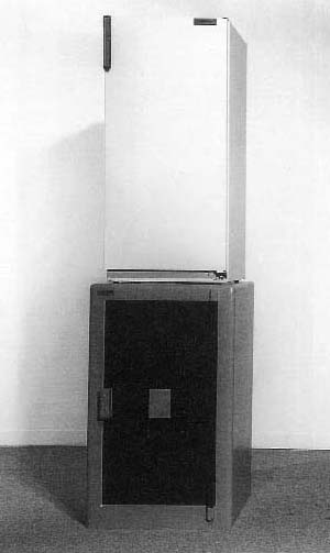
Jonty Valentine, an AUT teacher of graphic design, is the only case of a true interaction occurring between him and other artists, for he has taken their images and adapted them for presentation within an elegant hardcover book. Called A Commonplace Book, it is a collection of useful references and visual arguments, and alludes to Sally Mannall’s video, a work where she gets a group of individual students to examine an empty wooden gun case, figure out its function, and respond. Valentine has designed his book in relation to that unlatched, openable object – leaving the top folded edges of the pages intact so the owner has to cut them to open it.

Sally Mannall’s video of individuals investigating the felt-lined pistol case, makes assumptions more akin to a Kiwi sensibility than Australian. Firearms are more common (openly worn by police for example) across the Tasman, and not regarded with the great trepidation they are here, where we have more an ‘English’ than ‘American’ attitude towards them. I’ve seen people chasing each other through the streets of Melbourne, waving guns in their hands as they screamed at each other. I assumed at the time this was normal everyday behaviour for Australians.

Public fear, surveillance and the facial characteristics of criminals are all ingredients in the work of Martine Corompt. Her scroll of ersatz wallpaper depicts silhouettes of confronting, leering faces with scenes of potential petty crime. It has an inventiveness that takes a prolonged detailed examination to properly reveal, for initially it seems benign and sweet. Her other work, Cesspool, is mesmerising - an animated black puddle with transient menacing visages appearing in its rippling, flowing contours.

Greg Creek, like Corompt, likes black graphic forms, using them to explore a blending of several visual genres such as newspaper layout, comics, dribbled splatters, map contours and gestural brushmarks. His wall display is intriguing but it is his contribution to the Commonplace book that is particularly exciting, a sizzling display of riffs on speech bubbles, a set of playful extrapolations on the comic vocal convention. The highlight of the book.

Nova Paul’s The World of Interiors is a film and audio project that sit uneasily together. In fact the film is superfluous – though it does seem to refer to the title of this exhibition, a quotation form William James about the very early experiences of infants. What is striking is the intensity of the sound recording, an articulate monologue by a friend of Paul’s in Dunedin who is recovering from a breakdown. His rambling, debatable, but nevertheless pithy, comments on a huge range of subjects, such as denial (“denial is the engine room of the universe”), hospital bullying, drugs, wisdom, chakras, reflexology, and the elemental nature of psychic pain, make excellent - if not compelling - listening. It doesn’t need visual accompaniment.

David Thomas is a much admired RMIT teacher well known in both New Zealand and Australia, and a very interesting painter. His green and black site-specific contribution to the show on a tinted window and inside wall however is a disappointment, mainly because the work he had in Melbourne looked so much better – obviously the result of being extremely familiar with the spatial environs of where he works.

Part of the problem in Auckland with his painted installation results from the distracting given horizontal dotted lines on the dark window glass. However the tinted glass functions as a foil to his added shiny black rectangle inside and compels more viewer movement - and an inside/outside vertical green combination works well. In Melbourne (and I’m basing these views on online photographs) the spatial dynamic was more pronounced with its vertical planes of chroma, the rhythms of their position and orientation, and paired ‘chording’. Obviously having untinted glass windows made planar relationships clearer, and gave the work there more immediate wallop.

Ron Left is probably a better painter than Thomas (the year Sriwhana Spong won the Waikato Art Award, Left had a gloriously inventive painting in the final hang), but these days he seems far more interested in photography. The results are pretty ordinary, using processes and procedures in common usage for over thirty years now. However it is in Valentine’s book that you see Left’s talent for compositional placement being showcased. His playfulness in positioning lines of small photographs within certain sequences of pages, teasing out levels of height on different pages with repeated combinations, and contrasting colour of lines of images with tone, makes his contribution nuanced and distinctive.

The most sensual, methodical, yet haunting photographs in the show come from Monique Redmond: a series where she documents empty sections in the small, but once vibrant and busy, small town of Ohai in Southland. As population numbers dwindled and families moved north in search of work, they took their buildings with them, leaving rectangular paddocks oddly surrounded by the remaining houses, with the occasional remains of a path or garden in the middle. These subtle images show us where history has attempted to obliterate its own footsteps. You feel like an archaeologist looking at these images of absence, scrutinizing the surface ground-covering for clues. They have a discreet melancholy that forces you to imagine what was present, how it existed and why it left without a trace.

A show such as this – a collaboration between two tertiary institutions – you might expect to be dry and dully academic. While some of artists’ statements are, the work itself isn’t. There is a lot here to make a prolonged visit enjoyably memorable.

(Images from Jonty Valentine, Sally Mannall, Martine Corompt, Greg Creek, and Monique Redmond.)

Monday, July 28, 2008

Skin of Braddock's back


Chris Braddock: The artist will be present
St. Paul St. Gallery 2
24 July - 22 August 2008

This large installation in the left-hand St. Paul St gallery features three videoed films in interconnected darkened spaces. At first glance they seem to examine the skin on the back of Chris Braddock - an artist who is a lecturer at AUT - all filmed at different angles, with different quantities and qualities of epiderm.

Actually two images only are of Braddock’s back. The third is of a sheet of thin plasticky paper that is fibrous, translucent and pale pink. It takes you a while to figure out what it is not, that it is not a human body part. It curls at the edges and has stretched and warped under pressure from heavy objects. These have left unhumanlike creases and indentations.

The filmed back shots are of the artist sitting naked - but leaning forward - while kneading, slapping and pummelling what is probably some wet clay. One camera is positioned directly behind (level with his shoulder blades) and one is above, looking down his neck. The latter shows images that alter rapidly when Braddock leans far forward. When the angle of his body changes the fleshy and sinewy image suddenly stretches and flattens out, no longer at an oblique orientation.

There are also speakers loudly playing the crisp, snappy, staccato sounds of Braddock’s ‘performance’ in the more public foyer.

As the witty title suggests (referring to the wording on invitations), a certain amount of preening narcissism is necesary for such artist body-focussed projects. The project succeeds because, and not in spite, of that. Braddock’s wiry anaemic freckled back presented this way has its own muscular eroticism. Its taut bony outcrops and translucent moving skin are surprisingly engaging - especially when coupled with a sense of the clandestine. His moderately sized images are presented in three dark alley-like spaces that seem conspicuously remote and private.

In this installation the four elements (behind-back moving image; above-back moving image; above-paper moving image; spanking sound effects) work well spatially. Their meaning is extremely mysterious, and bizarrely funny – perhaps about some sort of violent solitary masturbation that desires the collusion of a furtively voyeuristic audience (mainly male but not necessarily). It is immensely absorbing visually and aurally. The best work Braddock has made for many many years. A wonderful installation.

(The images are from Above, Back and Caress. Courtesy of the artist.)

Friday, July 25, 2008

Newby installation


Kate Newby: Thinking with your body
Gambia Castle
18 July - 9 August 2008

It’s an interesting speculative problem to try to locate Kate Newby’s art practice (which has a large language component) as a form of literature. If it is legitimate to consider Lawrence Weiner a poet of sorts (to read his texts off the catalogue page or to see them as 'poetry’ on the streets) - and certainly in poetry anthologies like Douglas Messerli’s American collection “From the Other Side of the Century” there are several poets communicating with texts supplemented by added photographs or diagrams – then maybe when Newby paints a mural on a brick wall that just says ‘Plants songs food clothes’ she is presenting a poem. The same when she writes on a vase that is about to be fired, “Go and put on an album of Gillian Welch and try to remember a time before all this crap filled your mind.”

The fact that she uses words on banners, murals and ceramics this way is what makes her practice interesting, rather than her being a consummate wordsmith. It’s not academic language at all, not sophisticated or erudite - just very plain. Downright ordinary. Close to banal even – especially with her lists of nouns.

However the really odd thing in this show (outside the question of poetry) is that seemingly despite her best efforts to resist it, Newby is turning into a painter – not the portable canvas stretcher variety but a maker of surprisingly sensual props in installations.

The thin muslin hanging across the Gambia Castle gallery is in front of a newly painted, narrow section of yellow floor, walls and window panes. Trying hard to be on the periphery of the Gambia space, it looks as if the traditional position of a yellow sun suspended within a blue sky has been reversed. The blue hanging is enclosed by, and framed by, yellow. In the horizontal blue/grey strip at its top are delicately stained textures that look like bicycle tyre or shoe sole prints, softly smeared and mottled. Beautifully understated these wisps of colour float on the gauze that ripples and sways in the breeze, catching the light that streams in the window.

The other interesting artwork is the one made by leaving the staircase door to the street-front ‘Crockford window’ open. Of course from out on the K’ Rd footpath it beckons to pedestrians to come upstairs and check out Newby’s show, but its main feature is also to confuse you when you are leaving the building. If you are a little absent-minded (er like me) instead of turning right to the outside entrance at the bottom of the stairs, you find yourself attracted by the daylight and stepping out towards the window glass. It is a bit like a flytrap for day-dreaming reviewers and novice Gambia visitors, a ruse that shows you just how dangerous 'thinking with your body' can be. A warning to concentrate when you leave the rarefied world of art and creative imaginations and walk into the ‘real world’ of rowdy passers by and speeding smelly traffic.

Cheryl Bernstein on Woeful space for

woeful paintings and Tao Wells once more on Forget Art.

Spong sculptures


Sriwhana Spong: Backdrop
Newcall, Auckland
July 22 – August 9, 2008

I’ve always thought the New Zealand art world has been somewhat gullible in its rapid embrace of Sriwhana Spong’s videos, works particularly eclectic in their use of techniques by Lynch and Hitchcock, dropped into a Balinese context and plonked into poorly thought out installations of badly made props (as in her Turbulence ARTSPACE show).

However this artist learns fast, and her Newcall show has no moving image at all but some nicely made wall works and minimal sculptures. There is also a collaborative musical work (based on birds on telephone lines providing a musical score, an old Fluxus idea). Now she seems more in control of what she is doing. Her placement of elements seems more exact.

Most of the exhibition features lacquer in various forms, and is in fact a sort of meditation on it and shellac as substances. Both varnish products were once derived from lac, a resin found in certain beetles, but today the more durable lacquer is a nitrocellulose polymer that is dissolvable in certain solvents, and shellac the insect product once commonly used to make 78 records. Vinyl was invented in 1935, but shellac was used for records till the fifties, with some factories continuing in non-western countries till the seventies.

Some of Spong’s works are wooden panels, stained with dissolved shellac (from records), and sometimes combined with small make-up paintings. Others are rolled up balls (from melted pieces of records) placed in a chalk circle on the floor, but most impressive are two shiny black puddle shapes on the wall. Into these lac fetish objects have been set elements found in her earlier installations and videos: cigarettes, pins, string, cinnamon sticks, silver foil, burnt matches, necklace chains, bobby clips, pencil leads.

Two other works use rows of small tubular glass beads threaded on to nylon in a way similar to her use of strings of cigarettes in previous exhibitions. In one work four highly reflective lines make up a square cross-sectioned vertical column. In another, ‘Symphonic Variations’ (like the image on the invite) a curtainlike arrangement of overlapping parabolas and black beaded lines is suspended from the ceiling to make a ‘musical’ drawing in space.

Nice to see Spong’s various spatial explorations in this show. I enjoyed its understatement. Lots of air.

Thursday, July 24, 2008

Woeful space for woeful paintings


Jokes With Strangers: Denys Watkins, Roman Mitch, Garth Steeper, Milli Jannides, Sam Rountree Williams
Curated by Sam Rountree Williams and Patrick Lundberg
A Centre For Art (Level 3, R5, Achilles House)
10 July - 26 July 2008

Here is a problem to be considered. Experimental art spaces like ACFA and R103, collectives set up by young and emerging artists, usually rent space from venues like Achilles House, areas originally designed to be used as offices. These premises are perfect for parties, performances, sound works, moving image and some sorts of installation and sculpture – but for paintings and drawings, their walls invariably are an abysmal disaster. If such works are not shown in pristine circumstances, in a properly prepared environs with clean (usually) white walls and good lighting, their presentation ends up looking appalling. They end up not being taken seriously as items for contemplation and thoughtful debate. They suffer a resistance even before their own individual attributes are looked at and discussed. They become a joke.

So with the title of this show, one assumes the ‘strangers’ are the handful of gallery visitors the artists and curators don’t happen to know. The ‘jokes’ are not intended, I’m sure, to be laughable works in the sense that I’ve explained above. No artist wants their endeavours to be rudely mocked. So assuming that, perhaps these paintings – even in a ‘proper’ gallery – are actually intended to be jocular…er you know…designed to raise a smile.

Putting aside the fact that only two of the five works really make it (and one of these almost accidentally), let’s look for wit in all of them. Take the title as a literal thematic statement and look for humour or clever paradox.

First of all the two competent paintings in the show, by Denys Watkins and Roman Mitch: it was good to spend time poring over their imagery and thinking about spatial organisation. In Watkins' work, the sensitively undulating contours of his shapes, plus the skilled underpainting and manipulation of temperature in the hues, made it easily the most sophisticated item in the show. Not witty particularly, just extremely classy. A wonderful, beautifully considered object that makes you wonder why an artist of Watkins’ calibre bothered to contribute. Leaning on a window ledge, the placement of the work insulted the intelligence of its creator.

Roman Mitch’s black and white painting on a hanging piece of paper slowly grows on you, despite its scruffiness and shambolic presentation. Its geometrical configuration experimented with Alberslike internally receding planes, with an opened-out box turning into a sort of chair. The lids became its seat, backrest and legs and teased the viewer with its ambiguities.

Garth Steeper’s sort of ‘realism’ was a sentimental portrait with a corny narrative. It used humour with the reflection from a bloody steak (on a plate on the table) casting a rosy glow over the large face of a girl about to devour it. A half-clever idea in a roughly made work that only partially hinted at irony.

Sam Rountree Williams’ painting, like Steeper’s, avoided finesse. It seemed to be a strange pun on heavenly bodies: a glowing sun in front of a painted, cross-sectioned medical diagram of post-coital male and female bodies. Very oblique but somehow getting its point across. Just.

One suspected that the fact that Milli Jannides’ painting of rippling waves was one hundred per cent serious, was a joke in itself created by the context of this show and the other works around it. For this exhibition, single selections from individual artists were inadequate. By themselves they remained isolated. There was little conceptual conversation between works, no vibrant thematic argument going on. The paintings were so totally different, it was like five untranslatable languages all speaking loudly at once in this very small room.

Wednesday, July 23, 2008

Cholesterol-laden 'paintings'


Richard Maloy: Yellow Grotto/Raw Material
Sue Crockford
22 July - 16 August 2008

This is a show of photographs of temporary butter paintings, an exploration of dairy product as raw material - with much of its physical attributes also examined in two DVDs.

The ‘paintings’ explore the properties of butter (warmed and softened by the artist’s hands) when applied onto a mid-toned grey board and combed and poked by fingertips. We think about the marks made by raking and prodding, patting with palms, and the shape of the flattened sticky mass: what they might add up to. No metaphor for butter as substance seems intended.

I wonder whether these four attempts are Maloy’s sole corpus of attempted butter paintings, or if they are the end of a long line of investigations. If he keeps going, they might get a whole lot better. The yellow gives them an aura of purity, and pattern and rhythm provide an immediacy for the simpler compositions. The unsuccessful ones are where he tries to draw, to represent or depict things.

There are also portraits of the artist with hunks of ‘expressively’ kneaded butter applied to his face. He applies the greasy goop to his visage and it just manages to adhere. And perch absurdly on the top of his head. And splatter all over his clothing.

Round the corner in the back room is a suite of related work from last year using wet clay. It is a very interesting point of comparison because while this year’s butter portraits look comical, these earlier clay ones look monstrous. Quite gross. A different mood entirely. The clay is heavier and bulky, and looks dark and evil. More helmet-like in the way it covers his whole head. It even covers his neck and shoulders.

There is also an earlier video of Maloy smearing clay over the leftside of his torso and waist, and left arm, melding the two together, smoothing over the join. The work has an intriguing Naumanesque quality, but creepier because it suggests a burn or deformity. It’s my pick of the butter/clay Maloys. They are a intriguing body of research that fit in with his earlier, but not so interesting, bag-over–head self-portraits. Well worth a visit.

Elam Sculpture


Rory Dunleavy, Luke Willis Thompson, Shannon Teao: Deadline, Authentico!
George Fraser
16 - 26 July 2008

In this sculpture show we see three artists collectively use the two GF rooms in entirely different ways. In the front we see two photographs (Site A and Site B), each showing a pear-shaped chunk of wet clay that has been pulled out of a plastic bag, photographed, and then that photo painted to look as if white slip had been applied to the upper portions of the lump.

In the back room things are more complicated: twenty units positioned in a grid–like arrangement on the floor. Some test mainly binary combinations of unorthodox materials like clay and branches, polystyrene and cardboard, rock and paint, plaster and foil, wire and tape etc. Others investigate just what plinths might be; much like the French artist Bertrand Lavier who has done peculiar (but brilliant) things like placing a fridge upon a safe. Still others explore patterns of painted marks on odd materials and constructed Picassoesque ceramics. Others yet try transitive verb actions with materials, the ideas embodied in Richard Serra’s verb list for example, using processes like gravity or decay. Little bricks that have tumbled off the seat of a toppled chair. Clay blocks in a pile, some of which have been crumbled, or diminished in scale.

The result is a fascinating floor display that has energy and intelligence, is visually intriguing, and a great contast to the calm and quiet of the front room. An exceptionally good exhibition at George Fraser. A knock-out.

Auckland permutation


Julia Morison: Myriorama
Two Rooms
3 July - 9 August 2008


At Two Rooms Julia Morison presents a second permutation of her newest project, Myriorama, the first being in April at 64zero3 in Christchurch. The title refers to a Victorian picture-card game where a landscape has eighteen components that can be recomposed in a line with a continuous horizon. With seemingly infinite possibilities. Morison can create at least eighteen sorts of repeatable panel. These can be recombined according to the needs of each gallery space.

In Christchurch the work in one room was linked up to form two looping, twisting fat worms, with nodding dancing heads. These were joined on several walls continuously.

Now in Two Rooms’ upstairs gallery, Morison has gone for discrete units that look like flattened cylinders, featuring pinstripes that contain configurations like Celtic/Nordic motifs or slip knots – inserted in different sizes. The colours are delicate blues, greys or cream with a mottled feathery texture –the result of thin ink being applied over gesso. There are also shiny black Perspex panels inserted into the forms.

Compared to her other recent projects, these works are formally simple and restrained: unlike say the wild and decorative extravagance of Gargantua’s Petticoat with its flailing arabesque tendrils. These are subtle spatial teasers where flat shapes can quickly pop into convexly moulded plasticity, and forms that travel around corners suddenly resolve into cohesive spatial masses. The work has tension and verve where she has taken the implications of the edges and flat shapes and contradicted them with wilfully independent internal configurations and linear alignments.

Morison’s Myriorama paintings place intriguing pressures on the rooms they occupy, such as this narrow gallery with its sloping roof and long proportions. They are an unusual combination of formal ornamentation with the shrewd manipulation of a bodily confining space, one that usually shows framed rectangular works. A memorable and exciting treatment for a space that is normally difficult for installational sensibilities. In September Myriorama appears as a third variation in RAMP in Hamilton. There will also be a fourth one in Tauranga.

(With the above photographic images digital technology, one discovers, cannot cope with parallel lines, forming strange moire effects. As I've said, the lines are parallel.)

Tuesday, July 22, 2008

Visually simple, mentally complex


Michael Harrison: Example of the Ravens
Ivan Anthony
16 July - 9 August 2008

Some artists are never totally committed to a completion of a work, even if the item in question has been signed or exhibited. Even if a collector has purchased it and installed it in their home, they still might call round and just add (or remove) a little something. The work is never far from their thoughts, especially if it is owned by a friend or somebody who lives close by.

The artist once known as Merylyn Tweedie used to be famous for occasionally changing collages that collector friends owned. And in this show at Ivan Anthony’s are several Michael Harrison paintings that have been shown in earlier stages years ago, but now are different. He obviously hasn’t wanted to let go. To forget them and walk away.

There are nine acrylic works on paper in Example of the Ravens, all looking unnervingly like watercolour but not. I used to only prefer the Harrison works that focussed on positive/negative shape relationships – a carry-over from my deep affection for Gordon Walters paintings - but now I’ve changed. I’ve grown fond of his other stuff too.

Harrison’s images exude incredible sensitivity, by virtue of their ultra-delicate washes of very thin colour, faint pencil lines and precise placement of symbolic images. That can be a drawback. Like Reichsmarschall Gōring who once said "Whenever I hear the word ‘Culture’ I want to reach for my revolver,” one can sometimes bristle at too much sensitivity. It can be cloying, and make you long for something raucous and deliciously vulgar. A fistful of salt chucked into the bowl of sugar.

These works are incredibly romantic in the way they depict women. As images of besotted adoration they intrigue because of a sense of worship that seems Victorian. Yet Harrison (thank God) is more complicated than that. Hints of sarcasm and mistrust creep in.

Enlist shows a man saluting his overbearing, controlling lover, trying to figure out how to break free. Prediction has another fellow contemplating the dynamics of his relationship, represented by an embracing couple in the sky. They are enclosed in a silhouette that could be a woman’s head with long hair and flouncing curls. It also could be a skull and crossbones. Crows and a leopard-faced gargoyle hover ominously nearby.

Such images of healthy cynicism keep Harrison’s work fresh and not soppy like it might at first seem. His use of soft greys and mottled blues bring a discreetly moody atmosphere to his practice. Images on your computer screen won’t capture it though. You need to see these works directly in the gallery to enjoy their intimate scale and painted surface.