Sunday, November 29, 2009
Les fruits de mer


Julian Hooper: Once Inside
Ivan Anthony
25 November - 23 December 2009
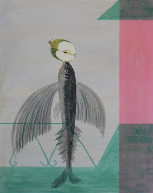
The six Julian Hooper paintings and one drawing shown in the K’ Rd end of the Ivan Anthony premises develop his interest in Surrealism in a more pronounced way than previously – when his method was pitched slightly differently: maybe now they seem an even more quirky version of Archimboldo. As before (as in his ‘K’ Rd’ section last year) these are all portraits. Some large canvases this time.
Usually these standing figures are made up of marine life and fruit: catfish or flying fish balanced vertically on their tails, with split apples or unraveling, peeled oranges or empty seashells balanced precariously on their snouts. The dominant mood is that of Max Ernst, but the references often include Miro, Dali and Magritte.
Sometimes the portraits are a different combination, using decorative motifs of church architecture and voluminous, brightly patterned, peasant dresses. The images seem to be satirical when considered collectively, as if an attack on pomposity but also gender clichés. The men are rendered as rigid and wooden, the women as soft flowing, undulating forms of fabric.
Hooper’s images are very knowing in their eclecticism. They expect you to spot the references, for the hybridity is deliberately not hidden under the mantle of a newly absorbed ‘originality.’ They flaunt their art historical origins openly.
Whether there are metaphoric tropes intended with the rendered objects is another question. Is there a precise Renaissance type of symbolism involved with say the fruit and fish? That seems implausible. More likely they have been chosen for the simplest of reasons - that fish make nice long supple bodies, and fruit make good heads. And that they entertain with their celebration of artifice mixed in with poetic resonance.
There could also be an underpinning, sharply dualist, interpretation going on here - that the contemplative mind (i.e. the exposed fruit-head) is sweet and juicy but the aging or unwashed (fishy) body is repulsive and smelly. Probably though the reasons are morphological, just the pleasures of shape alone, rather than bearing a specific message.
Hooper’s paintings are getting more decisive and confident with their compositional placement and scale now. Yet they have a looseness and lack of spatial density that is an intriguing foil for the Saskia Leek show further up the corridor. If you are the same as me and a bit of a sucker for Surrealism, you’ll like this show.
Friday, November 27, 2009
Jodie Dalgleish tells us about SITE in Dunedin


SITE ‘09
The Dunedin School of Art
21 November – 26 November 2009
This week SITE ’09 presented the work of The Dunedin School of Art’s graduating students. With recent cuts in funding fuelling changes to its teaching programme, and talk of a potential cap on the number of new and returning students in the future, I was interested to see how student work had fared in an environment of fear, uncertainty and doubt. As with any of these kinds of events, the work was multifarious in terms of approach and (much less so) quality. Overall, however, there was a noticeable dedication to making work and engaging the senses.
For me, a stand-out work is Alex Mackinnon’s A Deaf Piano, a sound installation involving no less than 130 audio speakers, 34 tape loops, 50 tape channels, 40 digital audio channels, various tape and CD players and amplifiers and 300 meters of speaker wire. Exposed audio speakers of various sizes run down coloured wires to a plethora of sound gear. Each speaker, wire and piece of sound gear makes its own audio channel. The wires are like the wires of an exposed upright piano, the speakers are like its hammers and the gear its keys. A Deaf Piano is an instrument made for sound-as-music, as much as any piano. It can be heard as a myriad of flat-line electronic sounds that merge to produce a constant drone that is modulated by intermittent interference-like sounds that tweak the work’s harmonic range.
While on the verge of being oppressive, the sound creates a strangely pleasing and intimate field of experience and interest that is visually confirmed and enhanced by the stripped-bare instrument on display. As the artist wrote as part of his year’s project, the work is bio-acoustic. It plays on Hermann von Helmholtz’s nineteenth century theory that related the physiological experience of hearing to the mechanics and practice of music making. Mackinnon responds to Helmholtz’s suggestion that the tiny hairs of the ear canal are the same as the wires of a piano. Each hair is tuned to a specific frequency. When in full sustain these wires give the mind a reproduction of the full and infinitely detailed acoustic world. The instrument that ultimately makes Mackinnon’s work possible is innate and is celebrated as such.
It is the attention to making a ‘piano’ that is deaf to any musical preconceptions that places Mackinnon’s work in the artistic realm of experimental music. It brings to my mind Phillip Glass’ watershed art music performances in New York galleries and lofts in the late 1960s and Douglas Lilburn’s New Zealand music-changing electronic studio and compositions of the 1970s. Bringing it into the present, it teeters on the edge of a predilection for a wall of noise. At the same time, the work brings to my mind something of the sculpted spatiality of James Turrell’s light works that have helped push the phenomenological boundaries of sculpture from the 1960s onwards. Although Mackinnon is working with sound waves rather than light rays.
The installation of jewellery artist Priyavanti Makwana also engages the senses. Presenting works from her Lotus and Soogandh series in a small room, she encloses the visitor in an aromatic field created by the star anise, vanilla bean and cardamom pods showcased in her necklaces. A work such as Soogandh IV presents a vanilla bean pod pendant that would scent the skin of its wearer.
Jude Robertson’s sculptures Spill, and Ubiquitous, Ulex Europaeus, parts of her installation Ecological Score are also impressive. Spill is a floor-bound spill of 7,000 very small cast soap houses. Its slightly caustic smell and invasion of the ground plane evoke the outflow of household waste. Ubiquitous, Ulex Europaeus, which takes the form of a large rug-like floor covering is made from what could be every part of the Ulex Europas, or common gorse plant – its spiny leaves individually inserted and combined to produce a spiny ridge that traverses the work, dried and ground flowers forming its border, desiccated foliage and wood making flat areas reminiscent of cultivated fields seen from the air. With its map-like quality and evocation of a colonized landscape the work made me consider the often noxious landscape-defining activities of humankind made obvious in the introduction of gorse to New Zealand.
Melissa Trainor’s series of self portrait-like photographs taken with a self-constructed pinhole camera and Kate Vander Drift’s three channel video installation are also notable. Utilizing the pinhole camera’s ability to simultaneously encompass multiple viewpoints and the almost explosive qualities of light in the images produced, Trainor explores the limits (or not) of self perception. Vander Drift’s installation Silencing Dissent comprises a video played on each of three walls that enclose the domestic dining room table and chairs seen on screen. In her three channel video Domestic Terror three family members sit at the table and are served various glossy and colourful drinks and cupcakes along with the Otago Daily Times.
On leaving SITE I could not help wondering how well the New Zealand art system would support such graduating students dedicated to a practice of making. In a country where contestable funding is becoming ever more contestable and available funds regularly diminish, what kind of a practice will these artists be able to support? And what of the future of our art schools? Is it enough to accept that students can make stand-out work, even under duress?
Photographs of A Deaf Piano, by Markus Gradwohl, courtesy of the artist.
Thursday, November 26, 2009
After winter comes autumn


Saskia Leek: Yellow is the putty of the world
Ivan Anthony
25 November - 23 December 2009
These ten recent paintings from Saskia Leek show her transition away from paler, more detailed and illustrative imagery towards a more abstract sensibility; an interest in an interlocked picture place – accompanied by a bolder, highly saturated (without being garish) warmer colouration.
She’s turning into a sort of Fauve Charles Tole, using a simplified cubist structure but without being overly concerned with radical spatial depth and perspective – more a Matisselike interest in shape and chromatic chords. With a design sensibility that varies in its flatness, Leek renders buildings, bowls of fruit, a bridge over a moonlit river, and falling autumn leaves. They often have a lyricism through arabesque shapes, especially with the bowls of fruit, where she experiments with volumetric structure, though still clinging mostly to the picture plane.
In many of these works Leek’s palette is dominated by yellow (hence the exhibition’s title) a notoriously difficult colour with which to generate a tonal richness, and not have appear garish. Obviously it alludes to sunlight, and the uplifting, buoyant mood that generates.
In this show Leek often varies her method of mounting, sometimes butting her oil painted board against a gesso painted frame, or having the painting tucked in just under the frame lip, or (most of all) float mounting it away from the frame altogether. Also, with some austere ‘experimental’ works involving stark shapes of buildings, or leaves, she sometimes paints (with thin smudges) onto the frame, extending her pale image and with its unexpectedness, generating an emotional release in its surprise. It seems spontaneous, and quite a contrast to the tighter, more carefully shaped style of most of these images. Other works are very graphic and utilize flat shapes and few colours, as if printed in a book and not painted.
Leek in her current work seems more than ever to be achieving a focused condensation through her manipulation of shape and placement of chroma. There is an articulated awareness of the board’s four edges and an attempt to achieve eloquent density of form. She is quite similar to Isobel Thom and her self portraits because of these concentrated mark/shapes, but much more interested in colour’s play on form – as opposed to that of light – and not prone to grouping separate images together on panels. Both artists make images that have an intimacy and compactness.
The best Leek works have that sense of inevitability that comes from apparently effortless composition, the feeling that only the shapes we are seeing (and their location and alignment) could ever happily describe this arrangement of objects to generate this particular mood. Remove one daub and the image (and its attendant atmosphere) disintegrates.
Essential viewing.
Vaguer than nebulous


Jim Speers: Crystal Spirit
Starkwhite
21 November - 24 December 2009
We have here an enigmatic but ambitious installation of fourteen images under glass on the walls of Starkwhite’s large downstairs gallery. Elam lecturer Speers has also added a new white vinyl–covered floor on which he has placed converging red, white and blue lines, disappearing into a corner.
The odd floor design could be referring to the diminishing economic and political power of the U.S.A. while the exhibition’s title seems to be alluding to a George Orwell poem about an Italian soldier slain in the Spanish Civil war, where the last two lines go: no bomb that ever burst shatters the crystal spirit. Plus the different glassed-over images could be interpreted as faceted planes in a crystal.
The language within the images and title is rich in other references too, varying from football clubs, rock bands, methamphetamine use and Allan Smith to John Steinbeck’s non-fiction book, The Log of the Sea of Cortez which involved a marine–specimen expedition made in the waters of California in 1940. It is really an inventory of footnotes Speers expects you to figure out (Google each listed phrase perhaps?) and structure into some overarching cohesive sense, like a detective.
In other words the specific meaning of these framed factory photographs, Elsworth Kelly-like abstractions, snippets of text, and images of the sea and sunken ships, is calculatedly obscure - a tease. It is part poem and part encyclopedia with its many fragments of image, sentence and word. These juxtaposed visual, historical and verbal allusions are all geared up to both frustrate and pleasantly evoke.
But evoke what? About two thirds of the individual images are sufficiently compellingly on their own to hold your interest as you try to guess their origins. These, those of the sea and factory machinery especially - would look good in isolation.
Unfortunately the total experience for the viewer falls flat. There doesn’t seem to be enough cohesive focus to consistently engage an audience so that they really want to construct their own speculative account. The images end up too psychologically detached because of their size, lacking the impact that say Gavin Hipkins’ banner photographs had in the same space a couple of years ago - and the slashing trail of ‘American’ colours diagonally traversing the gallery (as if passing through a prism) isn’t sufficient to centre the visitor’s experience.
It is all too disparate and dryly cerebral, without sufficient physical (and emotional) involvement. Plenty of crystal; not enough spirit.
Tuesday, November 24, 2009
Monday, November 23, 2009
Talking Tao


Tao Wells: Space Jam 1996
A drawing and painting sale selected by Nick Austin
Gambia Castle
14 November - 28 November 2009
November is an interesting part of the art year calendar, with many of the main tertiary art institutions around the country briefly presenting public displays of their students’ work. Most of what is shown is invariably inconsequential, work made cloning their teachers or pages of international art mags, or a hybrid. Those few with any substance will become apparent in 3 - 4 years after their paper chase, when they develop strategies of survival, shake the teachers out of their hair, and find their own voices.
In Gambia Castle Tao Well’s show suggests the opposite process, as if his best work is the very early stuff, even before he went to university. Such a premise might be accurate - might even be obviously so if his practice in general is conspicuously unremarkable to start with.
So how can we be persuaded either way? No meritable quality, in my view, is apparent from just looking at the exhibition and unfortunately Nick Austin, the selector of the exhibited work, has no essay advocating its merits. Although he is not listed as curator (only ‘selector’), he is known as an eloquent verbaliser of ideas, one who is exceptionally articulate. A wasted opportunity.
Instead we have Dick Whyte (of Wayfarer Gallery) writing a little introductory text to the show. It is nicely written and in three sections.
The first starts with: Tao Wells is a terrible artist. But he is a good person. This writer is impressively candid it seems, although perhaps too generous about the artist’s personality. Whyte then distinguishes between moral behaviour (externally imposed codes, as with legal or religious injunctions) and ethical (internal and from reflection).
In the second paragraph he puts forward a second definition of ethics in which “we must become adept at talking with ourselves. We are always two, rather than one.” He wants to lead the discussion to the possibility in the third section that Tao Wells is both a terrible artist and a terrific artist. However I can't get that far. For a start I have problems with his use of the word must.
Amongst his many attacks on the notion of prescriptive moral rightness and attempts to systematically provide criteria for it, the British philosopher Bernard Williams claimed that ethical conviction about what one ought to do is not actually a kind of decision (not from a group or from the individual concerned): Ethical conviction, like any other form of being convinced, must have some aspect of passivity to it, must in a sense come to you. (Ethics and the Limits of Philosophy, p.169). However this conviction ends up being mixed in with reflection, discussion and theorising to form the individual’s ethical norms.
In other words, one might as well stick with the ‘one mind’ idea that Tao Wells is simply just a terrible artist, especially as there is no articulated evidence here by his Gambia colleagues (or Wellington dealer, Whyte) to counter that, let alone claim he is a ‘terrific artist’ as well or instead. If they are convinced there are arguments for the latter, it might be a good idea for them to elucidate them.
Sunday, November 22, 2009
Lemalu @ ACFA


Schaeffer Lemalu: Bobby Feet Blue
A Centre For Art
11 November - 5 December 2009
Schaeffer Lemalu is a Samoan painter whose practice in abstraction involves precise tonal control (difficult to do because when acrylics dry their tones alter) or the use of delicate washes combined with undercoats. Usually the works consist of three or two vertical monochromatic bands – sometimes there are two, but with a horizontal section underneath.
In this show of six smallish canvases, the works vary between high colour saturation and watery, very faint desaturation. Two consist of brightly intense chroma, two are fainter, and the others are extremely understated. Lemalu’s application is often liquidly tactile and painterly. It is not fastidious. Sometimes fingers are used; other times edges of pooled concentrated colour form when he has raised the wet canvas up from a horizontal position to that of vertical.
The nature of super-subtle optical practices is that they can become too minimal - forgettable and boring - if there is no hook (like a tune) to remember them by. That ‘hook’ usually involves bodily interaction: some visceral (as opposed to cerebral) response. The scale needs a tuned-up boost to engage. Otherwise they stay bland – an empty exercise.
Therefore many of these paintings, not the bright ones, remain insipid and a little twee. Their size limits them, for their fields of juxtaposed diluted colour need extension. They stay slightly anaemic and need more body, requiring a little injection of bobby feet blue so they can match the great title.
Images courtesy of the artist and ACFA.
Gone Troppo by Mark Amery


Lower Life Forms: Madeleine Childs and Philip Jarvis
Mary Newton Gallery, Wellington,
until 28 November
Visiting judge for the 2009 Portage Awards Scott Chamberlain, a University of Colorado Professor in Ceramics, had the clay community aflutter here apparently for his award of top honours to the bright kooky works of Dunedin artists Jim Cooper and pair Madeleine Childs and Philip Jarvis. Coming from my more general contemporary art perspective the selection is cause for celebration rather surprise. These are artists who shake up hierarchical notions that surround domestic craft objects and play with their relationship to culture and nature in captivating, complex and joyful ways.
Yet even I can admit to some bad taste twinges first seeing Jarvis and Childs’ gaudy box bouquets and giant broaches, with their mad mèlange of forms gone troppo in Lower Life Forms, currently at Wellington’s Mary Newton Gallery. I still find myself struggling with their irregularly shaped brightly colour-soaked foam bases – reminiscent for me of oversized old-fashioned stage food props. Mine is like an instinctive, reactionary repulsion towards aesthetic delinquents in a craft shop – something that passes when you get talking and discover they’re rather engaging, fun and clever.
The work titles are themselves an insult to given cultural hierarchies: Doodahs and Doodads, Thingys and Vegetable Sheep. Materials mix in previously unforgivable ways. Paint-soaked foam squeezes around pottery. Twisted braids of coloured rubber bands dribble through gardens of disparate natural forms, synthetic textures and colours. It would be not unlike a pick n mix meltdown in a candy store - leaving mounds of congealed marbled candy spiked by assorted jagged shelving material – if it weren’t for the fact that the work replicates nature’s own untamed excessiveness.
The arrangements mimic two fantastical low-to-the-ground marine and terrestrial natural groupings from two dissimilar climates: tropical coral reefs and the alpine small low bushes known as vegetable sheep (for their vague resemblance from a distance to the animal). Both exist in squeezed or challenging living spaces. In their compact shapes they provide their own balanced worlds, full of the bulging frictions of growing, replicating and dying. They could be seen to reflect our own fragile low-lying position on a globe.
The most successful are variations on Jarvis and Childs’ Portage winning work (currently showing at Lopdell House, Titirangi). These are coral reefs as overstuffed table settings. Fingers of mirror glass coated white coral artlessly grasp up towards the light like a dying man’s fingers. They rise out of multi-coloured sponge beds, rippling and bulging like some Neapolitan ice cream desert packed full of artificial colours. They surround ceramic polyps, which glazed and earthy in colour are more like the pottery we’re most familiar, yet raise the finger to tradition in being in form male and female genitalia – as commonly appears in nature. Diverse natural forms attempt to overtake, override and live off each other in a way which we would often call culturally undignified.
This is work that reflects that nature is in the constant process of growing up and out, as it is breaking down into powder. While most craft objects identify themselves by their noble stillness, these works are refreshingly alive and sexed - frothing, ejaculating and wiggling.
Another layer I didn’t get until I read their exhibition blurb was that the Doodahs are, like Dane Mitchell’s use of packing materials or Peter Robinson’s play with polystyrene breaking down hierarchies by employing the very material that constrains and cotton wools ceramics. Pottery here is held within its own packing material of foam and rubber bands.
The second major set of works Vegetable Sheep are wallworks that often make use of Egyptian paste to create mounds of repeated marbled patterns. Like overly fertile mosses, they refuse to behave and some contain tangles of number eight wire, which in one case appears yellow pollen coated, nature reclaiming the scraggly remains of the high country farm.
Also reminiscent of the knick-knack and bauble ornaments of another era’s homes, they’re either initially repellent because of this old fashioned ornamental, non-utilitarian quality (like wedding table settings or Race Day hats gone terribly wrong) or they’re everything you thought New Zealand ceramics wasn’t. They’re bright, brash, inelegant and utterly useless. Ugly even. The devil’s answer to a white John Parker vase and American pop excess to European modernist reserve. No wonder it took an American to pick them, they react against everything New Zealand is known for. I fear we may be too timid for them. Besides, they’d be a devil to dust.
The exhibition title Lower Life Forms echoes Jarvis and Child’s interest in what fantastical things might come from unexpected ordinary places. They have more in common with Judy Darragh than any other object-maker I’ve known. Our domestic environments are treated the same as other natural habitats. Jarvis and Childs often work with objects found closest to them domestically (from popcorn kernels to household cleaner bottles). Here an untangled pot scrubber for example is much used to construct fragile marine life forms.
Hats off to Mary Newton Gallery who for five years have drawn attention to artists like this pair and Cooper. Artists who play inventively with the world around them, have little care for divisions of high and low and art and craft, and don’t fit easily into any preexisting boxes.
Neil Pardington in Christchurch: some observations by Andrew Paul Wood


The Vault: Photographs by Neil Pardington
Christchurch Art Gallery
until March 14
Newly arrived and totally ignorant of the Levantine languages, Marco Polo could express himself ... with objects he took from his knapsack – ostrich plumes, pea-shooters, quartzes – which he arranged in front of him like chessmen. ...one city was depicted by the leap of a fish escaping the cormorant’s beak to fall into a net; another city by a naked man running through fire unscorched; a third by a skull, its teeth green with mould, clenching a round, white pearl. The Great Khan deciphered the signs, but the connection between them and the places visited remained uncertain; he never knew whether Marco wished to enact an adventure that had befallen him on his journey, an exploit of the city’s founder, the prophecy of an astrologer, a rebus or a charade to indicate a name. But, obscure or obvious as it might be, everything Marco displayed had the power of emblems, which, once seen, cannot be forgotten or confused. In the Khan’s mind the empire was reflected in a desert of labile and interchangeable data, like grains of sand, from which there appeared, for each city and province, the figures evoked by the Venetian’s logogriphs. ... Perhaps, Kublai thought, the empire is nothing but a zodiac of the mind’s phantasms.
“On the day when I know all the emblems,” he asked Marco, “shall I be able to possess my empire, at last?”
And the Venetian answered: “Sire, do not believe it. On that day you will be an emblem among emblems.” - Italo Calvino, Invisible Cities (1983)
In 2008, as I was wandering the hinterlands of Lower Saxony in the northernmost part of Germany, in the chocolate-box exquisite town of Oldenburg I happened to visit the local museum of natural history. I wanted to gape at preserved bog men and touch base with the bronze age roots of my Pakeha-ness. One room was done out to represent a nineteenth century zoological display, and quite unexpectedly I came eye to eye with three rather forlorn looking stuffed kiwi. I had a sudden pang of home-sickness and identification – I felt very far from home, exotic and somewhat on display. Suddenly being a New Zealander felt concrete for me. The museum’s records revealed nothing of how they came to be there, just the ornithologist’s names, the Linnean Latin and that they came from “Neu-Seeland” in the nineteenth century, but I bring up the story because I get the exact same sensation when looking at Neil Pardington’s exhibition The Vault at Christchurch Art Gallery.
Pardington and his sister Fiona are easily among the most important photographers working in New Zealand today. The images in The Vault are documentary in that they record museum storage areas around the country, much as an earlier series surveyed hospital surgeries. The repetition and archiving are an important artistic strategy – one thinks of the Bechers’ water tower photographs and Warhol’s endless Maos and Marilyns – but beyond that Pardington’s images are rich with mystery and even melancholy. The richness and diversity of colours and textures, and the neat ranked order of things carefully placed seduce the eye. We wonder about the stories behind these boxed and tagged objects (which quite likely have never been on public display).
Museum stores are liminal spaces; unfettered of the need to educate or appeal to an audience, they are beholden only to the economy of space, conservation and efficient retrieval. In essence, we might even describe Pardington’s large, beautiful images are meta-diagrams of Aristotle’s cataloguing and ordering philosophy stripped of the trappings of display. And yet, they are on display in the form of the photographs – the line between display space and back of house is irrevocably blurred, even inverted. The photographs make the racks and boxes exclusively aesthetic – we don’t have to know anything about the habitat of the dead seagulls (forming the sort of “symphony in grey” that would have appealed to Whistler) or the precise ethnographical meaning of the Samoan clubs (perhaps with the faintest suggestion of his sister Fiona’s evocative photographs of Maori taonga), we’re just here for the colours and forms (all masterfully handled). A set of specimen draws is transformed into a cross between Mary Kelly’s Post-Partum Document and a minimalist grid by Donald Judd.
Storage, is by its very nature, a minimalist grid, but the artifacts and fauna stored therein are baroque and luscious and this paradoxical juxtaposition lends an aesthetic frisson to the whole endeavor that was perhaps lacking in the starker images of hospital operating theatres of a few years ago.
More often than not the photographs are testament to the Victorian obsession for collecting and imperial acquisition (the sort of thing that makes modern collections managers twitch for a good de-accessioning). Each image is fundamentally a Wunderkammer (cabinet of curiosities) by proxy, and en masse make me slightly giddy. The vast gallery space becomes a cathedral of curiosities. At the same time there is this delicious frisson of something usually private and unseen made public in a very visual way. Any of these could prove a Proustian Madeleine to trigger a cascade of tiered reverie and semiotic free association of the sort we pointy-headed types are fond of. Indeed, I am reminded of something Proust on the painter Chardin: “Until I saw Chardin’s paintings I never realised how much beauty lay around me in my parents’ house, in the half-cleared table, in the corner of a table-cloth left awry, in the knife beside the empty oyster-shell”. The photographs are the still life equivalent of a found poem or an objet trouvé.
We feel that we are being let in on a secret, a sort of Eleusinian mystery. The act of viewing takes on a slightly sacramental quality and the gallery space does indeed become cathedral like, full of reliquaries; or even slightly tomb-like with the viewer in the position of the archaeologist seeing what has been hidden from public view for centuries.
I have to say I am very much a fan.
(The images above have been sampled from Neil Pardington's The Vault page on his website. They are not necessarily included amongst his 35 images selected for Christchurch.)
Saturday, November 21, 2009
Andrew Paul Wood tells us about Bronwyn Taylor’s new show in Christchurch


Bronwyn Taylor: From Kaituna to Kaitorete
SoFA Gallery
10 November – 29 November 2009
Bronwyn Taylor’s exhibition From Kaituna to Kaitorete is essentially a show of charcoal drawings on gessoed paper and some stuff on the floor by way of two installations. I can’t see much point in the latter – if anything they’re rather distracting and not especially interesting – but the drawings are splendid. Gestural and expressive counterpointing harsher geometries, Taylor demonstrates her entitlement to be called a senior artist, having graduated from Canterbury (DipFA) in 1968.
Drawing has been highly underrated for a long time, and yet it is probably the most difficult of all artistic skills to master. I delight in examining good drawing, and although the repetitions and similarities occasionally become a bit monotonous, this is da shizzle. There is a confidence and subtlety, fuelled by a striking earnestness, that requires close up investigation. The titles are specifically geological: Pyroclastic, Plate Motion and Sea Floor Spreading, and Caldera, suggesting an analogy between natural processes like continental drift and erosion, and the making of art, particularly sculpture.It also refers to the volcanic morphology of the artist’s Kaituna Valley home.
Sometimes the lines (expressive even when they are perfectly straight) seem to continue on beyond the paper – a modernist trope in defiance of the classical desire for compositional boundaries. This enhances the illusion of the projected fixed perspectival grid frequently over shadowed by ambiguous forms that may be landscape or even something far less tangible. The vanishing point is likely to be obscured by one of these forms, or else be off the edge of the paper somewhere.
The drawings refer to the landscape Taylor inhabits, making frequent references to landscape and the geometry of perspective, and show off the versatility of charcoal as a medium. Taylor makes her own from willow, and clearly the materiality of the medium is important to her. Understandably Taylor is primarily a sculptor. One of the floor works is a tidy and symmetrical pile of charcoal bundled up in charred and heat-warped tinfoil – no doubt a reference to the manufacture – but that is all it is; a footnote and not a very compelling one.
The other floor work is a sort of Carl André grid of casts taken from the rock face of Kaituna Hill Quarry – and I don’t quite see the point. It’s okay I suppose, indexing the geology, but even by the standards of land art it seems a bit twee and sophomoric in concept, and more than a little out of place when the drawings are so mature and deft. The minimalism of the installations jars with the textural and formal richness of the charcoal. Process as performance, is, I suppose, important to acknowledge, but in this case it’s just not as important as the drawings and should be left out of the picture. The installations simply haven’t got the presence to impact on the viewer’s space and make a point. The drawings do all the talking, and it is self evident that they are charcoal.
Images by Tim Veling for SOFA Gallery. Thank you Coralie
Subscribe to:
Posts (Atom)


