One Day Sculpture
Ed. David Cross and Claire Doherty
Book Design. A Practice For Everyday Life
276 pp, coloured illustrations
Kerber Verlag 2009
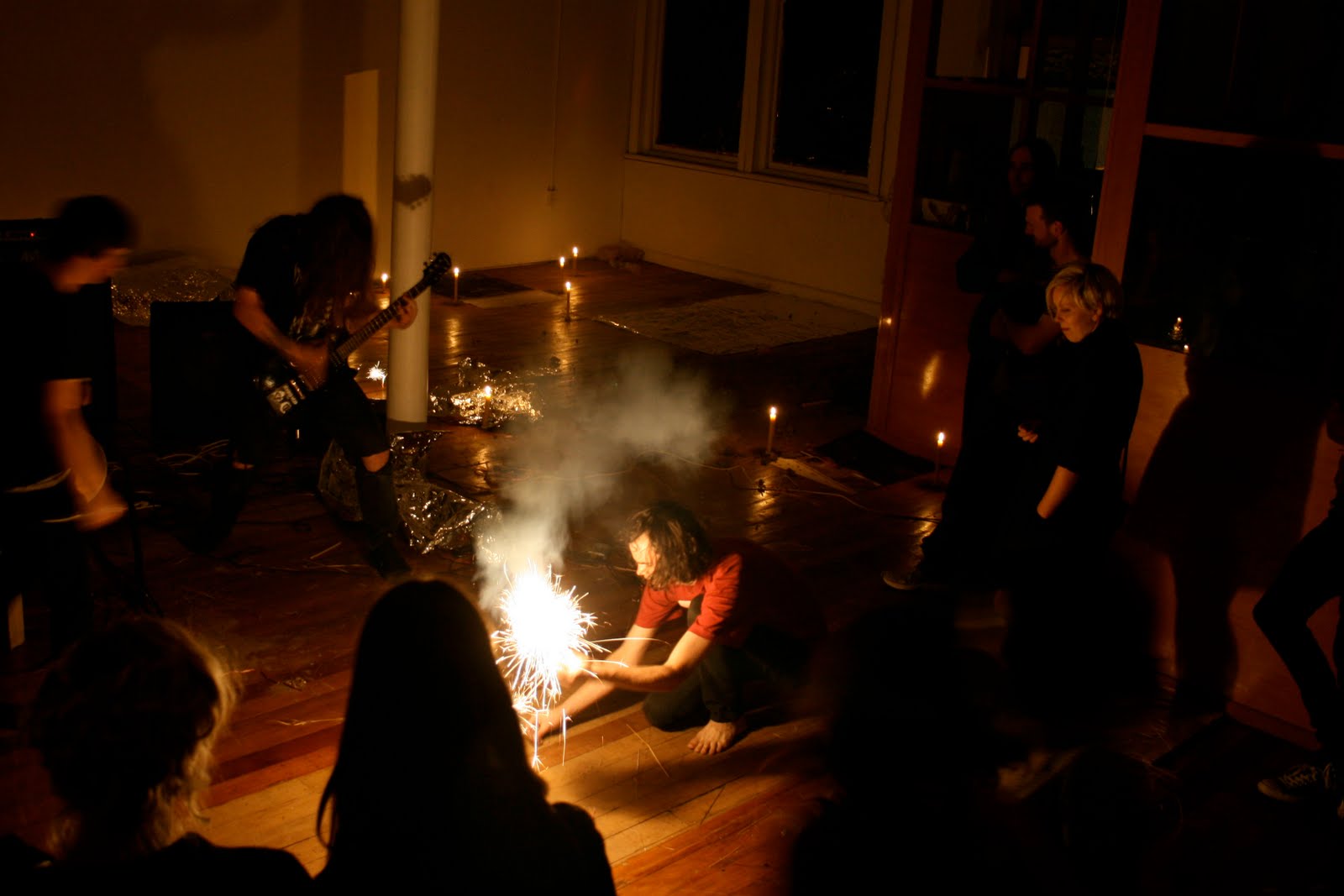
One Day Sculpture saw twenty works occur for one day each, spread over more than a year, across the country. How to assess something where only a few handfuls of people actually witnessed more than a handful of projects?
The answer is not to. Rather, how such a web of time-based activity is documented becomes crucial. Editors of this book and managing curators David Cross and Claire Doherty show they’ve given this a lot of thought. This title is a guidebook, providing some handy contemporary context and then gathering together with excellent photography disparate eyewitness accounts and curatorial perspectives of the projects. It’s the Lonely Planet of art publishing.
Whatever your assessment of One Day Sculpture’s success its impact has been significant. Artists, writers and curators will be sparking off for years to come the questions it raised, models it set up and the work, good, bad and indifferent. This is the quick reference book for that continuing enquiry, and its smart clear design makes it feel like one.
Given that most people’s experience of the work has been through documentation or discussion (signaled as an issue by the inclusion of an essay by Daniel Palmer on the photographs relationship to temporary work), how the book is led editorially is very important. This was one of the more interesting aspects of the whole enterprise - where and when the viewing point for work began and stopped – and writing around specific works here is kept principally subjective, with eyewitness accounts.
The book is a very self-aware exercise in keeping interpretation open, and for the most part that’s very welcome. That is taken to a fairly fruitless extreme however by the inclusion in the back of a transcript of an uneven conversation between various curators, better left in the public programme.
After a very readable summary from the editors of the entire programme, the book opens with what is titled a Reader: short essays on issues pertinent to temporary work. These texts provide general context from a distance rather than a response to the works, some more clearly than others (as with her address at the symposium Jane Rendell’s is full of fascinating insights but pretty impenetrable).
It’s uncomfortable that all bar one of the Reader writers (and he, American Martin Patrick, a recent addition to Massey staff) hail from outside of New Zealand. They give the work international ballast and attention (which I’m sure is a smart move academically), but it's disturbing that the project ends up feeling like it has that old hierarchy of being framed from the outside, while the writers on the actual work are in the great majority local.
Handy as it is it’s also a rather dense beginning to the book. Placed at the back these writers could have been given more room. As it is you sense they are just getting going on their topic before they have to wrap it up.
As for the overseas artists, while some visitors created works that were charged by and the whole concept of being brought to the other end of the world for the briefest of projects, others it seemed to me left behind not just light work but lightweight work. It was hard to see how brief visits were conducive to making good work. Some of my favourites were by artists local to their locations, able to understand the complexities of their context. I simply didn’t buy ODS’s championing of actions with only fleeting engagement with their sites.
Whether the different writers felt the events they write upon successful can be hard to gauge from their impressions. They often keep a passerby’s distance, and criticism becomes implicit rather than stated.
On Roman Ondak’s
Camouflaged Building, Max Delany starts by suggesting on first glance the work might seem disappointing, but then after thoroughly discussing its context doesn’t really offer enough to suggest a change in that judgement (it was disappointing). Cheryl Bernstein also seems initially unimpressed by Thomas Hirschhorn’s cardboard-dressed car, and her writing goes on to mostly avoids the subject by meditating on the difficulty of seeing art with children. Jon Bywater writes of the camouflage implicit in the title of the work by
Bik van Der Pol, but his text itself feels like an act of camouflage against actually saying how he was affected by the work. Having seen neither of those last two works I find myself trying to read between the lines to get a real impression of the work.
Generally however I found this first-hand account approach useful and refreshing. One of the book’s strengths is the diversity of writers brought together. Dylan Horrocks’ account of
Paola Pivi’s work for example is an articulate piece of storytelling - the story being his experience of the work. Horrocks allowed me to consider the complexities of what at a distance seemed like a memorable work on all sorts of levels. Given we can’t say we’ve seen the work through documentation, this sort of thorough first hand account feels like the best next viewing area.
Likewise Anna Sanderson, Ian Wedde, David Cross and Lara Strongman do well at reliving the experience of following an artwork over a one day period. Implicit here is that the test of a One Day Sculpture is to be with it, or thinking about it over an entire day. And while some writers seem reticent about their experience (and in being so critical), there are also equally strong responses to what sounded like great works – I came away from John Di Stefano’s consideration of Javier Tellez’s
Intermission kicking myself I wasn’t there, but glad for having this reflection of it in words and pictures.
One Day Sculpture’s principle weakness, and one that I felt is an undercurrent of comment through the book, is the fact that so few works paid strong attention to the time component. It felt like a better marketing device for temporary art series than it was actual conceptual framework. So many of the works I saw get a ‘yes’ answer when I ask the question as to whether the work would have been more effective staged over a longer period, to a wider audience. Nor was the word sculpture interrogated enough to warrant its use (Scape in 2008 was far better on this). What we had more was an interrogation of the notion of the event, which is written about by Mick Wilson in the Reader and the book as a whole conveys.
Conversely One Day Sculpture’s openness and focus on collaboration between artists, curators and institutions was a great strength. And ultimately it’s the openness of this publication to a diverse array of responses to the work that helps make it an essential item for the bookshelf, not to mention a really good read.
A final note. Crucial to the book’s success is Stephen Rowe’s colour photography and the plentiful space given to it. Rowe doesn’t pretend to mimic the experience of the visitor to the work, but rather step away and record the interaction with clarity and precision.


 Richard Frater: So Long The Difficulties of Being Single
Newcall
11 November – 29 November 2008
When does a collection of seemingly disparate sculptures become an installation so that an overall coherence is apparent where all the parts interconnect? Where there is a sense of only one work engaging the visitor? I’m not sure if that happens in this show, but it is certainly close, though the separate components retain a strong individuality.
Into the T-shaped Newcall space Frater has carefully positioned ten varied sculptures. These heighten a viewer’s (self) awareness of bodily dynamics between Newcall’s walls, window, door gaps, floor and ceiling - and the light (or lack of) on those surfaces. Despite his droll exhibition title about ‘being single’ – a bachelor or single artwork perhaps - the show seems really about binary combinations, the tension between pairs, and movement around, over, under and through them.
This is a meticulously deceptive and extremely subtle show that needs time to absorb because the links are not at first obvious. From two calls to Newcall, here’s some of what I spotted:
(1.) The title seems to be about getting married, but is nothing of the kind. Other appearances deceive too. Frater has a video loop which seems initially to be of walls of ice bricks slowly dissolving in a large tank of water. These on reflection probably are plastic or polystyrene sheets collapsing in a mineral solvent. Their behaviour is subtly different from dissolving ice.
(2.) There are two fabric rectangles on which Frater has printed large photographs. One is folded, the other spread out. The folded one by the window is grey and mottled like the gallery’s concrete floor. The other spread image is silvery and of rumpled sheets on a bed. It is itself creased and rumpled.
(3.) An isolated freestanding door is placed in the centre of the entrance to the stem of the gallery’s T-shape, coming from a nearby wall at the base. Its chrome doorknob sparkles in the light from two panels in the ceiling, as does a similarly sized, silver-plated, mirror egg standing on the floor.
(4.) There is a glowing fluorescent tube on the floor with one end raised by a vertical strip of plastic packaging tape going to the ceiling. The tube’s length seems to be the same length as a projecting wooden shelf on the opposite wall.
(5.) That shelf has been planed to strip off its topmost weathered surface. On it are scattered nearly thirty tags, thin plastic strips that seem to have come from the sticky sides of band-aids which they used to protect. On the adjacent wall in large letters is the name Andrei, possibly referring to the great Russian film director, Tarkovsky – famous for his use of natural elements and long pans. The letters have been shaped by cutting out and peeling off the skin of the gib surface.
As Matt Harris warns in an excellent accompanying essay that advises against interpreting Frater’s exhibition, these works need to be moved through and experienced, not thought about as semaphores or codes that require translation. To do that though means being aware of connections like those I’ve mentioned. They provide a pleasurable tension and keep the mind active. The show has not been built for robotic blockheads with legs on ‘automatic pilot’ but viewers willing to engage with, analyse, and compare the carefully placed ingredients.
Richard Frater: So Long The Difficulties of Being Single
Newcall
11 November – 29 November 2008
When does a collection of seemingly disparate sculptures become an installation so that an overall coherence is apparent where all the parts interconnect? Where there is a sense of only one work engaging the visitor? I’m not sure if that happens in this show, but it is certainly close, though the separate components retain a strong individuality.
Into the T-shaped Newcall space Frater has carefully positioned ten varied sculptures. These heighten a viewer’s (self) awareness of bodily dynamics between Newcall’s walls, window, door gaps, floor and ceiling - and the light (or lack of) on those surfaces. Despite his droll exhibition title about ‘being single’ – a bachelor or single artwork perhaps - the show seems really about binary combinations, the tension between pairs, and movement around, over, under and through them.
This is a meticulously deceptive and extremely subtle show that needs time to absorb because the links are not at first obvious. From two calls to Newcall, here’s some of what I spotted:
(1.) The title seems to be about getting married, but is nothing of the kind. Other appearances deceive too. Frater has a video loop which seems initially to be of walls of ice bricks slowly dissolving in a large tank of water. These on reflection probably are plastic or polystyrene sheets collapsing in a mineral solvent. Their behaviour is subtly different from dissolving ice.
(2.) There are two fabric rectangles on which Frater has printed large photographs. One is folded, the other spread out. The folded one by the window is grey and mottled like the gallery’s concrete floor. The other spread image is silvery and of rumpled sheets on a bed. It is itself creased and rumpled.
(3.) An isolated freestanding door is placed in the centre of the entrance to the stem of the gallery’s T-shape, coming from a nearby wall at the base. Its chrome doorknob sparkles in the light from two panels in the ceiling, as does a similarly sized, silver-plated, mirror egg standing on the floor.
(4.) There is a glowing fluorescent tube on the floor with one end raised by a vertical strip of plastic packaging tape going to the ceiling. The tube’s length seems to be the same length as a projecting wooden shelf on the opposite wall.
(5.) That shelf has been planed to strip off its topmost weathered surface. On it are scattered nearly thirty tags, thin plastic strips that seem to have come from the sticky sides of band-aids which they used to protect. On the adjacent wall in large letters is the name Andrei, possibly referring to the great Russian film director, Tarkovsky – famous for his use of natural elements and long pans. The letters have been shaped by cutting out and peeling off the skin of the gib surface.
As Matt Harris warns in an excellent accompanying essay that advises against interpreting Frater’s exhibition, these works need to be moved through and experienced, not thought about as semaphores or codes that require translation. To do that though means being aware of connections like those I’ve mentioned. They provide a pleasurable tension and keep the mind active. The show has not been built for robotic blockheads with legs on ‘automatic pilot’ but viewers willing to engage with, analyse, and compare the carefully placed ingredients.