Nau mai, haere mai, welcome to eyeCONTACT, a forum built to encourage art reviews and critical discussion about the visual culture of Aotearoa New Zealand. I'm John Hurrell its editor, a New Zealand writer, artist and curator. While Creative New Zealand and other supporters are generously paying me and other contributors to review exhibitions over the following year, all expressed opinions are entirely our own.

Friday, October 30, 2009

Contemporary Physicals


Modern Physics: Alex Monteith, Bas Jan Ader, Eddie Clemens, Hanna Schwarz, John Ward Knox, Philip Dadson, Shaun Gladwell. Curated by Stephen Cleland
Te Tuhi
10 October – 29 November 2009

The moving mass of a muscular human body is the theme of this mainly video international exhibition: firstly in how it senses its external relationship to its immediate spatial environment; secondly how it is internally aware of its own various extended components.

Such phenomenological themes might sound a bit dry, but in this show they are not at all. It is an inspired piece of curating by Stephen Cleland where the assembled artworks are deftly positioned in a convincingly cohesive sequence, and where there is an abundance of humour and aural and visual delight. This exhibition is so intriguing and so full of pleasant surprises you won’t want to leave.

In a newly furbished space opposite the Te Tuhi entrance Shaun Gladwell’s stunning video installation presents an inverted film of Og de Souza, a Brazilian skateboarder with stunted legs, sitting cross-legged on his board as he races through a carpark upside down - propelled only by his exceptionally strong arms. This imagery (with audio) is a foil to another (silent) film screened simultaneously at rightangles on another wall. In a nightclub in front of a bar, the glamorous leggy transvestite Grace O’Hara, an erotic pole dancer, gyrates alone in a tasselled bikini and high heels.

The contrasts between these two films (both with dominant horizon lines) are utterly absorbing: one with pulsing strobe-lights, other lit soft and even; the strip club with reflective steel, the carpark with matt concrete; the dancer leggy, the skateboarder legless; a ‘naked’ black ‘female’, a clothed white male; 'she' is upright, he inverted; one comparatively stationary, the other ‘pursuing’ at speed; the club referencing Francis Bacon’s theatrical cages, the boardrider alluding to Velasquez’s court dwarves.

In the rest of Te Tuhi, in the main viewing area that you access between the bookshop and the library, are works by the six other artists. Just inside the double-glass doors are three b/w seventies videos by the legendary Dutch conceptual artist Bas Jan Ader (1942 -1975), exploring the body’s limitations with gravity. They try to hilariously construct T-shapes by attempting equilibrium.

In one film he tries to balance a large slab of concrete high up in the air on one hand while standing above glowing light bulbs positioned on the floor; in another he attempts to hang vertically from a tree branch over a running stream; in the third he tries to balance on his right leg so his left leg and torso are horizontal. In all three, gravity inevitably defeats him. These actions seem on film to be Buster Keatonish – funny but tragic. Even Bas Jan Ader’s most famous image, of him weeping with tears trickling down his face, is connected to the themes of failure and gravity.

Nearby Cleland has positioned another b/w film, a recent, very elegant work by German artist Hanna Schwarz. It shows her dressed in white shirt, androgynous eighties rockstar haircut, grey jeans and boots, making quick walking motions or foot actions, or holding careful Nijinsky-like positions with her torso, head and arms in profile like a hieroglyphic. These sections are all sequenced to be accompanied by a soundtrack of tap dancing or clacking temple blocks, sometimes in sync, but mostly not. Often she takes up minotaur poses with her head pulled under and her arms extended like horns. With the soundtrack the images have a Spanish flavour.

In one scene, she like Bas Jan Ader, balances on one leg, not frontally, but like a reaching ice skater – in profile. In another she adopts a golf putting pose. Tongue in cheek humour permeates every image she presents.

With the room of installed ‘dematerialised’ sculptures by John Ward Knox we move from a trajectory of sequential filmic experiences (where we are stationary) to an awareness of our own bodily movements. We now circle within a space shared with understated static objects that modify the architecture - and so lock into our own perceptions of form, light, shadow, as demonstrated by his intervening materials that play with the sides and corners of the classic white cube.

Using the first gallery wall just inside the door, Ward Knox mocks the materiality of paint by carving into plaster on its surface to render in relief a slashing streaky mark made by a horizontally moving housepainting brush. It also has little vertical dribbles running off its bottom edge. Gentle plasticity, light and shadow create this shallow-relief, meticulously sanded drawing that forces us to closely examine the brightly-lit wall’s plane and the subtle projection of its surface.

The two corners Ward Knox treats with bent wire and delicate silver chain, one with the two joined to form a continuous arabesque, the other with the two curved materials straddling the gap between the intersecting planes separately. Shadow in this artist’s hands becomes another substance which accentuates traces from materials that in bright light almost become invisible.

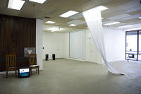
Nextdoor inside the main Te Tuhi gallery space, we find spotlit in its centre a small circular wooden stage with steps. This serves as a seat for the huge five screen Alex Monteith panorama on three walls, and is also the platform for the Eddie Clemens interactive kinetic sculpture.

In its middle is a spinning Scalextric slot-car track, complete with mini safety fence that surrounds a bowl of black oil. The track starts moving when you step on to the stairs. On its upper curved slot is a small blue and white sedan (with its own tiny orange light under its chassis) that moves independently of the backwards turning track – so that it can even accelerate forwards faster.

Clemens’ project is mesmerising through the way you automatically attempt to analyse the paradoxical relationship of the moving track with the motion of the toy car, but in the context that Cleland has constructed around it, it also becomes a brilliant metaphor for the movement of the viewer doing the circuit in the Modern Physics space. A witty, schematicised, God’s eye view.

It is also a perfect foil to the spectacular acrobatics of the Monteith display, with the five cameras set looking out over each of the five pilot’s tracer streaming tails as the RNZAF Red Checkers stunt team perform a highly choreographed series of double loops, barrel rolls and ‘spaghetti-breaks’ – all co-ordinated with synchronised sound and simultaneous action.

The synchronised DVD loops start when the five planes take off in sequence and finishes after they’ve landed and manoeuvred to park on the runway. Not only is the work’s churning visceral sensation extraordinary (though personally I found the ‘firecracker’ aural component of her motorbike videos at AUT last year more bodily penetrating) but the colourful cloudscape and changing light is rivetting.

Philip Dadson’s DVD project is also aeronautically focussed, but using balloons - not speeding aircraft. Part of a much bigger version he made last year with seventeen colourful balloons and twenty-four musicians, this small two channel version with two balloons (and six green uniformed brass band members) focuses on the aerially viewed patchwork landscape more than the much faster Monteith work, with the two cameras aimed either across or down.

The thin, mournful, drawn out notes of the musical performances from tuba, trombone and trumpet players, with little melodic variation, make Dadson’s hovering music quite haunting. Like the leisurely moving balloons the music gently drifts - sometimes stopping, then restarting. Occasionally he has dubbed undertoning over the brass, using his own voice.

Dadson’s two screens are positioned at rightangles to each other, like the screens in the Gladwell work. In fact his moving coloured aerial images fit perfectly in the sequence between the Monteith and the Gladwell works, cleverly completing the ambulatory loop. Cleland has come up with something exceptional with this very special Te Tuhi show. All the individual ingredients individually and collectively add up to a great total experience. Everything is strong and memorable. A wonderful treat that you would be an absolute nitwit to miss.

Thursday, October 29, 2009

Taipei comes to Auckland


Szu Han Chen: The room is too small to store memory
Snowwhite gallery (UNITEC)
20 October - 6 November 2009

Szu Han Chen is an artist in residence from Taiwan who has studied at St. Martins College of Art and Design in London and at Cheng Chi University in Taipei. Her interactive and relational projects often incorporate videoed documentation of the various social exchanges or interpersonal negotiations she sets up. That aspect (of two earlier works) dominates the large front room, with her current ongoing interactive project occurring in the smaller back space at Snowwhite.

Her three channel installation Make a Wish (2009) shows abandoned objects (that can serve as containers) placed in front of a fountain in Washington Square in New York and filled with water as a symbol of hope for the homeless. It is hoped passers-by will throw money in. That way the needy can help themselves from these improvised ‘wishing wells.’

In Then I said ‘Have a Nice Day' (2009) the artist approaches various individuals handling out flyers on the very crowded streets of New York. Because the activity is filmed secretly from a hidden camera that is far away it is hard to see (or hear) precisely what it is she is up to when she chats to the distributor, takes their promotional flyer, makes an origami plane out of it, and hands it back. While she sees her activity as transforming a ‘purposeful thing’ to something economically ‘useless’ and also poetical or contemplative, they being busy are likely to be puzzled or exasperated. Though her manner is sweet and charming, her actions can be taken as peculiar or ‘oddball’ at best, or at its worst, a veiled form of insult. Her actions imply she is taking something ‘useless’ and adding value. However nobody ever gets offended. Just perplexed.

The 'Room' work that is continuing now until the end of next week refers to storage problems in its title, and how to recycle old memories for new. The artist’s role here is that of facilitator. She co-ordinates the exchanging of abandoned items and their contextual narratives, the details of which she records and passes on.

Szu Han Chen here serves as a conduit for snippets of information and history. Invariably she will be compared to local artist Eve Armstrong and her Trading Table performances but my impression is that Armstrong is more proactive in suggesting solutions for fair swaps. She will broker (I think) transactions so that equivalent balancing occurs between giver and receiver. She will insist on exchanges that she thinks are equal.

Chen on the other hand seems to be quite happy for the value to be lopsided. She doesn’t directly bring contributing parties together, nor does she refuse any offer. In fact economic or social depreciation (like say potlatch) might be more her point, along with a poetic sensibility. Her attention is focussed not so much on the objects changing hands and their matching worth, but the flicking on of stories. Of course I’m saying here these two things are separable, and maybe that can be disputed. You might argue the only value that these items have is the narrative that accompanies them from usage, but that that narrative cannot be pried apart from their (re)saleable value – it just gets reabsorbed.

So how do you assess this kind of work? It has of itself no detectable visual aesthetic, but maybe the conveyed anecdotes, the sequences of past ownership (and linked events) as imagined mental pictures replace that? However the quality of such stories seems to be not the point either, nor is it the quality of Chen’s channelling of information - which appears to be striving for invisibility anyway?

In the end you look at the treasures you brought home to put on your shelf or workbench, briefly think about what useless things you discarded to get them, and forget about the artist and exhibition to get on with your life. Just like that pot of homemade chutney you got from some school fair eight months ago that is sitting around half eaten in your fridge. It’s not going mouldy for it tastes good, but where did you get it, and who served you, on that autumnal Saturday morning? You are not sure.

(The above images show the artist in her show, chatting to Abby Woolcombe, a student of the Design School. Photography by Karen Crisp.)

Tuesday, October 27, 2009

Andrew Clifford and Jennifer French on Jeena Shin

Skimpy fragments add up


To Say The Least: Ruth Buchanan, Ash Kilmartin, Sarah Rose, D. M. Satele, Holly Willson
Newcall
15 October - 31 October 2009

This five artist show at Newcall has austere tendencies towards not so much minimalism, but rather, dematerialisation. Often this consists of traces that allude to earlier states that are fuller and denser with information, fields from which a selection has been made. Prying elements free of their original context.

Sarah Rose has two works that draw this out. One is a series of thirty A4 sheets with typed nouns pinned to the main wall. The words descend from left to right in the formation they would be positioned in within their original context: various Emily Dickinson poems.

Oddly Dickinson (1830 -1886) is a poet where there has always been a lot of conjecture about her original drafts - because of the many versions she left with variant wording, spelling, line length, punctuation and of course ultimately, meaning. The fact that Rose has worked with Dickinson’s ‘final’ texts is amusing because of their slippery nature - and variable interpretations that seem to change with each new anthology editor.

Brevity of fame is the content of Rose’s other work. On an outside window is a page with ‘as long as a rainbow lasts’ typed on it. Inside, on a timer so it plays only intermittently, is a nearby video clip of Nadia Comenici, fourteen year old Romanian gymnastic star of the 1976 Olympics, performing some of her perfect scores – memory flashes (for some) of thirty-three years ago.

Holly Willson’s two aural works are related to Rose’s visual contributions. One is a crashing piano chord that comes through the office door, and the other a selection of four fast snippets taken from a vinyl record. (Though it is highly unlikely, to me the samples sound like bits of Dylan’s ‘Blonde On Blonde’.)

Willson has a third work of a wide strip of muslin extending down from the ceiling, but twisted (flipped over) halfway down, and neatly folded on the floor. The stretched material seems to be a metaphor for time, and perhaps spatial context.

Related to both Willson and Rose’s projects is the display of residue from D. M. Satele’s opening night performance: two chairs; a video of some guy sitting on a bed in his underwear yakking on the phone; and two bound transcripts of six jokes from comedienne Wanda Syke’s ‘Tongued Untied’ TV series. More than props that remain from a past event, the joke transcripts seem a poignant trace of the television comedy - its shadow.

The works of Ruth Buchanan and Ash Kilmartin seem to have quite different sensibilities. Kilmartin has a small pile of paper pages on which he has written in pencil a text that diminishes in size as the pages get closer to the floor. It declares the work to be ‘self sustaining sheets’ and its logic seems to be that as the paper pile gets lower, the text is supported less by the paper and more by the floor. The accuracy of the text alters according to the position of each page in the pile.

Buchanan’s project is a fake lecture about problems of architectural relevance to local needs, that you listen to through headphones resting on a mirrored shelf. On part of it the speaker refers to buildings on the Chatham Islands that have specially designed flexible joinery. This lets them sway under pressure from the ferocious winds, thus providing a source of relaxation for the inhabitants.

Like Kilmartin’s sculpture where you have to look at several sheets to get its point, with Buchanan you need to listen to most of the recording to get its humorous drift. Looking at too few components won’t help you much.

This is a finely nuanced exhibition, probably Newcall’s best ever group show. The five contributors work beautifully together. Well worth a visit.

Here's Stephen on the Bath St review

Monday, October 26, 2009

Here are some thoughts from Andrew Paul Wood on a Clare Noonan show in Christchurch


Clare Noonan: Field Work
SoFA,
18 October – 7 November 2009.

And do you see, I said, men passing along the wall carrying all sorts of vessels, and statues and figures of animals made of wood and stone and various materials, which appear over the wall? Some of them are talking, others silent. You have shown me a strange image, and they are strange prisoners. Like ourselves, I replied; and they see only their own shadows, or the shadows of one another, which the fire throws on the opposite wall of the cave? [Plato, Politeia VII, 515b]

Clare Noonan’s Field Work is the product of the artist’s tenure as the Olivia Spencer Bower artist-in-residence in the Christchurch Arts Centre. Noonan’s work is singularly concerned with mapping the artist’s body located in geographical, historical and cultural space in a manner bordering on the Situationalist. In the Field Work installation, this is counterpointed with the history and nature of photography, and specifically its virtual relationship with light. One is reminded that Karl Marx once compared the function of ideology to the mechanism of a camera obscura:

If in all ideology men and their relations appear upside-down as in a camera obscura, this phenomenon arises just as much from their historical life-process as the inversion of objects on the retina does from their physical life-process. [Karl Marx and Friedrich Engels, The German Ideology(1976)].

In this sense a camera is like an ideology because it produces an image of the human relationship with the world, but further themes must include the relationship between the viewed and the viewer, what is visible and what is obscured, and the ephemeral and transitory reality of occupying any space.

Field Work feels a little like a minimalist stage set representing a sort of camp site – diagrammatic, illustrative, allusive and suggestive with just a hint of a steampunk aesthetic. From tripods that look like they might be from some ancient surveying kit, hang hurricane lanterns fitted with moon-glow black-light tubes. These light sources provide numinous accents to counterpoint the minimal concrete nature of the other artefacts. Something like a photographer’s hide or maimai hangs off two tripods. A half open suitcase emits a mysterious light (like the trunk of the car at the end of Repo Man). The whole is connected by a baroque tangle of electrical cable.

On one long wall a kind of backdrop is formed by hanging three hide sheets, which in one sense suggest animal skins (if we think of a maimai as a sort of animal), but on the white wall of the gallery also conjure up art-historical memories of the iconoclasm of modern monochrome field painting: Arnulf Rainer, Allan McCollum, Imi Knoebel, Ad Reinhardt, and Kasimir Malevich…the list is endless.

On the opposite corner of the gallery hang what appear to be four monochrome prints or mechanical drawings alluding to photography text book diagrams depicting overlapping circles of light on flat surfaces. In fact these are connected to a picture in the accompanying catalogue of a drawing in one of the artist’s notebooks. The drawing is a Venn diagram that attempts to place the role of ‘Explorer’ where ‘Artist’, ‘Scientist’ and ‘Entrepreneur’ intersect.

That would appear to be the key to understanding the installation – it is a metaphorical camp site (abandoned Marie Celeste fashion) in the re-contextualising sterile white cube of the art gallery setting. Another picture in the catalogue (and really, the catalogue must be considered intrinsic to the installation, complete with a rather nice essay by Paula Booker) shows a number of those plastic name tags ubiquitous at corporate functions, announcing the presence of Joseph Banks, Walter Buller, Alfred Burton, Samuel Butler, Charles Heaphy, William Travers and others.

This connects back directly to the Claude glass in Noonan’s exhibition Pilgrim Tourist at Enjoy Art Gallery, Wellington and the compass references in Landscape Portrait at The Physics Room, Christchurch in 2007.

Dasein (literally ‘being there’ in German) is Heidegger’s term for the way beings relate themselves to the world that surrounds them, but from which they are existentially alienated. It seems the perfect definition of the Pākehā context and the mood evoked by the representation of landscape.

Heidegger divides Dasein into three modes of possible existence — factuality, existentiality and fallenness. The first of these could be used to describe the status of the first European colonists in New Zealand, the first generations of Pākehā, or even the Pākehā experience of Europe. The second refers to the state in which beings achieve knowledge of their purpose in life and the resultant authenticity – arguably the current historical phase. The third refers to the inauthentic existence of those who do not realise their purpose – the reality of many Pākehā whose lack of knowledge blinds them to the nature of their anxiety and the urban Māori who have become divorced from their status as tangata whenua.

In any discipline field work is carried out either unobtrusively in situ on location, or in a controlled laboratory environment. Which of these two options applies to Field Work? Or is it even a case of qui custodiat – “who watches the watchers?”

(Above documentary images: Tim Veling for SoFa Gallery)

Comment from ..... on Music/History/Painting

Sunday, October 25, 2009

Music/History/Painting


Michael Shepherd: SCORE (Upon the electronic works of Douglas Lilburn)
Jane Sanders Art Agent, cnr Shortland & Queen St.
September 22 – October 30, 2009

Douglas Lilburn (1915 -2001) is a hugely revered figure in New Zealand culture, one often called ‘the Father of New Zealand composition’ due to his search for aural qualities particular to this place. He is known not only for his pioneering work as a composer and musician in both classical and electronic genres, but also because of his close friendship with the artist Rita Angus.

It makes a lot of sense that the painter Michael Shepherd, known for his interest in social history, should while doing a residency at St. Cuthbert’s College create a series of four paintings examining this composer’s life and music. Shepherd was inspired by an original score Lilburn created for one of his electronic works, but drew on the individual qualities of five. These compositions, written between 1967 and 1977, are known for evocative aural properties linked to the New Zealand landscape, referencing distinctive natural elements like cicadas or running streams.

Some New Zealand paintings, particularly certain late sixties or early seventies works by Walters, McCahon, Hotere, Trusttum and Mrkusich, have salient musical qualities (they might induce hallucinatory synaesthesia if you have the chemical disposition) but Shepherd is not really pursuing that. This work is more akin to the painted ‘scores’ that Michael Smither for example has created; a sort of horizontal scroll of directions with annotated notes.

Separating the two approaches is not as easy as you might think, especially with a prolific painter like Smither, but in Shepherd’s case the work is graphic and uses muted, very soft colour. It emphasises the picture plane because after all it is called ‘SCORE’, and so lacks spatial depth. It is linear. It doesn’t evoke landscape as Lilburn did, nor does it evoke Lilburn’s sonic qualities. Instead it looks at the signifiers, not the signified; the notation, not the experience of hearing the notes.

Rather than trying to make music Shepherd is attempting to paint a sort of conceptual portrait – often through quoted texts, like whole poems from people like Baxter (Lilburn loved poetry), or snippets of snide family comments - taken from the Lilburn biography by Philip Norman. Sometimes drawn insects serve as codes for sound properties, like elements listed within the key of a map.

The interesting thing is that this work is just as much about Shepherd as it is Lilburn. Shepherd is a tenaciously obsessive researcher, and in his history paintings his research is often original, collected by talking to people or examining archived papers. So these paintings about a composer really consist of aligned strata of marks and written texts. They are constructed documents of collected annotations that cumulatively create a four part, two-way psychological profile.

While for my own tastes, I prefer Shepherd’s landscape painting of land and botanical forms to his other projects (I like his outdoors light), there is a sense that all his painting is a painting of documents representing something else. There is a constant flavour of intervening mediation, a love of experiential deferral, a succession of conceptual screens, an intellectual nervousness that self consciously refers to its own distancing as an ‘art’ process.

This separation seems part of Shepherd’s decision to focus on a ‘score’ as opposed to creating a visually musical experience. However aspects of the latter do discretely slip in, particularly in the underpainting where rhythmically positioned, hazy dark blocks peek through pale layers to become partially visible as an extended ‘pulse’ along the horizontal lengths.

Shepherd’s activities of writing researcher and painter craftsperson however result in an uneasy blend. His passionate enthusiasm for Lilburn’s music still ends up as detached – not of course through his considerable energy, but through the disembodied experience he ends up with. His attempt to blend musical diagrams and biographical quotations to create a new sort of painting doesn’t work.

I’m not arguing for any rigorous notion of purity in painting practice here, only saying that these particular kinds of hybrid are so self consciously documents - with none of the pleasures of a good read or a good listen – that they lack painterly or graphic excitement. Despite being wide and quite bodily in scale, due to their being schematic notation in a horizontal format, these paintings remain a head trip only.

Saturday, October 24, 2009

Both Mark Amery and David Cross will be covering Wellington shows for eyeCONTACT readers. Here is a post from Mark.


Ngaahina Hohaia
City Gallery Wellington
27 September 2009 – 10 January 2010


Far be it for me to begrudge Wellington some dotty fun with the excellent Yayoi Kusama exhibition, but it can’t go unremarked that there’s some tension around the City Gallery reopening programme.

When the gallery last reopened in 1993 (after the move into the refitted old city library) the waka Te Raukura - a representation of the mana and history of local mana whenua - was housed for three months in the foyer. This time round, to see work grounded in this place until February you’re going to have to pay an admission fee and find your way past the dots and mirror mazes to two new cell-like galleries up at the top, far end of the building.

What the Michael Hirschfeld Gallery for Wellington artists has gained in getting a purpose-built space within the mainframe, it’s lost in accessibility - the old ex-bar space next to ever-humming Nikau Café felt like part of the membrane that separated gallery from city; a vent that circulated fresh air into the institution.

Meanwhile next door the new Roderick and Gillian Deane Gallery dedicated to Maori and Pacific Island artists (do patrons insist on these naming rights? Surely soon it will no longer be seen as tasteful?), together with the appointment of a Maori curator, Reuben Friend, provides some welcome representation. Hopefully however in both cases it will lead to increased presence in City Gallery curated exhibitions in the main spaces, rather than these galleries resembling privately funded chapels for local denominations within the grand international church.

This tension is all the more apparent for how strong the Deane Gallery opening installation is. Ngaahina Hohaia’s two works may not be brand new – Roimata Toroa (Tears of the Albatross), 2006 is from the Govett Brewster collection and was first shown to coincide with the first Parihaka Peace Festival, and Paopao ki tua o rangi (Reverberation beyond the heavens) has been touring in the lower North Island this year - but they could have held their own up front at the gallery. Together they are magnificent.

Amplifying the enduring vision of peace of the 19th century Parihaka settlement led by Te Whiti o Rongomai and Tohu Kakahi, and recharging the lightning rod that was the moment in 1895 when government troops entering the settlement were met by passive resistance, this installation of hundreds of hand embroidered poi is both a powerful and politically savvy opening selection.

Local iwi Te Ati Awa are also based in Taranaki, and the installation recalls arguably City Gallery’s finest moment, the Parihaka exhibition co-curated with Parihaka Pa and Hohaia’s father Te Miringa. Ngaahina worked as a guide on that show and this installation would have held its own amongst the other commissions for the exhibition. It is in a sense a return home; Parihaka’s own contemporary response to these other artists’ works.

Hohaia’s achievement is that the work seamlessly brings together the high public storytelling art of articulating a shared visual iconography, as you might find in wharenui or church, and the deeply personal. As a textile artist she has found her own way to recite her whakapapa and state her foundation, whilst representing visually the traditional Parihaka waiata and poi her whanau have played a strong role in reviving.

Embroidered onto the head of hundreds of white poi in lines on the wall are insignia that provide strong storytelling shorthand for not only the events of 1895, but the richness of this period’s cultural cross-fertilisation and its many assertions of political independence. The hau hau handprint, a girl skipping, handcuffs, a teapot, the bugle, the ruru, the Ratana crescent and star, the Christian cross and the three albatross feathers (that the work’s title refers to), are just a few.

This period of history continues to provide rich inspiration for artists. The motifs here celebrate the raft of symbolism to be found on Maori flags and in the figurative painting of the painted marae as a distinct language. Hohaia writes of Parihaka 19th century oratory as rich too with such crosscultural symbolism, with the poi traditionally part of the performance of chants, with a complex meld of terms, phrases and names. The lines of poi become like lines of verse to be read as you wish in patterns across the walls, like tukutuku. Running along one line, a word per poi, are inspirational words from Tohu himself from 1895. The title ‘tears of the albatross’ also reminded me of Harry Dansey’s description of a poi dance in his play Te Raukura: “It is a single long poi – slow in time with the sweeping movements of the albatross skimming the waves.”

The installation is a contemporary take on the Parihaka tradition of poi-manu, which Hohaia explains as “the ceremonial application of poi that maintains the timing of reciting whakapapa (genealogy) and karakia (ritual incantation), with the movement of the poi carrying the story line.” The works find a way to translate both the content and the time-based performative aspects of this artform.

The newer work, Reverberation consists of poi flying towards a central circle like tadpoles, evoking its circular performance in different lengths of flight. Woven patterns are activated across the poi by a complex light show. It’s like a glorious baroque starburst church altarpiece radiating shafts of light, or a large drum (an important instrument with Parihaka waiata) surrounded by tomtoms. Descendants flooding back to this core magnetic source of knowledge and inspiration, to continue to bang the reverberant drum. The circle provides a screen for the projection of a slide show of images of the pa and ancestors with the accompaniment of a soundtrack (the sound of children, approaching troops, the burning of buildings, the whir of the poi). It’s conceptually grounded enough to just avoid the hamminess such sound and light shows have been guilty of at Te Papa.

If I’m reminded of a church, the whole installation also alludes to the readable architecture of the wharenui - reminiscent of curator Reuben Friend’s structuring of the excellent Plastic Maori at the Dowse earlier this year – with the slide show providing the photographs of ancestors on the back wall of the house.

As a textile artist Hohaia is interested in the meanings inherent in her material and the forms she employs. She brings together craft traditions from both Pakeka and Maori in a very sophisticated way. The poi are made out of that most loaded of New Zealand textiles, the woolen blanket: used for land barter, created off the back of the land (sheep), and providing shelter and warmth – the land itself is considered a blanket.

The blankets used on the heads of the poi in Roimata are, like the albatross feathers, white - but it’s woven in beautifully with other colours in their tails to animate them. These tails are woven, evoking weaving traditions but also children’s pigtails, and are finished off with tassels, resembling the frills on Victorian furnishings. With gold and silver thread used for the embroidery, as objects they resemble royal bellpulls attached to pin cushions as much as they do poi.

What makes Hohaia’s installation strong ultimately however is that it remains ripe for interpretation no matter your knowledge base. For me the rows and rows of white poi were powerfully representative of the force of Parihaka’s passive resistance - a fence or palisade of poi, like the rows of children that met the invading troops.

(Above, Roimata Toroa (detail) (2006): images courtesy of the artist and City Gallery [top], and the artist and Govett-Brewster Art Gallery [two below, photography by Bryan James].)

Friday, October 23, 2009

Bloodless


Richard Orjis
Starkwhite
12 October - 7 November 2009

Richard Orjis is well known for his luscious coloured photographs that with their botanical props and oil-stained faces, are half portraits, half still lives. This show has the orchids as images, but it is in essence an installation, and the photographs are black and white.

The exhibition shows Orjis moving away from the overt theatricality and chromatic and tactile sensuality of his earlier photography to attempt something new. It is comparatively austere in its lack of colour and more about process as an image, rather than process as content or an ongoing sequence of events. It is a sort of contemplative tableau, an arrangement of symbolic props to be pondered over.

Central to the display is a circular podium on which is presented a fake gym with a weight-lifting bench, a stand for bodybuilding gear, and assorted barbells on the floor. These are all made of wood, painted white and on the night of the opening they served as supports for burning candles. Molten white wax has therefore poured down their sides and set hard.

On the nearby Starkwhite walls are three black and white photographs. One is of dispersing wisps of smoke, and the two others are of orchids – as young, unflowered, leafy bulbs in rows in a nursery, and later as fully developed blooms. On another wall is a large disc painted gold that is slightly smaller than the circular stand for the mock gym.

So what is Orjis up to with this array of symbols that he clearly wants the visitor to decode. In this puzzle, how do the various components interconnect?

First of all the photographed smoke could be candle derived, as an evaporating or disappearing gaseous substance, and the two discs some sort of alchemical process, with the smaller one ending up as condensed gold – residue from some sort of distillation perhaps?

The presence of the candle wax implies stasis and inertia over a fixed period of time. So with the gym symbolism, the implied ‘no pain no gain’ ethos is thwarted. The gold is not attainable. Unlike the orchid bulbs that eventually over time reach a state of bloom, the process necessary to reach that goal has not begun. The sequential chain of causal events has not been kick started.

Orjis here seems to be thinking about human agency and drive. The fact that the candle flame could incinerate the gym implies perhaps that ambition is useless and that maybe passivity (even fatalism) is a good thing. There is a strange conceptual oscillation going on in this work where a certain path is embraced, rejected, and then advocated again, then re-rejected.

While this wavering idea is intriguing, this show is missing something visually. It doesn’t have that necessary finish that Orjis normally has to resolve the whole project in a compelling way. This could be because there is a tackiness about the wooden gym that extends to the golden disc. It might be deliberate, but even his black and white photographs (especially the orchids) lack memorable impact.

Here I’m guessing, but Orjis seems to be resisting his natural inclinations for full throttle sensuality – as if by wanting his work to be ‘conceptual’ he is frightened of being too visually seductive. Yet many conceptualists, from Kosuth to Apple, don’t hesitate to use visual seduction to draw their audiences in towards their ideas.

It’s an odd show, disappointingly anaemic but admittedly adventurous with the tropes which were always in his colour photography anyway. It’s clever but dry. It doesn’t thrill.

Wednesday, October 21, 2009

Grey water


Simon Morris: Folding Water
Two Rooms
16 October -14 November 2009

A dozen stretcher paintings and one wall drawing are currently being presented by Simon Morris in the large downstairs Two Rooms space. As most of us now expect from Morris, the focus in these works is the delicate nuances of brushed on diluted pigment, the textured textiles it is applied to, discreet tonally controlled underpainting over those textiles, and complicated (or simple) linear configurations that often state the time of physical execution within their titles.

The big, gridded up drawing takes up the central end wall. Its thin looping, double-jointed grey line snakes its way (up and down in stacked-up but joined round-cornered rectangles) from the left side to the right - and back again in a reversed alignment. The thin black acrylic wash becomes grey on the white wall and could almost be mottled India Ink but has no sheen. This transparency helps you grasp its pre-planned trajectory quicker through its doubling over earlier sections and through making chosen options unambiguous. Its sense of directional inevitability is more pronounced here than in, say, his recent wall painting at the Adam.

Morris’s mixture of liquid ‘grey’ paint highlights every flick of his brush edge at the corners (their curved lines seem to have been completed after the vertical and horizontal components), every little trail of bubbles or splatter, each minute drop in registered edge through horizontal templates. The line takes on a bodily vulnerability with its exposed building processes acquiring an unexpected metaphorical (let’s say ‘psychological’) dimension.

That ‘expressive’ (you could if pushed, almost say ‘expressionist’) quality is as if his bodily – er 'manual' – processes are linked to the contingencies of his emotional core. Not sweepingly of the arm of course but through wrist movement, within the narrow parallel contours of the moving grey ribbon.

Morris’s square stretcher paintings are less transparent and so less varied in his range of marks and tones found within the line. The yellow and orange trajectories that form very simple mandala-like configurations tend to have a gentle pulse. They are sufficiently opaque to make this throbbing a subtle sensation that can easily be missed. With the other black-lined works the opacity is sooty and matt, and with the thickness of line, solidly robust.

Some unusual inclusions for Morris in this show are a suite of Daily Paintings with thick vertical bands, where he applies paint every day but leaves untouched a strip that he painted the day before. These works are the antithesis of the wall work and so immaculate in their tonal control they look bland, as if seventies décor. Because the band shapes are repeated with no directional variation, there is a rippling sensation horizontally across the deepening tones or intensifying saturation levels, much like curtain fabric.

Personally I like the complicated ‘time’ paintings much more, especially those that traverse the picture plane only to double-back to the edge of origin - for they are brilliantly designed. Morris’s inventiveness here lies in the dropping down (or raising up) of flipped-over returning modules to form a repeatable, intertwined relationship between the two overlapping linear directions. This shrewdly calculated aspect, worked out beforehand on computer - more than the clever incorporation of time of paint application into the title - is what makes these remarkable grids mysterious and memorable.