This blog is pleased to announce it is now EyeContact the website, at www.eyecontactsite.com.
If you have the blog site bookmarked or linked, please change the address.
The new site is designed to provide the reader with easier access to both current and past reviews, as well as offering a guide to visual arts venues, institutions and service providers throughout New Zealand and Australia. This intersects with our articles to provide useful and relevant local information.
The new site also provides the usual search functions to quickly locate review content and writers in a more accessible and engaging fashion, as well as offering the opportunity for advertisers and sponsors to support its writers. Please explore.
Monday, May 17, 2010
Wednesday, May 12, 2010
Judy Millar currently has a show at Hamish Morrison's in Berlin. Anthony Byrt tells us all about it.


Every year, Berlin’s galleries team up to coordinate Gallery Weekend: three days of openings that attract curators, critics and collectors from all over Europe. This year, people flew in for what promised to be a pretty exciting few days. There was a buzz about the fact that some of the biggest names in the art world were having shows in the city: people queued almost round the clock to get into the new Olafur Eliasson show; and out on Heidestrasse, crowds gathered outside Damien Hirst’s opening, trying to get a peek at some of the works he didn’t sell at his Sotheby’s auction in September 2008. Other big names, though not quite as stratospheric, were also opening around town: Gursky, Wallinger, Bonvicini and Peyton among them.
In the middle of all this hype (and right next to Hirst’s exhibition), Judy Millar opened at Hamish Morrison Galerie. Millar’s show, A Better Life, is her first major installation since representing New Zealand at Venice last year. As with Venice, she hasn’t backed away from either the high-profile context or the size of the space she’s been given: it’s an all-or-nothing project, for an all-or-nothing weekend.
Extending the concerns of her Venice show, giant strips of billboard material printed with her blown-up marks collapse over each other and spill through the gallery. There’s more colour than at Venice. Complex negative curves make the piece more dynamic too, and there’s a sharper interplay between form and content. In the past, I’ve written that at ten times their actual size, her marks become graphic rather than expressive. But here she’s managed to make them architectural too, designing them to follow the curves of the structures that support them. She’s also resisted the temptation to put too many paintings on the walls, so there’s nothing to distract viewers from the main event; as one artist said to me at the opening, the work is like a single breath through the gallery.
I’ve worked with Millar many times before: so people can take or leave the fact that I think it’s a great exhibition. The more important issue is what it represents for her career. It’s no secret that the New Zealand art world has had an uneasy relationship both with her international rise and with her work for a while now. I think this is caused by three factors. First, her work demands time, and a lot of people either don’t want to, or don’t think they need to, give it the extended attention it asks for. Second, there’s a fixation with the idea that her work is primarily about abstraction, which it isn’t, and it’s therefore written off as decorative and out-of-date. Third, and perhaps most importantly, it looks out from New Zealand rather than in, participating in a global conversation about the relationship that painting has with the real world it both seeks to represent and be a part of. While there aren’t many artists in New Zealand exploring similar ideas, there are plenty of very good ones around the world who are: Katharina Grosse, Sterling Ruby, Arturo Herrera, Thomas Scheibitz and Richard Wright, to name a few. I’m not suggesting that these artists have exactly the same motivations as Millar, but there are parallels.
The fact that Millar is now participating in this conversation points to her own determination to be part of it. But it also says something about the platform that Venice has given her. Like her predecessors et al, Michael Stevenson and Peter Robinson, Venice has brought her work to the attention of international curators, collectors and writers. That’s why this exhibition with Hamish Morrison is so important: it’s her first chance to confirm that Venice wasn’t a one-off, and that she really does belong on a big stage.
There’s also a lot riding on the show for the gallery. Expatriate New Zealander Morrison was one of the first gallerists to move to Heidestrasse, which is now one of Berlin’s most important gallery strips. Over the past few years, he’s built up a diverse stable of artists including: Iceland’s Gabriela Fridriksdottir (also a Venice veteran); The Netherlands’ Ronald de Bloeme; Dresden-based painter Paul Pretzer; Britain’s Andrew Cranston; Australia’s Mikala Dwyer; and Millar. Morrison has taken a leap of faith by giving Millar the Gallery Weekend gig – one of the two most important slots in Berlin’s art calendar (the other is the start of the gallery season in September, which he’s given to Dwyer). But if reaction at the opening is anything to go by, the gamble is paying off.
Morrison, and Millar’s other dealers Mark Müller (Zurich) and Gow Langsford (Auckland), will all have been perfectly aware that once Venice was over it was up to them to push the artist’s career forward. This raises a challenging question for CNZ though, about who benefits most from their massive investment in the bi-annual event. Obviously the artists do well out of it. Their dealers do too: Venice, for any artist from any country, still serves as a quality-mark for collectors. However, there might still be questions about the value it creates for New Zealand; the old ‘home or away’ debate that causes CNZ – and New Zealand artists based overseas – endless amounts of grief. The anachronistic ‘national’ structure of Venice doesn’t help. But the harsh truth is, this national angle doesn’t really matter much any more. In a global art world, there’s nothing inherently interesting about an artist being from New Zealand: it only becomes interesting when that artist harnesses their point of cultural difference to make work that contributes in a worthwhile way to international conversations. This is exactly what Millar has done, and what et al, Stevenson and Robinson did before her.
Millar’s show with Hamish Morrison then, is exactly the sort of thing that CNZ should be pointing to as a positive outcome from their investment in Venice. A Better Life, and the results that will likely come from it – museum shows, big collections, residencies – illustrate that there is life after Venice for New Zealand artists, even if that life doesn’t play itself out at home.
Images courtesy of the artist and Hamish Morrison Gallery
Tuesday, May 11, 2010
Andrew Paul Wood visits Eve Armstrong's show at The Physics Room


The Physics Room
21 April - 23 May 2010
Eve Armstrong’s installation After coherently and holistically fills an entire gallery space, but consists of sub installations which makes for a visually interesting and engaging environment without diluting the web of associations and connections (song lines, ley lines, lines of sight) of meaning or becoming inarticulate. On a basic level it can be read as a Romantic landscape constructed from the found detritus of modern consumer society, seemingly after the apocalypse and in carefully selected shades of pastel pink, grey and black. As with movies like Planet of the Apes and Logan’s Run, it is difficult to guess how future humans might interpret and seek to enshrine the relics of the present, even though After is clearly here and now.
The colours are essential in providing a harmonising and homogenising matrix for all of these objets trouvé. Using colour as the means for the unification of the whole is a clever strategy, remaining true to the minimalist aesthetics of modern consumer goods and avoiding the sensation for the viewer that they are surrounded by a less consciously selected, random or pastiche-seeming clutter - lacking refined meaning and significance. The muted nature of the palette enhances an overall minimalist sensibility that does not distract from the important physical relationships between zones and sub-installations within the gestalt whole. The focus is not on nostalgia, the beautiful, kitsch nor sentimentality, neither does it seek to revise art history. Rather After seeks to redress a new place to stand for artist and audience that metronomes between yearning and anxiety. Armstrong is obviously as aware of the debates within contemporary art as she is of art historical predecessors.
The Romantic spirit which reached its full flowering where the eighteenth century becomes the nineteenth is, I think, key to teasing the intellectual threads of meaning out of the complex fabric of After. Romanticism in art, has in recent years come back in force – one might consider the 2005 survey exhibition Munschwelten: Neue Romantik in der Kunst der Gegenwart (Ideal Worlds: New Romanticism in Contemporary Art) at the Schirn Kunsthalle, Frankfurt am Main. The ‘landscape’ effect is strongly suggested by Outlet; a towering ‘alp’ of concrete blocks studded with electric lamp stands in which candles have been inserted (consider the opposition of technological levels) overlooking Display; a small ‘lake’ constructed on the floor from mirror off-cuts. The classic Romantic landscape is represented at scale and in metaphor, a visually stimulating accumulation of altitudes and voids. Silvered glass and concrete seem as natural as this landscape will get, and yet that also seems to be enough.
Casper David Friedrich-like lone figures in a landscape is intimated in two seats; Vying to return – a bathroom stool upholstered ad hoc with a fluffy pink bath towel seen better days, and de rigueur – an insubstantial tube aluminum chair (picture a cheap collapsible ironing board folded into a chair, ugly and tacky as sin) atop a plinth covered in carpet off-cuts. A third ‘figure in the landscape’ seems to be represented by Bystander – a metal standard lamp stand sans lamp – a skeletal pole rising out of its base, trying to be casual and insouciant in its relationship with the other components. These suggestions of isolated observers, staffage really, are in of themselves quintessentially Romantic with a capital ‘R’.
Unlike the various variations on Classicism, Romanticism does not propagate any absolute set of ideals, but rather sought to create individualised alternate counterworlds through which to escape the violently accelerated tenor of contemporary life. Whereas the Romantics of the nineteenth century tried to find escape in an idealised pastoral fantasy of the past, Armstrong has eliminated the present altogether. The modern world is represented through discarded, obsolete objects aesthetically associated with the 1970s and 1980s (thus aligning the installation with Armstrong’s X-generation youth, the important aesthetic developmental period) as they might be found in the ruins of Western civilisation after some terrible global man-made natural disaster.
At one end of the gallery is Future you – a minimalist shower door mounted monolithically and architecturally atop a sheet of linoleum, the marble pattern of which suggests a sculptural plinth. Leaning against a wall, Passing consists of a glacial wall of glass off-cuts, some of which are slathered with a gestural plain of white acrylic paint. Posted to these are laser prints on newsprint depicting collages of consumer appliance and white goods superimposed on landscapes associated with the Sublime (volcanoes, mountains, geysers) and the Picturesque (forest). These prints (including to the one stuck to the shower door of Future you) represent primers to understanding this alluded to world of capitalist technocrat consumerism, with a historical vision of nature as metaphor for the human world.
The installation grows crystal-like from a ground of culture, dispersed around horizontal and vertical surfaces like something organic, coaxing high drama and a sense of becoming out of the mundane and otherwise static surfaces of the gallery space staged independent of space or time. These are very much interlocking tableaux functioning like an ambient organic machine to evoke deep and unexpected emotional states in the viewer – another trait of Romanticism. There seems to be an innate desire on the part of After to undergo transformation and dissolve boundaries, confounding our sensibilities of mind and scale. Scale is important here, because only when taken as a whole does the Lilliputian nature of this indoor landscape become apparent.
This really is a delicious assemblage that has real depth, meaning and interest, and a refreshing delight when all too many installations of found objects seem merely to be going through the motions.
Images courtesy Mark Gore and The Physics Room.
Reflective fluorescent Culbert


Sue Crockford
27 April – 22 May 2010
For this new Bill Culbert show at Crockford’s we have his characteristic use of the illuminative and reflective properties of light, demonstrated through a suite of works using fluorescent tubes positioned along the edges of large squares of shiny glass or placed across their centres. These are displayed on the walls of the front gallery, while an assortment of white tubes threaded through groups of plastic bottles are presented on shelves in the small back room.
The glass sheets and aligned glowing fluorescent tubes make a wonderfully nuanced presentation but its effect depends largely on the time of day you visit. When I called it was about 4.45 on a cool clear autumn afternoon when the sky (seen through the ‘waterfront’ windows) was a dark blue, giving the right-angled and diagonal lines and their multiple reflections (from the floor too) added impact – by virtue of contrast. Having the sun low in the sky was an advantage.The work looked more striking than the above photographs indicate.
As you moved around the space the precisely angled lines caught in the shiny squares were mirrored in the floor’s reflective parquet surfaces, to mix with the dark azure window rectangles. The way Culbert had positioned the tube brackets on the glass edges or flat plane of each glass sheet was a crucial element: sometimes on their backs in an inverted, diagonal T-formation in the square’s middle so that the light faced the viewer frontally bordered by two fuzzy shadows; sometimes on their sides on the lefthand and bottom edges so that a softly illuminated wall side was contrasted with an opposite parallel shadowy edge.
These seven Light States collectively force the strolling visitor to think about their movement, getting them to notice the shifting relationships between the different reflected works coming and going between the vertical glass edges before them. For a Culbert installation, this organisation of different carefully placed elements within a series, is unusually participatory and immersive – quite different with its self awareness from say any passively observing of glowing objects on a wall, like that found in the other gallery.
Those particular translucent screwtop container works (for which Culbert is now quite famous) make you think about the internal properties of each horizontally repeated hollow form, the nuances of colour, the different densities of the plastic shell and how they were originally made. Here is light partially passing through substance, not completely so as with glass and not lying on top of it as with an opaque wall. You experience these levels of transparency along with the shadows that they might cast and the white light that goes from the frosted glass of the projecting tubes directly to your eye.
The immersive front gallery experience, with the reflective glass and fluorescent tubes on the walls interacting with the shiny floor, shows Culbert at his very best. Worth a late afternoon trip down town to investigate for yourself.
Sunday, May 9, 2010
Andrea Bell tells us about the recent Richard Orjis / LA Lakers / Death Throes performances in Christchurch


Richard Orjis: Silver Park (with LA Lakers and Death Throes)
HSP
Christchurch
16 April – 8 May
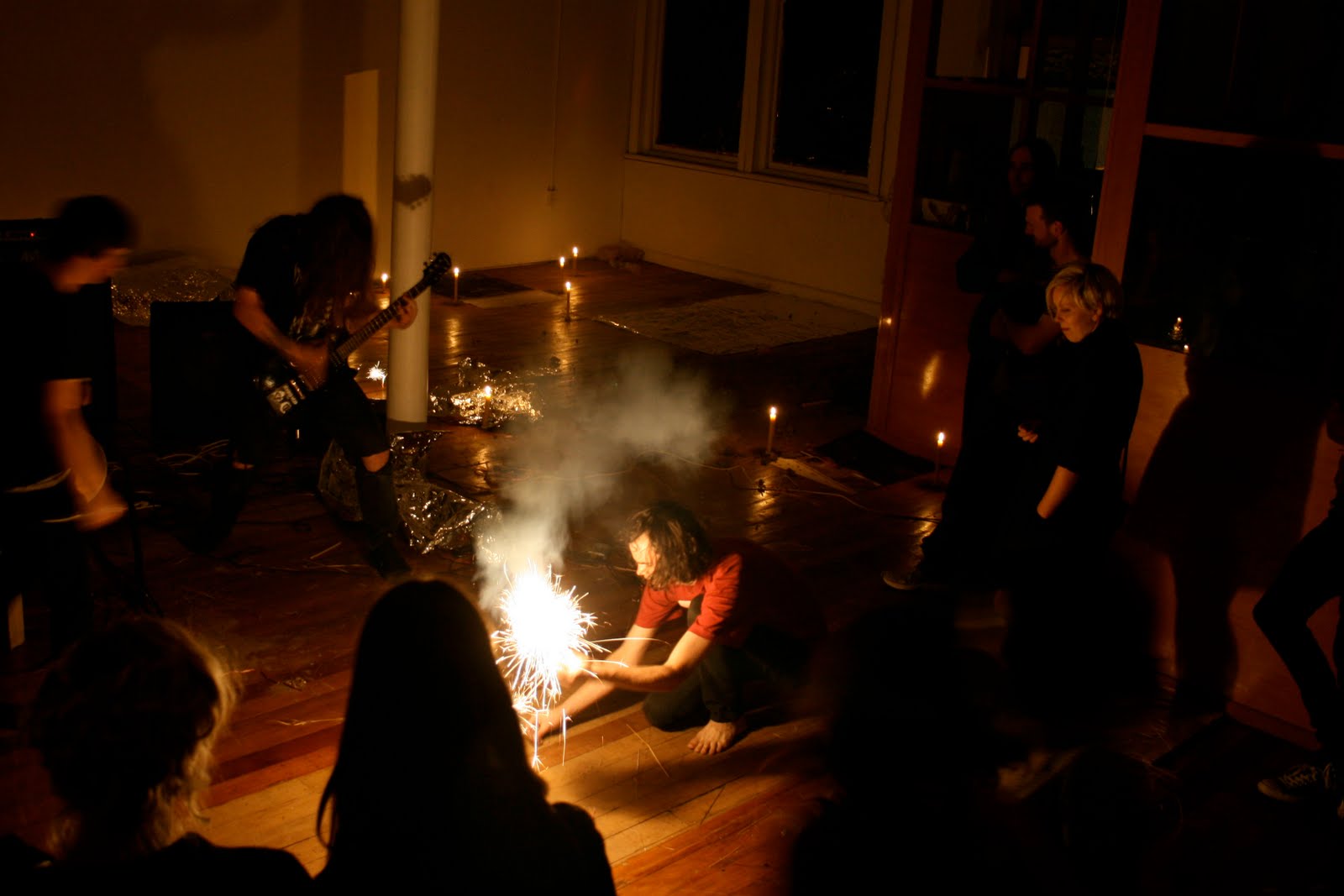
Dirt, heavy metal and pyrotechnics: what more could you want from an exhibition?
After a long wait on the stairwell outside the gallery we were finally let in. The lights were out, and any natural light was banished with the windows sealed in shiny black plastic. The gallery’s candle lit floor was littered with straw, crumpled tinfoil, the occasional photograph, amongst other detritus. At the end of the room, someone (something?) was throwing clods of dirt through an open window into the gallery. To the right of the window sat a robed shaman-like figure. A tinsel wig covered his face, disguising his identity. A small circular stage sat in the centre of the room, set up with a drum kit, microphone and amps.
The first performance was by LA Lakers (the robed figure). Crouching near the stage, his low-tech cassette tape and a-lyrical vocal performance echoed the pagan sentiment of the setting. Bells were rung and Walkmans were methodically flung across the floor. Following the performance, LA Lakers shuffled blindly around the gallery, lighting sparklers and offering them out to members of the audience, marking the close of the initiation. After a short interlude Death Throes took the stage. At this point, some of the audience there for the art left, replaced by an influx of teenage metal fans. This was my first metal gig. Although I couldn’t make out any of the lyrics, the throaty vocals and sustained power and aggression was hypnotic.
Coupled with the music, the Silver Park installation suggested the same dark anthropological sense of ritual and contemporary gothic that Orjis’ is known for. Having only ever seen Orjis’ Empire of Dirt photographs of young men, smeared in mud, and adorned with phallic flora garlands, Silver Park was not quite what I’d expected. Described on the gallery’s website as a “crepuscular ceremony” rather than an exhibition, Orjis’ installation set the scene for a performance-based manifestation of his interest in mysticism, and transcendence.
The performance aspect of Silver Park showed certain continuities with Orjis’ 2008 Physics Room show Welcome to the Jungle (For this work Orjis invited Christchurch locals to cover their bare skin in soot and be photographed in the gallery. On opening night bodies writhed in the black coal while the portraits of coal-faced individuals were projected on the wall. Meanwhile a black station wagon parked below the gallery, brimming with orchids in lush fushias, purples and marigolds alerted those at street level to the activity above.)
Formally, the circular stage in Silver Park echoed the circular mound of coal central to Orjis’ earlier show. Circles are ubiquitous in pagan rituals, symbolizing the changing seasons, wheel-chart of astronomy and the cyclic nature of life itself. Orjis’ act of casting a circle creates a place suggestive of earth worshipping and ritual in the gallery.
The relationship between the performative and installation based elements inherent to Orjis’ work is one of evolution. Whereas in Welcome to the Jungle, the relationship between the material and performative aspects of the exhibition was cohesive and unified, here Orjis’ stage, dirt, foil, candles and floor-based photos were less polished, and more open and anarchistic. This is perhaps suggestive of a desire to move away from the formal and thematic aspects that he has become known for.
Saturday, May 8, 2010
Mark Amery has been reading One Day Sculpture - the book

Ed. David Cross and Claire Doherty
Book Design. A Practice For Everyday Life
276 pp, coloured illustrations
Kerber Verlag 2009
One Day Sculpture saw twenty works occur for one day each, spread over more than a year, across the country. How to assess something where only a few handfuls of people actually witnessed more than a handful of projects?
The answer is not to. Rather, how such a web of time-based activity is documented becomes crucial. Editors of this book and managing curators David Cross and Claire Doherty show they’ve given this a lot of thought. This title is a guidebook, providing some handy contemporary context and then gathering together with excellent photography disparate eyewitness accounts and curatorial perspectives of the projects. It’s the Lonely Planet of art publishing.
Whatever your assessment of One Day Sculpture’s success its impact has been significant. Artists, writers and curators will be sparking off for years to come the questions it raised, models it set up and the work, good, bad and indifferent. This is the quick reference book for that continuing enquiry, and its smart clear design makes it feel like one.
Given that most people’s experience of the work has been through documentation or discussion (signaled as an issue by the inclusion of an essay by Daniel Palmer on the photographs relationship to temporary work), how the book is led editorially is very important. This was one of the more interesting aspects of the whole enterprise - where and when the viewing point for work began and stopped – and writing around specific works here is kept principally subjective, with eyewitness accounts.
The book is a very self-aware exercise in keeping interpretation open, and for the most part that’s very welcome. That is taken to a fairly fruitless extreme however by the inclusion in the back of a transcript of an uneven conversation between various curators, better left in the public programme.
After a very readable summary from the editors of the entire programme, the book opens with what is titled a Reader: short essays on issues pertinent to temporary work. These texts provide general context from a distance rather than a response to the works, some more clearly than others (as with her address at the symposium Jane Rendell’s is full of fascinating insights but pretty impenetrable).
It’s uncomfortable that all bar one of the Reader writers (and he, American Martin Patrick, a recent addition to Massey staff) hail from outside of New Zealand. They give the work international ballast and attention (which I’m sure is a smart move academically), but it's disturbing that the project ends up feeling like it has that old hierarchy of being framed from the outside, while the writers on the actual work are in the great majority local.
Handy as it is it’s also a rather dense beginning to the book. Placed at the back these writers could have been given more room. As it is you sense they are just getting going on their topic before they have to wrap it up.
As for the overseas artists, while some visitors created works that were charged by and the whole concept of being brought to the other end of the world for the briefest of projects, others it seemed to me left behind not just light work but lightweight work. It was hard to see how brief visits were conducive to making good work. Some of my favourites were by artists local to their locations, able to understand the complexities of their context. I simply didn’t buy ODS’s championing of actions with only fleeting engagement with their sites.
Whether the different writers felt the events they write upon successful can be hard to gauge from their impressions. They often keep a passerby’s distance, and criticism becomes implicit rather than stated.
On Roman Ondak’s Camouflaged Building, Max Delany starts by suggesting on first glance the work might seem disappointing, but then after thoroughly discussing its context doesn’t really offer enough to suggest a change in that judgement (it was disappointing). Cheryl Bernstein also seems initially unimpressed by Thomas Hirschhorn’s cardboard-dressed car, and her writing goes on to mostly avoids the subject by meditating on the difficulty of seeing art with children. Jon Bywater writes of the camouflage implicit in the title of the work by Bik van Der Pol, but his text itself feels like an act of camouflage against actually saying how he was affected by the work. Having seen neither of those last two works I find myself trying to read between the lines to get a real impression of the work.
Generally however I found this first-hand account approach useful and refreshing. One of the book’s strengths is the diversity of writers brought together. Dylan Horrocks’ account of Paola Pivi’s work for example is an articulate piece of storytelling - the story being his experience of the work. Horrocks allowed me to consider the complexities of what at a distance seemed like a memorable work on all sorts of levels. Given we can’t say we’ve seen the work through documentation, this sort of thorough first hand account feels like the best next viewing area.
Likewise Anna Sanderson, Ian Wedde, David Cross and Lara Strongman do well at reliving the experience of following an artwork over a one day period. Implicit here is that the test of a One Day Sculpture is to be with it, or thinking about it over an entire day. And while some writers seem reticent about their experience (and in being so critical), there are also equally strong responses to what sounded like great works – I came away from John Di Stefano’s consideration of Javier Tellez’s Intermission kicking myself I wasn’t there, but glad for having this reflection of it in words and pictures.
One Day Sculpture’s principle weakness, and one that I felt is an undercurrent of comment through the book, is the fact that so few works paid strong attention to the time component. It felt like a better marketing device for temporary art series than it was actual conceptual framework. So many of the works I saw get a ‘yes’ answer when I ask the question as to whether the work would have been more effective staged over a longer period, to a wider audience. Nor was the word sculpture interrogated enough to warrant its use (Scape in 2008 was far better on this). What we had more was an interrogation of the notion of the event, which is written about by Mick Wilson in the Reader and the book as a whole conveys.
Conversely One Day Sculpture’s openness and focus on collaboration between artists, curators and institutions was a great strength. And ultimately it’s the openness of this publication to a diverse array of responses to the work that helps make it an essential item for the bookshelf, not to mention a really good read.
A final note. Crucial to the book’s success is Stephen Rowe’s colour photography and the plentiful space given to it. Rowe doesn’t pretend to mimic the experience of the visitor to the work, but rather step away and record the interaction with clarity and precision.
Thursday, May 6, 2010
Mystic panoramic sandwiches


Anna Miles
7 April – 8 May 2010
The six recent Barbara Tuck oil paintings displayed here were made during a trip to the South Island’s McKenzie Country, that sparsely populated, high altitude basin that straddles the border between Canterbury and Otago.
These paintings are quite impressionistic – in the sense of mental impressions, not qualities of light on surfaces. They contain collage-like fragments of landscape or clumps of terrain, botany or sky, usually aligned within horizontal strata. Earlier shows of hers have been more vertical or diagonal with their organisation of vista portions – as if looking up through or down into treetop canopies. These compositions have a sense of looking across austere grass-covered landforms towards dominant mountain ranges. There is a sense of loosely stacking multiple views on top of each other that is vaguely related to a famous Cental Otago Rita Angus painting, where the sky at the top is replaced with a new imposed landscape foreground – like a club sandwich. Or like McCahon’s Six Days in Nelson and Canterbury which is like a sequence of film story-boards made by a cycling traveller.
Tuck’s organic images however have a wild spontaneity that is totally different from Angus or McCahon. She seems to enjoy riffing with certain repeated brush lines that often reference landforms, foliage or patterns on chinaware. Her oil paint is thin and runny, providing an oozy, bubbly sensuality that lets the underpainted gessoed board shine through.
Tuck obviously delights in mark making, and there is a strong sense of obsessive process where the aim is not a refined, compositionally perfect product but an outpouring of restless energy and felt response to the environs. This is strangely related to Alan Pearson’s squiggly improvisations painted while listening to Italian opera, Bill Hammond‘s early suburban interiors made while grooving to rock music, or Phil Clairmont’s excitement with Hendrix: an intoxicatingly bodily drive that results in experiments with shape and line. Except Tuck’s ‘music’ is the McKenzie Basin location itself and the wonder of its particular geology, climate, flora and fauna.
Sometimes she has pale blobby forms floating in front of the picture plane, flat curved shapes hovering in a space all their own and painted with thin blue twitchy lines. These slightly foetal decorative forms disrupt the image like a floating Brent Wong architrave and their oddness undermines even the discordant collaged feel of painted fragmentation – as if symbolic in intention and slightly at odds with the surrounding space. However such shapes, like the rest of her spontaneously arranged textures, patterns and rendered vistas, are kick-started by an intuitive response to an unusual location. Their unpredictable properties, dwelling on interiority and spiritual preoccupations (as indicated by her titles) reinforce the subjectivity of her method.
The paintings, in descending order, are: O Maramu. Ahuriri Augellus; Unfurnished Eye; About Fleeing; Pour and melt of Distances; Soul’s Neural Tekapo.
Exquisite watercolours of calamities


Tim Melville
13 April - 8 May 2010
This selection of works by Linden Simmons showcases his extraordinary dexterity with watercolour, for his finely intricate, life-size copies of New Zealand Herald images really draw you in close so you can admire their delicate detail.
What is interesting about them is the combination of the sensuality of the transparent gum medium – made palpable with its nuanced overlaying of planes and forms – with the ramifications of the images he chooses. Though his titles are deliberately vague the information about each image source is easily coaxed out of his very approachable dealer, or seen in nearby filed photocopies of pertinent newspaper pages.
Why the indeterminate titles? Well obviously he wishes to emphasize the bodily experience of the image, and feels mental imagery within a label might overwhelm it. So why divulge the image origins to his dealer? Because he wants contextual information circulated – to eventually get embedded within the social matrix of the art world audience - even though he doesn’t want to appear too brazen about directly presenting it, or wants it to dominate so that the images become illustrative.
Simmons picks a certain kind of image to copy. Firstly they come from faded newsprint where the ink seems to have soaked in and not kept to the surface. They do not have the saturated colour or spatial depth of a glossy photograph.
Secondly these images are of a particular type. All taken overseas most feature calamitous highly destructive events that have resulted from the forces of nature. Of course now ‘forces of nature’ are no longer perceived as always isolated from human stupidity. Often there are direct ecological causal connections.
Simmons’ rendered images include the destructive results of tidal waves, volcanic eruptions, earthquakes, and storms of land and sea. Sometimes the site or activity of a future disaster is implied, such as locations where uranium is planned to be mined. The pervading theme is mass human suffering – usually in third world countries.
What Simmons seems to be doing is commenting on the desensitisation of readers when they come across accounts of catastrophic tragedies in ‘foreign’ lands while relaxing at home or at work. He offers a form of escapism in the form of beauty and virtuoso technique while at the same time undercutting that release. This ‘reality trip’ occurs not so much through the descriptive properties of his painting as through the eventual dawning of the initial context through word of mouth or reading – gradually eroding the built-in mental distance. The beguiling works become disturbing.
How significant that is I’m not sure. The visual appeal of the work dominates, and while perhaps a sense of helplessness is caused by the enormity of these disasters, or feelings of guilt at one’s own comfortable privilege or security, ultimately nothing changes except perhaps personal contributions to aid relief.
Perhaps that is enough, and the precise point. That is all that can be expected, for the work is not just about manual finesse but a meditation on economic and geographic separation, and the psychology of an art-lover's self-awareness.
Work titles in descending order: Mosque; Princess Ashika; Legazpi; Forensics; Thursday January 7, 2010, Page A3; Tuesday January 19, 2010, Page A12.
Monday, May 3, 2010
Running out of time


Gow Langsford
28 April - 22 May 2010
With this new Gow Langsford exhibition Darryn George carries on with some compositional aspects of the ‘abstract’ wall painting that he presented last December at Te Tuhi. With that work the image (entitled Rehita) could be described as a diagrammatic drawing of a bookcase, with books lying on their sides on its shelves.
George is interested in systems of knowledge and how cultures accumulate and store it. With Rarohiko (the Maori word for computer) there are similarities to the earlier show but the ‘Maori’ red is mostly gone, as is the wide airy flat space. Instead the motifs are stacked on top of each other within a boxlike computer screen and allude to systems of stored files (digital or in cabinets) or to tabs attached to folders.
The alignment of space within each work varies. Sometimes it is conventional perspective, occasionally aerial perspective, now and then orthogonal. The same sized rectangular tabs are stacked vertically, or descend moving to the bottom right, or else they recede. There is a sense of these precisely arranged oblongs being symbols for containers of information.
With the Countdown series there is a focus on ten recited numbers that seems a tribute to McCahon’s 1965 Numerals series, plus a visual tip of the hat to the English Gothic ‘Gang-patch’ lettering of Shane Cotton and perhaps the delicate ink drawings of John Bevan Ford.
As the title states, George here is using a line of small canvases to list their numbers backwards in diminishing denominations. He is not using them to surprise the eye with unexpected placements (as McCahon might do) - only showing them decreasing within a sequenced row. This creates a sense of the apocalyptic.
There is an abstract distancing with this predetermined arrangement, supplemented by a pulse of alternating red and black footers and the alternating arepa/omeka (alpha/omega) names of Jesus from the Book of Revelations. They are ominous whilst also decorative. Furthermore the subtle (though I suspect coincidental) optical mixing of finely linear coloured koru forms in their backgrounds introduces a pleasing chance component – makes the work less icy and more spontaneous.
I think the Rarohiko canvases work better than the more intricate, much smaller Countdown paintings. Their size has more impact, while the varied experiments with a stark compositional layout and the ideas about digital information storage - blended with traditional Maori motifs - are more satisfying and unique.
What is interesting is the tension created by George’s presentation of these two series together. One type seems to be about building a better future through the accumulation of knowledge, and the other is saying that time is running out, that the benefits of using such knowledge may never get the chance to be appreciated. George might be referring to the planet’s ecological demise or he might be thinking of The Second Coming. Perhaps both.
Self-referential Killeen bores


Ivan Anthony
21 April -22 May 2010
This quite large show of Richard Killeen’s digitally inked paper prints and larger canvas ‘paintings’, occupies both ends of the Ivan Anthony Gallery. These ‘objects’ reference many parts of his very varied career, particularly his earlier cut-outs, those silhouetted single-coloured shapes (1978-81) designed to be hung side by side within compositionally arranged groups created by the exhibition hanger.
With these recycled images now being fixed in position within portable rectangles - juxtaposed, overlaid or sometimes bodily interwoven - the metallic looking, computer-rendered forms look as if they have been made with an airbrush. Gone are the flat monochromatic primary or black hues: these have a sheen and are often mottled. Absent also are the thin, perpendicular in cross-section, edges of each shape. The drawn contours curve over into the top plane like a sanded bevel, and accentuate the shapes’ highly ornamental properties as animals, utensils or plants, with painted highlights added. They look like decals found on heavy industrial machinery.
The shapes thus are softly rounded, with no spiky geometry or threatening sharp edges – and are always accompanied by fuzzy shadows so that they have a thickness. The shallow tray-like space, because it references the wall on which the cut-outs were hung, though illusionist, is a vaguely modernist picture plane that repudiates the depth of his other digital, more densely packed and highly decorative images.
The hermetic reflexivity of Killeen’s practice has been going on for some time now, going round and round, spiralling in on itself. Sometimes it leads to fresh, unexpected surprises; on other occasions he seems too preoccupied with his own umbilicus, and the work (for Killeen – one of the indisputably great NZ artists of the seventies and eighties) becomes disappointingly tired.
Here you can see the artist’s mind ticking over with new spatial and stylistic treatments of his image–bank but the constant revamping is now becoming lacklustre. I visited this show with excited anticipation, because Killeen is an artist with an exceptionally interesting painting history, and he of course knows he has that drawing power. However there are signs within this self-referential exhibition that the work is getting jaded, too conceptually repetitive. He needs to escape from his standard now over-utilised repertoire, take a holiday, and start reinventing.
Subscribe to:
Posts (Atom)

