

Neil Dawson at Jonathan Smart Gallery, Christchurch. 27 November -22 December 2007
It is easy to see why Neil Dawson is exhibiting his latest set of wall works in the front room at Jonathan Smart’s, the space with the big window overlooking High Street. The light is so intense there, especially in summertime, and it brightens noticeably as the day progresses. The work changes accordingly. It becomes more evanescent and shimmering, more holistic and less composed. Figures merge into ground. The metallic green and grey colours in particular become even more iridescent.
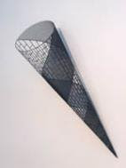
Dawson has six works on display: five on walls, one hanging suspended from the ceiling. The hanging work (Pointer) is a spray-painted, double cone that turns horizontally like a swivelling compass needle. The two halves are coloured grey and red while the opposing cones are made of a curved steel mesh with patterns of flying darts that diminish in size as they approach the two tips.
Two other cones (Vanishing Points) are on the walls, pointing to the floor. One pattern is of crevasses, the other of vertical crosses. The two motifs are linked with the two cones being side by side. Dawson has a black wit.
While the cone works are great, the rest of the show is made of three arcs (Sweeps) that hang on the walls. I like these even more. Curved with the centres projecting out, they look like sweeping brushmarks sliding across the wall. One is patterned with inverted darts among scudding clouds, another is with just clouds, and the third with I-beams suspended in the cumulus. They have a lightness of touch the cones lack, partially because of their interaction with the walls, the way they cling to the vertical planes of the architecture. There is a nice teasing of the volumetric, a nuanced agitation of the space that accompanies the eddies turning the double-cone and the shifting light coming in the window.
By the way, the images I have pasted here are not from the Smart show, but very similar.


No comments:
Post a Comment