Nau mai, haere mai, welcome to eyeCONTACT, a forum built to encourage art reviews and critical discussion about the visual culture of Aotearoa New Zealand. I'm John Hurrell its editor, a New Zealand writer, artist and curator. While Creative New Zealand and other supporters are generously paying me and other contributors to review exhibitions over the following year, all expressed opinions are entirely our own.
Showing posts sorted by relevance for query george. Sort by date Show all posts

Monday, May 3, 2010

Running out of time


Darryn George: Rarohiko
Gow Langsford
28 April - 22 May 2010

With this new Gow Langsford exhibition Darryn George carries on with some compositional aspects of the ‘abstract’ wall painting that he presented last December at Te Tuhi. With that work the image (entitled Rehita) could be described as a diagrammatic drawing of a bookcase, with books lying on their sides on its shelves.

George is interested in systems of knowledge and how cultures accumulate and store it. With Rarohiko (the Maori word for computer) there are similarities to the earlier show but the ‘Maori’ red is mostly gone, as is the wide airy flat space. Instead the motifs are stacked on top of each other within a boxlike computer screen and allude to systems of stored files (digital or in cabinets) or to tabs attached to folders.

The alignment of space within each work varies. Sometimes it is conventional perspective, occasionally aerial perspective, now and then orthogonal. The same sized rectangular tabs are stacked vertically, or descend moving to the bottom right, or else they recede. There is a sense of these precisely arranged oblongs being symbols for containers of information.

With the Countdown series there is a focus on ten recited numbers that seems a tribute to McCahon’s 1965 Numerals series, plus a visual tip of the hat to the English Gothic ‘Gang-patch’ lettering of Shane Cotton and perhaps the delicate ink drawings of John Bevan Ford.

As the title states, George here is using a line of small canvases to list their numbers backwards in diminishing denominations. He is not using them to surprise the eye with unexpected placements (as McCahon might do) - only showing them decreasing within a sequenced row. This creates a sense of the apocalyptic.

There is an abstract distancing with this predetermined arrangement, supplemented by a pulse of alternating red and black footers and the alternating arepa/omeka (alpha/omega) names of Jesus from the Book of Revelations. They are ominous whilst also decorative. Furthermore the subtle (though I suspect coincidental) optical mixing of finely linear coloured koru forms in their backgrounds introduces a pleasing chance component – makes the work less icy and more spontaneous.

I think the Rarohiko canvases work better than the more intricate, much smaller Countdown paintings. Their size has more impact, while the varied experiments with a stark compositional layout and the ideas about digital information storage - blended with traditional Maori motifs - are more satisfying and unique.

What is interesting is the tension created by George’s presentation of these two series together. One type seems to be about building a better future through the accumulation of knowledge, and the other is saying that time is running out, that the benefits of using such knowledge may never get the chance to be appreciated. George might be referring to the planet’s ecological demise or he might be thinking of The Second Coming. Perhaps both.

Tuesday, January 5, 2010

Darryn George at Te Tuhi


Darryn George: Rehita
Te Tuhi: The Drawing Wall
12 December 2009 – 10 March 2010

If you put a gun to my head and demanded to know what my favourite form of visual art was, and I was forced to come up with something, I’d probably say “Grid paintings.” Used to make them centuries ago, and still enjoy looking at (and thinking about) the genre. Mercifully there is still a bit of it about.

So this matrix by Darryn George is one that’s features a deep matt red wall. It's organised around what seem to be twelve modules of four vertical units by three horizontal ones. Except these twelve units aren’t identical. They have small skinny horizontal rectangles alternating between the bottom left and bottom right corners of the larger oblongs.

Have a peek at the above photos. You might think, why didn’t John describe them as a grid of six flipped double-units that is two by three? Well look again, it is actually quite complicated. There is a thin ‘frieze’ of three linked slivers of rectangle at the very top, right where you least expect to see them. That’s a cunning device to accentuate the upper and lower edges, bring in vertical symmetry and lock the design optically onto the wall. Otherwise with the dominant retinally advancing red, the top edge you'd get from a solely twelve unit combination would seem to float away while the bottom remained anchored. Those three upper white and black motifs are essential.

Being Nga Puhi, George has used the traditional Maori colour colours of red, white and black, and if you really, really insisted on a rudimentary narrative, you could say they represented bookshelves with the smaller lower motifs depicting books lying flat on their sides so that you see only their spines. A comment about the desirability of recording traditional knowledge before it disappears, perhaps?

The work is beautifully designed, taking advantage of thin elegant white lines to bring a quality of light and delicate exuberance. Executed by a technician it has none of the deliberately stippled and encrusted paint found on George’s usual canvases. This is a notably flat surface.

This is a wonderful multi-layered work; visually not too busy but not too empty either. It’s precisely and airily balanced so that there is no possibility of clutter at intersecting vertical and horizontal white lines. It’s expansive too. The perfect dynamic of minimal patterning to hold your attention.

Friday, March 7, 2008

Too rigid


Darryn George: Pukapuka
Gow Langsford, Auckland
4 March - 28 March 2008

Darryn George is well known as a Maori painter in this country, but you know what, his earlier sculptural works are so much better. In the mid nineties he made a series of red/black/white sculptural wall reliefs, heraldic in nature, depicting motifs that examined colonial history from the Māori point of view. They had a fluidity of line and an organic quality that has long been lost.

George’s paintings in comparison have a busyness and rigidity, a harshness induced by their tonal contrast and geometry. Overcooked and wooden, they seem too earnest and too literal in their symbolism (a strange thing to say about ‘abstract’ works, I know.) Their excessive narrative layering makes them try too hard, and consequently they flounder.

Let me give an example: his use of thick white 3D paint in the borders is awkward – visually a mix of Jonathan Lasker and Max Ernst’s decalcomania. In the gallery’s very fine discussion of this show by Shelley Jahnke-Bishop, she mentions it is done to emulate the chisel marks of carving, but they actually don’t look chisel-like. The work is spoiled by its symbolic intent, which even if rendered impeccably, would still only overload the content. The ‘footnotes’ would have replaced the ‘essay’. The show’s title means ‘book’ so my literary comparison is apt.

The odd thing is that the best work of the show is in the gallery’s Wellesley Street window (bottom image above). It has an intriguing literal quality, looking like two rows of panels leaning against a wall. It also is comparatively simple, having no complicated background kowhaiwhai or tukutuku patterns. Plus there are grey panels that in the context of all the red, black and white, suddenly become visually refreshing.

This sounds like I’m trying to remove all the Māori components from George’s work, but not at all. I’m just advocating visual subtlety, and hinting that he could come at it from another direction. To my pakeha eyes it seems a bit heavy-handed and market-driven; devoid of intellectual risks. The earlier wave of ‘Māori painters’ like Peter Robinson and Shane Cotton are much more adventurous in comparison.

Wednesday, January 23, 2008

Incompatible Perhaps

New Painting Digital Age
Te Tuhi Centre for the Arts, Pakuranga, Manukau City
17 November 2007 -10 February 2008

This ‘new painting’ exhibition is toured by Porirua’s Pataka gallery, and curated by Pataka’s Senior Contemporary Art Curator Helen Kedgley. She has picked Darryn George, Sara Hughes, Andrew McLeod, Kelcy Taratoa and Tim Thatcher so with such disparate styles it is quite idiosyncratic. Plus much of it is traditional oil painting. No Andre Hemer (repeatable pseudo gestures), Simon Ingram (robot painting) or Leigh Martin (digital painting machine) here. But there are some nice surprises.

In New Zealand the pioneering work mixing painting with digital technology was done by Richard Killeen in his investigations of the properties of language, especially the paintings made in 1986-7. Over twenty years later such digital methods have become commonplace, and Killeen’s influence very apparent.

With Kedgley’s selection, the obvious choices are McLeod and Hughes.


I’m not sure about the significance of the others though. In some, digital technology is not absolutely essential to their image making process, as say the methods of Andre Hemer or Julia Morison might be. And from looking at the catalogue, the reduced touring version here does not seem as successful as the original Pataka hang. While Sara Hughes only has one painting, Tim Thatcher has five, yet a lot of wall space in the outer corridor is unused. Because there is no even distribution of work for all five artists, the show seems slightly ad hoc.

Kedgley doesn’t fully show how painting can be more flexible or more adventuresome with digital technology. Even though her selection is limited, her quirky tastes can provide pleasant surprises. For example, I’d never seen Tim Thatcher’s work before, but I enjoyed his paintings of tree parts. They are sumptuous oil renditions of Andy Goldsworthy-style sculptures, but scrawnier and weedier – perhaps as envisaged by a comic artist like Chester Brown. They have an appealing stoned nuttiness about them, and seem to be a sort of tongue-in–cheek meditation on a woman (‘The Log lady’) in David Lynch’s TV series ‘Twin Peaks” who is always cradling a log: a satire on ‘tree-hugging.’

Despite my enthusiasm for Thatcher’s oils, I’m not convinced he should be here. Simply because he uses Google to download tree images is hardly a valid reason to put him in a ‘digital‘ show, and in fact his (and McLeod’s) traditional painterly sensibility show Kedgley’s thematic premise to be a bizarre oxymoron. Why the hang up on paint? A print or photography show would have enabled a far more focussed examination of digital technology. Yet Kedgley stays true to her passion for old style painting: she prefers Andrew McLeod’s sensual painting over his more innovative (Guillermo Kuitca influenced) prints. Really she is using artists’ digital interests as an excuse for a painting show. That is her priority, not the other way round.

For example Kedgley’s choice of Darryn George’s work includes roughly made, less pristine examples. His ‘The Equaliser’ - five alternating red/black pairs of repeated size and motif - looks terrific on one wall by itself, but this Māori synthesis of Walters/McLaughlin formalism with Lasker tactility has a surprising casual rawness close up. George is uncharacteristically sloppy.

Yet to be fair, Kedgley hasn’t deliberately ignored painting with a fastidious industrial finish – it is just that in Te Tuhi it happens to be downplayed. Sara Hughes’ dazzling synthesis of Stella, Anuszkiewicz and Held is hard to ignore, and the suite of Walholesque Kelcy Taratoa paintings fits into Kedgley’s theme well. His work though, despite its appropriate method, is tiresomely similar to a lot of Pop art in this country – like Rudolf Boulee for example – and is not distinctive. His fixation on war comics, action heroes and media manipulation is too heavy handed and didactic to be significant.

This show tries to be both painting and digital but doesn’t embrace either satisfactorily. Maybe the entire original exhibition has to be seen for the argument to work; perhaps it could have gained from a more detailed examination of the technology particular to each artist; but I think Kedgley’s choice of artists is the problem. Too few of the artists really tackle the implications of the theme full on – they are too busy being painters. The grouping doesn’t convince.

Thursday, April 10, 2008

Colour Cathedral


Darryn George: Pulse
Christchurch Art Gallery (William A. Sutton Room)
9 March – August 2008

Darryn George’s installation here is light years more exciting than his recent, related, Gow Langsford painting exhibition in Auckland which was hampered by the muddled variety of its images, its overworked textures and too complicated Christian/Maori symbolism.

This Christchurch show was executed by professional sign painters working directly onto the walls, and is exciting because of its physicality. It is an amazing experience to walk around the huge room, the designed motifs are so rhythmically and chromatically intense. The super saturated colour gets absorbed by every pore in your body, and the intense walls, the front one repeating the number ‘Waru’ (eight: the eight day of the week, a mystical, spiritually focussed day), pulse with an octane energy that pleasurably steamrolls over you.

This is a particularly successful treatment of this space. Hopefully it is the first of many such spectacles to come.

Wednesday, July 23, 2008

Elam Sculpture


Rory Dunleavy, Luke Willis Thompson, Shannon Teao: Deadline, Authentico!
George Fraser
16 - 26 July 2008

In this sculpture show we see three artists collectively use the two GF rooms in entirely different ways. In the front we see two photographs (Site A and Site B), each showing a pear-shaped chunk of wet clay that has been pulled out of a plastic bag, photographed, and then that photo painted to look as if white slip had been applied to the upper portions of the lump.

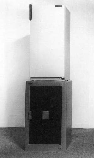
In the back room things are more complicated: twenty units positioned in a grid–like arrangement on the floor. Some test mainly binary combinations of unorthodox materials like clay and branches, polystyrene and cardboard, rock and paint, plaster and foil, wire and tape etc. Others investigate just what plinths might be; much like the French artist Bertrand Lavier who has done peculiar (but brilliant) things like placing a fridge upon a safe. Still others explore patterns of painted marks on odd materials and constructed Picassoesque ceramics. Others yet try transitive verb actions with materials, the ideas embodied in Richard Serra’s verb list for example, using processes like gravity or decay. Little bricks that have tumbled off the seat of a toppled chair. Clay blocks in a pile, some of which have been crumbled, or diminished in scale.

The result is a fascinating floor display that has energy and intelligence, is visually intriguing, and a great contast to the calm and quiet of the front room. An exceptionally good exhibition at George Fraser. A knock-out.

Tuesday, April 27, 2010

After K comes L


Chris Lipomi: Interactive Visual History Compression (the Ks)
Featuring work by Mike Kelley, Kieran Kinney, Martin Kippenberger, Alice Könitz, Paul Kos, Michael Krebber, George Kuchar.

Michael Lett
21 April - 15 May 2010

Chris Lipomi is one of those artists interested in the merging of creative identity and blending of artistic content or style. We have here an exhibition that is a sort of voluntary cuckoo-host, where an artist has devised his own show to include several other artists whom he admires, generously inviting them to pop their eggs into his own (gallery) nest. Whilst it could be seen as a shrewd way of clinging to their shirt tails if they are superstars and advancing himself, if the show is exciting enough as a curated project and attracts attention, those guests get introduced to new audiences who perhaps buy work. The other artists appreciate the new contextualisation. They enjoy the support.

Lipomi’s installation at Michael Lett incorporates parallel railway sleepers as seats for looking at videos. It gives us the chance to investigate several artists (all with names beginning with K) mostly not seen here before, mixed in with some fake Kaprows, and Kawaras.There are lots of surprises.

For example, there is a wonderfully verbose, double-sided Mike Kelley poster, The Great Tragedy of the Bill Clinton Administration…(under glass but on a hinge), which attacks America’s fixation on celebrity culture and on sexual desire. As a remedy he recommends that all Hollywood stars be compelled to do medical work in clinics for sexual diseases. Kelley’s poster and a silkscreened, coloured cotton table cloth are blended into a row of imitation Lipomi ‘Kelleys’ in a mash up of artistic identities.

Other works make the presence of ‘authentic’ individuality much clearer. There is a Martin Kippenberger set of nine wooden frames converted with Mylar and black tape into a game of noughts and crosses. To perpetuate his hang dog ‘loser’ image, there is never a winner (i.e. a line of three) in its hanging arrangement.

There is also a riddlelike Paul Kos with a coathanger hanging off the top of a broom handle, balanced by a bell one end and a candle at the other. It seems to be a meditation about thought and action, the activity of sweeping seen as generating ideas - symbolised by the lighting of the candle or the ringing of the bell.

Cologne conceptual painter Michael Krebber once worked for Martin Kippenberger as his assistant, and Kippenberger often used his ideas. He displays here a black and white painting showing an excerpt of a smeared photocopied comic where sections of teenage action are densely overlaid with confusing text. The year later (2008) he showed at Maureen Paley in London, a similar series of images based on French cowboy comics.

Krebber also has a slice of a red windsurfing board on Michael Lett’s wall. The tilted, sawn off parallelogram seems to be a metaphor for the adventurous side of an art career, a journey over the waves where work is fun, a recreational, even escapist, activity. Another interpretation (on an online blog) is that it is created to mock ‘sculpture’s bodily immediacy’. That seems farfetched. The work embraces immediacy – even as a mutilated readymade.

Kieran Kinney contributes a dramatic, completed oil painting. Men Are Back is a send up of the film ‘Men In Black’ and seems an amusing photorealist comment on gender balance in the art sector, saying that the current apparent dominance by women is changing. Maybe that is accurate in Melbourne, the city where Kinney lives, or Australia.

Los Angeles artist Alice Könitz has two tightly geometric, formally elegant, cardboard masks that link to a nearby video where similarly masked actors balance on tree trunks and mumble lines from Genet, Brecht or other playwrights. The masks are great but the video is superfluous.

The videos of New York underground film-maker George Kuchar are less pretentious. He has two low budget, low tech, richly layered works about variable weather patterns and places he visits when travelling. They are structured around what seems to be Kuchar himself playing the bored out-of-towner, either cleaning filthy bathrooms in sleazy motels or gazing anxiously out of grubby windows - pondering the local wildlife or contemplating changing cloud formations. Apparently he used to earn a living painting weather maps for television studios.

This is one of those shows you need to look at in the space, go home and do some Googling or ferreting around with your stack of favourite art mags, and then return for another squiz - with some new contextual background under your belt. There is a lot here to ruminate over - particularly with Kelley, Kos, Krebber, Kuchar and Kinney. It’s an unusual, extremely interesting exhibition.

Thursday, March 20, 2008

Forget your cinnamon buns and chocolate


Stations of the Cross: an Easter Exhibition
Curated by Joanna Trezise and Jaenine Parkinson
Gus Fisher Gallery
14 - 24 March 2008

The Gus Fisher is trying to cover all bases at the moment, but the fact is it is not a good venue for contemporary art. The floor is a real distraction that kills sculpture, as do the venue's decorative inlaid doors and domed space two-dimensional work. The place needs a proper makeover, but as it is a historic, protected building, such a sensible and functional modification is not likely to happen.

The exhibitions now also tend to be fusty. The recent Adele Younghusband and (current) Gabrielle Hope shows for example were/are excruciatingly inconsistent affairs, and over the last year or two the programme has become more conservative.

On hearing that this Easter show of specifically contemporary work was commissioned by the Presbyterian Church, I didn’t know what to expect – especially as the Stations are a particularly Catholic concept. However the curators involved, Joanna Trezise and Jaenine Parkinson, spring a few stimulating surprises.

‘Hallelujah!’ first of all for there being no McCahon, Smither or Harris works. Their over-exposed crucifixion or ‘Station’ paintings are thankfully nowhere to be seen, and the fifteen commissioned artists selected for the fifteen stations along JC’s bodily trajectory make up a peculiarly mixed bag, but there are some treats. It would have been much better using the whole gallery and including some film or video, but never mind.

Fifteen artists with fifteen hugely varied approaches in media and attitude is quite a gamble. The fragmentation is not resolved by the thematic structure but it doesn’t seem to matter. The many contrasts and vehement oppositions bring an unexpected richness. Instead of Christian propaganda we have here a true forum, a notion that the art world often embraces in conversation but which it rarely puts into practice. Many of these artists appear to be non-believers. Others broadcast their commitment to the Christian faith. This ideological jostling makes the show refreshing in its candour.

Five works in particular I found physically and mentally engaging.

Peter Madden’s sculpture has one of his ubiquitous, gold leaf covered, plastic skulls placed on a tall plinth of shiny purple plastic. As he has also coated the Gus Fisher glass doors with gold leaf, it is not until you have opened them and entered that you are suddenly confronted by this vertical figure. It represents Jesus, clad in a sarcastically ‘royal’ robe, about to be condemned. The intense colour makes it quite a visceral experience and a superb start to the ‘Station‘ tour.

Further down the sequence at the Tenth Station, Niki Hastings-McFall has another skeletal Jesus standing on a green hill of foliage and flowers. Awaiting execution and stripped of his clothes, he is holding a vinegar soaked sponge and a straw. There is a lightbox under the plastic leaves and they glow gorgeously. The absent flesh and clothes merge into one as a metaphor about the transience of life, youth and beauty.

John Pule’s series of painted hardcover tomes, continue a number of projects where he attacks the destructive influence of Christianity in the Pacific region, using written or drawn post-colonial narratives. His set of 14 Christian guidebooks are given raw, repainted covers that are virulently scathing of missionary-induced guilt and despair. I prefer these to Pule’s paintings, though those are hard-hitting too. The books are more confrontational, and don’t bury their anger in a mass of decorative detail. Their inclusion brings some gritty intellectual credibility to this show.

Darryn George is a hard-edge abstractionist pretending to be a Christian-Maori symbolist. The reverse is stated in the catalogue, and understandably so, for he often clutters works with symbolic elements even if they detract visually. Yet if put on the spot, George would probably rather construct an elegant design than tell you a morally uplifting story. He loves form. His ‘The Women of Jerusalem Weep For Jesus’ is a seductive though deceptively simple painting, with particularly rarefied compositional control.

The placing of Jesus’ body in the tomb is the theme explored by Hamish Tocher in his wonderful projection on to the gallery ceiling via six over-head projectors. The various foreshortened actors look like they are standing on a high glass sheet and participating in a Mannerist mural. In terms of Biblical narratives these figures seem to obliquely allude to another story, that of a vision experienced by the hungry disciple Peter, where on a rooftop in a strange city God delivers out of the sky a sailcloth sheet bearing live animals to be eaten (Acts 10:11). The confusion between a food-laden sheet and Jesus’ corpse wrapped in a burial shroud makes an inadvertent pun about the Eucharist and the eating of Jesus’ body.

What believers would make of such humour I do not know. However the range of work in this show makes it worth a visit for anyone - whatever their religious inclinations. Naturally it is on over the entire Easter period, even public holidays.

Saturday, January 5, 2008

Another review of Existence, and a look at an earlier exhibition at Waikato Museum of Art and History - from Deborah Cain


“Extended Summer Musings on Two Art Shows in Hamilton’s Waikato Museum of Art & History Te Whare Taonga o Waikato, 2006-2008”

Tale To Tell: Victorian Narrative, works from the collection of Auckland Art Gallery, 28 April-October 2006.
Existence: Life According to Art. 14 July 2007–14 January 2008.

Two separate art shows, over a two-year period, one titled Tale to Tell and the other Existence, provide an opportunity for mid-summer musings on some art in a public institution in Hamilton. Due to renovations to the main building of the Auckland Art Gallery Toi o Tamaki in 2006, a number of art works from its Victorian art collection were on display in an exhibition A Tale to Tell in Hamilton’s Waikato Museum. The works in this show were mainly from the Mackelvie Trust Collection, and the focus was on narrative painting. Strategically placed bronze sculptural pieces of Hercules and Pan-like figures atop blue octagonal plinths, representing classically posed nude forms of mythic man and youthful boy, complemented the overall installation in its blue room. A mood simulating Victorian New Zealand settler aspiration was decoratively set by the opulence of some large fabricated floral arrangements (coincidentally, the work of La Faux Floriste), as well as by the historically elaborate gold frames, the Prussian or Royal blue painted gallery walls, and, the dark and gloomy staging of spot-lit art. The latter is a notable feature of certain types of shows at the Museum, although the low LUX also prevents the art works from being damaged by too strong light: its romantic drama of dark to light is another thing. The gallery visitor, as participant, was drawn in to peer closely at the infinite detail by this lighting and in order to read the wall texts.

There was a certain art to all of this. To start with, it was a refreshing change. For a long period a crop duster and agricultural-show-like installation had occupied the upstairs’ gallery space of the Museum in support of the region’s considerable farming history. So finally, some art was on display? But things are never that simple, and a story can spin out in different directions if one is open to this possibility. It all depends on one’s view of Victorian art, society, and politics. But this was notably an era dominated by Darwinian science, and the idea of empire and progress, which coincidently connects with the theme of the second exhibition Existence, to be discussed shortly.

The word ‘Victorian’ is double edged—indicating a historic period, or nostalgia and fuddy-duddy values, as has been discussed by historians like Miles Fairburn—and along with the ‘kitsch’ of the faux Egyptian and imperial or colonial-esque décor it is a many-sided notion, likewise the terminologies of ‘art’ and ‘history’ themselves. For example, Fairburn has pointed to the naming practices of Antipodean historians (of Victorian studies in Australian and New Zealand), where the era, age, or period of history so designated is more frequently referred to here as the ‘colonial era’, with diverse connotations that are often negative.

This exhibition promoted some interesting and important thoughts on the subject. It was coincident with the Tainui celebrations of Te Arikinui Dame Te Atairangikaahu’s reign as monarch in the Kingitanga tradition that started with the crowning of the first Maori king, Potatau in 1858. And, that, in turn, connected with the mid-19th century struggles over land and the interpretations or translation of Victorian ideas and values, coexistent with people like Sir George Grey, for example. Waikato Museum also marked another 40th anniversary in its exhibition Aukaha, 40 Years of Maori Contemporary Art, one floor down from A Tale to Tell.

James Tannock Mackelvie who helped establish the Auckland Art Galleries’ public collection—a canny Scot we were told, indicating the complex layering of Victorian era colonial politics—was a careful purchaser of art and bought work to benefit the “young, vital but raw New Zealand society” of the 19th century. Thus, due to such like-minded collectors as Mackelvie and Sir George Grey, we saw in Hamilton works like Lawrence Alma-Tadema’s “Cleopatra” (1877), itself a smaller replica of another painting by the artist held in the Sydney Art Gallery of New South Wales, and, John Waterhouse’s “Lamia” (c.1905).

It was all very stunning, reminiscent of devices and structures seen today more in the advertising industry than contemporary art practice, or perhaps only as pastiche. Yet it should not be taken lightly. Victorian art already has its own element of sentimentality and kitsch, which became popularist in its own time from the perspective of artists like Alma-Tadema, whose renown was to be diminished with the demise of the age of idealistic illusions in art, by modernism, and by the decline of Empire in the post-WWI world.

The frame of the Victorian era was Queen Victoria, who came to the throne in 1837 and died in 1901, although the time span is not strictly fixed to these dates. Here Victoria’s marriage, and then fairytale-like seclusion from public life when her ‘lost love’—Albert, her German Prince died from typhoid—replicated an aspect of the narrative tradition seen in the exhibition.

Thematically, the show followed a series of costume-like dramas: queens from classical antiquity, exotic dancers, great loves, and a veritable classificatory taxonomy of female types in biblical and legendary scenarios, or from modern life. There were images of dying poets and lovers, a funeral for a child, sentimental genre paintings of marriage proposals, and pretty women reading letters, sleeping, or seen seated in gardens.

Of particular interest were the paintings and etchings by the French artist James Tissot—a refugee in London during the 1870 Franco-Prussian and ensuing 1871 Civil War in Paris—who had an academic training but associated with avant-garde artists like Manet and Degas, and whose work fitted between academic art and the modern of the Impressionists. An etching of a larger painting with the figure of a woman decoratively silhouetted against a background of chestnut leaves, depicted an everyday subject matter in its simplicity of form influenced by Japanese ukiyo-e printmaking.

Another image, a drypoint of the same woman who in real life was Mrs Kathleen Newton, a Tissot obsession, depicted her sleeping on a summer evening in a garden idyll. She was dressed in fashionable ruffles and lace of Baudelairian ‘iridescent clouds of stuffs’, but there were intimations of mortality and poor health, shown by the dark shadow under her eyes and the fine black mittened hand awkwardly curled up on her lap. It’s another story of love and loss, in that Mrs Newton soon after died of consumption, leaving Tissot to become bent on contacting her spirit through the occult and turning to religious painting. Mirrorings of this sleeping beauty could be drawn in Queen Victoria’s story: the period of her reign beginning in the year of John Constable’s death and ending when Walt Disney was born.

Flowers decorated the Waikato Museum space and underlined an astutely doubled narrative-frame of the exhibition. Like the copies of nature that they were, they simulated frozen ‘still-lives’ in their abundance of exquisite, yet imported floral attributes, forming a reminder of mortality and the art of contrived stories in time and space. In part they brought to mind The Consolation of Philosophy photographs by Michael Parekowhai of European flowers made in China: silent images of whiteout, death, vases of flowers, and the names of French localities signifying the places and ‘remembered losses’ of WWI.

The Maori phraseti he mauri ora [sneeze lustily, ‘tis the essence of life]quoted at the commencement of Existence: Life According to Art, is a powerful expression from a tangata whenua narrative of origins. So began a different curatorial storytelling exercise, from 2007, loosely framed as an anthology of art and ideas about aesthetic, cosmological, and scientific creation.
A sneeze can arrive suddenly, unexpectedly, and involuntarily, a surprise that shakes up the whole body, tip-to-toe. It can be associated with spring, and allergic reactions to the pollen of newly blossoming flowers. Cherry blossoms in their very brief seasonal appearance show the beauty and transient fragility of life. Museums and galleries offer a different story. It is now January 2008, and summer life is evident in the many private and public gardens of Hamilton, and in the surrounding Waikato river valley. The newest addition to the central, themed City Gardens, is a Maori area currently under development, but there is also a curious stone marker near a corner store along Peachgrove Road, which states that ‘near here was the site of the peach grove planted by the Maoris’ [sic]. With history things are introduced, changed (again), then pass away/disappear, to be revised and remembered by the traces left behind, like life in general.
The existential plays out against the spiritual, philosophic and scientific questions premised by the theme of ‘life according to art’. One is firstly confronted by a voiced ‘Thou shalt not touch’. Beaming intermittently from a loud speaker at the entrance of the exhibition, it is an authorative, dis-embodied instruction, which places viewers on their toes right from the start. This voice from above suggests that the visitor is under surveillance, reminding one how there are systems in place by this doubling of institutional ‘big brother’ mechanisms.
On the top step approaching the gallery entrance, one is met by what appears to be a drunken monkey lying face down. In his hand he holds a small video monitor that plays the moving image of his demise, while the song ‘The House of the Rising Sun’ can be heard, from one of two fake ‘stones’. Ronnie van Hout references art and science in a satire of evolutionary creation, urban development, and popular culture (music and cinema), in the form of a performance by his alter ego, the be-suited derelict chimp.
In the diminutive video narrative by van Hout one sees a vaguely familiar simulation of the Stanley Kubrik film 2001 A Space Odyssey, set in the outskirts of the city of Melbourne. At sunrise, over the prehistoric/urban skyline, a distant plane comes in to land. Then the scene shifts to a park landscape and the pseudo-metaphysical appearance of ‘the bottle’. A hairy hand comes into view, reaching out and grabbing this miniature monolithic upright, in its iconic brown paper bag. It in turn leads the drunken chimp on a journey to the motorway underpass, past the controversial red architectural artwork on the road connecting Melbourne’s CBD with the airport, to where monkey-man collapses into his ‘present’ state, dead-drunk, lying face down. The film ends with the darkness at sunset.
Van Hout inverts the 1960s sci-fi evolutionary tale of nature-to-culture, or monkey-to-technologywith man’s conquests of outer space eventually overtaken by the machine itself, HAL, and whatever you think Kubrik is saying in his film. Meanwhile on a nearby wall, outer space is re-imaged in the reproduction of random light from far off stars. This ‘old light’ was originally trapped using pinhole cameras tracking the night sky near Mount John Observatory at Lake Tekapo, with over night exposures of photo-sensitive paper, and digitally blown up here for Proof I and II by Lisa Benson.
So the scene was set for the exhibition. Forty-six artists, some well known and some less so, local and from wider afield, are represented in this joint Hamilton City Council (Waikato Museum) and Waikato Institute of Technology (Wintec) promotion. Conceptualised by Museum curator Leafa Wilson, it was accompanied by a catalogue publication co-edited by Dr Gaby Esser-Hall. The artwork brought together under the rubric of ‘existence’ both fit and don’t fit the collective proposition, creating discordant clashes between works on display. But one of the results of this somewhat chaotic aspect is that Existence does create questions for the viewer, without always producing answers to the topics it throws into the mix.
Grouped under subcategories with obscure catchy titles, the exhibition covers issues that fluctuate between serious and playful. These groups could be classified according to a number of obvious links, such as natural/cultural history (origins, myths, geology, astronomy, biology, genetics, physics), technology (manipulations, adaptations), popular culture (mimicry, masquerades, disguises, social realism, death), and modern living. Several works included taxidermy, with plant/animal/human metaphoric implications. Michael Parekowhai’s Driving Mr Albert, with a taxidermic dead bunny on an upright faux-tree trunk, is a case in point. One of a group of similar stele or pole-like works of different colours by the artist, the title is based on the book Driving Mr Albert: A Trip Across America With Einstein’s Brain, about the journey taken by a journalist and a pathologist to return the physicist’s body-part to family. [Michael Paterniti, 2000. Random House, Incorporated]

Parekowhai’s work deals by inference with the ethics and scientific attitude of dissecting and collecting human organs as curios in archival storehouses, for ‘objective’ research. It hints at the return to New Zealand of human remains collected here in the colonial period and exhibited overseas, though this is not explicitly mentioned in the Waikato show. By contrast, death and technology are differently associated processes implied in Francis Upritchard’s Untitled fibreglass and resin fake-shrunken head, and in Ricky Swallow’s iMan prototypes, where skulls are lined up in their Apple Mac simulated production line as variously coloured pastel replications.

There are many artworks in the show that could be mentioned, but a life/death juxtaposition allows us to refer to Yvonne Todd’s light jet print on photographic paper, Fractoid. Here a woman in a pink dress posed with crutches, face blurred-out and hair-a-flurry, can be contrasted with Andrea Wilkinson’s My favourite outfit, large format digital posters that pose friends in a series of ‘round-the-world’ everyday ordinary locations, dressed in a set of her own clothes. The tensions between these artworks, and their relationship to notions of photography marking an absence or a death, overlap with the confluence of the Existence themes generally. The analysis of photography in association with notions of death, loss, and mourning has been discussed by a number of people. For instance, Roland Barthes (1915–1980), has written how photography is a process that freezes, or embalms the living subject into a rigid statue-like image, with death being the ‘eidos of that Photograph’. [Camera Lucida, trans. Richard Howard, 1981. Hill and Wang, New York, p.14-15. Eidos being the mental image, the specter, an apparition.]

If we consider Stefanie Young’s photograph Faux, a portrait of a young girl in her Goth-like costume of a teenage subculture — the tattoo, fake fur coat, body piercing, and neck ornament — looking directly at the camera. The subject is absent except for the image marking her presence in this guise, yet it is placed alongside Upritchard’s work that is an actual grotesque ‘plastic’ thing of death sitting there in its vitrine. Or there is the artificial light of the doubled image of Blue Water, a diptych by Janice Abo Ganis. This photographic representation of an iconic geyser makes its technological manipulation of a ‘natural wonder’ apparent as de-natured and reproductive devices.

The curation of thematics such as life/art, science/art, religion/art is not new. Writings by Siân Ede and Marina Warner, for instance, have covered aspects of this terrain, as has the art of Damien Hirst and Patricia Piccinini. Just as art and science are seen as opposites, like reason and feelings (a focus of the Sydney Biennale 2004, and a flip-side of ‘think with the senses—feel with the mind’ for the Venice Biennale 2007), their conjunction in this exhibition and in the Waikato Museum itself is a poignant statement. The late 1990s saw the incorporation of science and technology into the art and history museum on a more permanent basis, resulting in ongoing conflicts and debates.

Although tending towards the didactic and the cluttered, the Existence exhibition is nevertheless fun. Like the uncertainties experienced in everyday life, the confusions in this curatorial display somehow manage to work in its interest and allow the viewer to meander around and make up one’s own mind about the various strands that link the art on show with real life, real existence. In this same space, the Waikato Museum has gone from a crop duster-centred display, to a feast of borrowed Victoriana, on to some contemporary musings with a range of nominally linked ideas. Where to from here?

© Deborah Cain

Part of this text is reprinted here from an original version from CS Arts, issue 29, February 2008.

Top four images are from Tale to Tell, particularly works by John Waterhouse and James Tissot. The bottom image from Existence comes from a film by Rosie Percival.

Thursday, May 15, 2008

Cohesive Combination


This Much is Certain: Alexandra Savtchenko, Sonya Lacey, and Sarah Rose (Elam Grad Exhibition)
George Fraser Gallery
7 May - 24 May 2008

These three Elam graduates showing together in the George Fraser have come up with a surprisingly tight exhibition – even though it was their supervisors who actually selected them for this project.

So why does it succeed? First of all, and most obviously, Sonya Lacey’s Structure for Standing while Talking (After Pistoletto) – a steel L-shaped sculpture that looks like a freestanding support for a lean-on-able bar in a pub - has ties with Sarah Rose’s Open Space, a large sign holder that looks like part of some monkey bars from a children’s playground.

Both major works function as metal forms (one is stripped of paint, the other is powdercoated) to be enjoyed as sculptures, but they could also work with human bodies swinging or leaning on them. They ‘beckon’ to passers by to be touched or climbed on, and reek of function and bodily interaction, not contemplative delectation. The participation of people with their rigid forms though is not essential. In fact, Rose doesn’t want people to touch her public sculpture, but because it looks like it is designed for children, and not art, her wishes will probably end up being ignored.

Rose has two other works in the show. One is a banner lying on the floor that is strangely folded so that its configured patterns point at the Open Space work outside the door. The other is a length of steel wire rope hanging from the ceiling and wall forming a suspended parabola. Its gravity induced, soft, round form is a vivid contrast to the rectangular hard contours of Open Space, and refreshingly casual.

Sonya Lacey’s Structure for Talking was once painted but she decided to strip that layer off and expose the ground, buffed steel. Her graphite drawings show that interest in surface, and both her preoccupations and Rose’s link well with Savtchenko’s video. Using a laptop Savtchenko presents films of billowing volcanic ash spilling out of erupting craters. She has also made a substraction work (related to the methods of seventies artists like Billy Apple) where she sanded and chipped away encrustations of paint from an internal gallery archway. Her removal process and images of suspended ash particles high in the air are a clever foil to the methodologies of her two colleagues. This is a rigorous, austere exhibition, but clearly a thoughtful one. It shows good teamwork without downplaying the significance of each individual contributor.

Thursday, July 30, 2009

La femme à tête de chou-fleur


Mhairi-Clare Fitzpatrick and Robyn Hoonhout: Words Fail You
George Fraser Gallery
30 July - 1 August 2009

The pairing of these two Elam photographers is an interesting one because they are so different. One makes lightboxes for her images (backlit duratrans) that even when featuring living people, still in this context look like consumerable commodities for sale. The other shows pairs of women at work, in their places of employment, or in clubs, or neutral public spaces. There is no consistent pattern. The lighting conditions and the contextualising visual narrative keeps abruptly changing.

The most accessible images by Mhairi-Clare Fitzpatrick are of two young women in a freezing-works. An update of Darcy Lange perhaps, and in this show, they become positioned images of ‘authenticity’. Her other images seem overtly preoccupied with fakery, with odd smocks and wigs. They are bizarrely futuristic, as if off the set of A Clockwork Orange, but in ultra-violet light.

Robyn Hoonhout’s duratrans have pairs of objects (images of elderly women included) is if in a promotional campaign that might go in bus shelters. She seems to be contrasting human individuality with Fordist factory production - and deliberately mixing consumer with the consumed.

The essay by Lucille Holmes that goes with this show is in this context inappropriate, for like every other student theorist who has been writing over the last twenty-five years, she is obsessed with Roland Barthes’ Camera Lucida and his use of the term punctum. She is also keen to show her erudition with the writings of Lacan and exactly how Barthes derived punctum from Lacan’s eleventh seminar. This is precious little use for anybody trying to grapple with Hoonhout and Fitzpatrick’s imagery – and will probably send them fleeing screaming from the George Fraser, never to return.