Nau mai, haere mai, welcome to eyeCONTACT, a forum built to encourage art reviews and critical discussion about the visual culture of Aotearoa New Zealand. I'm John Hurrell its editor, a New Zealand writer, artist and curator. While Creative New Zealand and other supporters are generously paying me and other contributors to review exhibitions over the following year, all expressed opinions are entirely our own.
Showing posts with label Anthony Byrt. Show all posts

Wednesday, May 12, 2010

Judy Millar currently has a show at Hamish Morrison's in Berlin. Anthony Byrt tells us all about it.


Every year, Berlin’s galleries team up to coordinate Gallery Weekend: three days of openings that attract curators, critics and collectors from all over Europe. This year, people flew in for what promised to be a pretty exciting few days. There was a buzz about the fact that some of the biggest names in the art world were having shows in the city: people queued almost round the clock to get into the new Olafur Eliasson show; and out on Heidestrasse, crowds gathered outside Damien Hirst’s opening, trying to get a peek at some of the works he didn’t sell at his Sotheby’s auction in September 2008. Other big names, though not quite as stratospheric, were also opening around town: Gursky, Wallinger, Bonvicini and Peyton among them.

In the middle of all this hype (and right next to Hirst’s exhibition), Judy Millar opened at Hamish Morrison Galerie. Millar’s show, A Better Life, is her first major installation since representing New Zealand at Venice last year. As with Venice, she hasn’t backed away from either the high-profile context or the size of the space she’s been given: it’s an all-or-nothing project, for an all-or-nothing weekend.

Extending the concerns of her Venice show, giant strips of billboard material printed with her blown-up marks collapse over each other and spill through the gallery. There’s more colour than at Venice. Complex negative curves make the piece more dynamic too, and there’s a sharper interplay between form and content. In the past, I’ve written that at ten times their actual size, her marks become graphic rather than expressive. But here she’s managed to make them architectural too, designing them to follow the curves of the structures that support them. She’s also resisted the temptation to put too many paintings on the walls, so there’s nothing to distract viewers from the main event; as one artist said to me at the opening, the work is like a single breath through the gallery.

I’ve worked with Millar many times before: so people can take or leave the fact that I think it’s a great exhibition. The more important issue is what it represents for her career. It’s no secret that the New Zealand art world has had an uneasy relationship both with her international rise and with her work for a while now. I think this is caused by three factors. First, her work demands time, and a lot of people either don’t want to, or don’t think they need to, give it the extended attention it asks for. Second, there’s a fixation with the idea that her work is primarily about abstraction, which it isn’t, and it’s therefore written off as decorative and out-of-date. Third, and perhaps most importantly, it looks out from New Zealand rather than in, participating in a global conversation about the relationship that painting has with the real world it both seeks to represent and be a part of. While there aren’t many artists in New Zealand exploring similar ideas, there are plenty of very good ones around the world who are: Katharina Grosse, Sterling Ruby, Arturo Herrera, Thomas Scheibitz and Richard Wright, to name a few. I’m not suggesting that these artists have exactly the same motivations as Millar, but there are parallels.

The fact that Millar is now participating in this conversation points to her own determination to be part of it. But it also says something about the platform that Venice has given her. Like her predecessors et al, Michael Stevenson and Peter Robinson, Venice has brought her work to the attention of international curators, collectors and writers. That’s why this exhibition with Hamish Morrison is so important: it’s her first chance to confirm that Venice wasn’t a one-off, and that she really does belong on a big stage.

There’s also a lot riding on the show for the gallery. Expatriate New Zealander Morrison was one of the first gallerists to move to Heidestrasse, which is now one of Berlin’s most important gallery strips. Over the past few years, he’s built up a diverse stable of artists including: Iceland’s Gabriela Fridriksdottir (also a Venice veteran); The Netherlands’ Ronald de Bloeme; Dresden-based painter Paul Pretzer; Britain’s Andrew Cranston; Australia’s Mikala Dwyer; and Millar. Morrison has taken a leap of faith by giving Millar the Gallery Weekend gig – one of the two most important slots in Berlin’s art calendar (the other is the start of the gallery season in September, which he’s given to Dwyer). But if reaction at the opening is anything to go by, the gamble is paying off.

Morrison, and Millar’s other dealers Mark Müller (Zurich) and Gow Langsford (Auckland), will all have been perfectly aware that once Venice was over it was up to them to push the artist’s career forward. This raises a challenging question for CNZ though, about who benefits most from their massive investment in the bi-annual event. Obviously the artists do well out of it. Their dealers do too: Venice, for any artist from any country, still serves as a quality-mark for collectors. However, there might still be questions about the value it creates for New Zealand; the old ‘home or away’ debate that causes CNZ – and New Zealand artists based overseas – endless amounts of grief. The anachronistic ‘national’ structure of Venice doesn’t help. But the harsh truth is, this national angle doesn’t really matter much any more. In a global art world, there’s nothing inherently interesting about an artist being from New Zealand: it only becomes interesting when that artist harnesses their point of cultural difference to make work that contributes in a worthwhile way to international conversations. This is exactly what Millar has done, and what et al, Stevenson and Robinson did before her.

Millar’s show with Hamish Morrison then, is exactly the sort of thing that CNZ should be pointing to as a positive outcome from their investment in Venice. A Better Life, and the results that will likely come from it – museum shows, big collections, residencies – illustrate that there is life after Venice for New Zealand artists, even if that life doesn’t play itself out at home.

Images courtesy of the artist and Hamish Morrison Gallery

Monday, January 25, 2010

Two Millar publications


Judy Millar: Giraffe-Bottle-Gun
With an essay by Jennifer Gross and an introduction by Jenny Harper
Ed. Leonhard Emmerling
This catalogue was published for the Judy Millar exhibition of the same name at the 53rd Venice Biennale
56 pp, coloured images of the installation, English text
Kerber softcover 2009

Judy Millar: You you, me me
Two essays by Anthony Byrt and Leonard Emmerling, also with Judy Millar in conversation with Justin Paton
Editor Leonhard Emmerling - the exhibition's curator.
Translated by L. Emmerling and Anita Goetthans.
Again, published in coordination with the exhibition Giraffe–Bottle-Gun in Venice.
182 pp, coloured illustrations of her paintings, English /German texts
Kerber hardcover 2009

These two books are quite different. One is specifically about last year’s Judy Millar Venice Biennale exhibition inside the domed apse of Chiesa La Maddalena, the other about Millar’s practice in general as it led up to that show. If we use them to think about Giraffe-Bottle-Gun (I never got there so I’m really curious about this installation) then the Gross essay is the most useful, after that the chattier Byrt, and then the contextually informative Paton /Millar contribution.

So, looking at the smaller book: Jennifer Gross is a contemporary art curator at Yale who obviously wrote her essay after seeing the installation when it was up, unlike the New Zealand–based writers in the thicker hardback. Alongside the included on-site photos she gives a clear sense of Millar’s aims behind her project, though in my opinion her discussion of Italian artists like Michelangelo and de Chirico is of little benefit.

Overall Gross’ essay is good because she zeros in on how Millar’s installation confronts the religious architecture and subverts the space – physically and politically. This Millar achieves in a number of ways: Firstly by obstructing the centre of the church with a large tilted, wide cylinder that restricts viewer movement to clinging to the outer curved walls. Secondly by referencing a shattered (modernist) picture plane with towering stretchers that are Giraffe-Bottle-Gun shaped like shards of smashed window glass. Thirdly to have amongst the many associations (Gross’ prose describing them is quite ‘purple’) created by the wiped off - but photographically enlarged – paint, the licking flames of Hell. They disturb inside a church. Fourthly, by creating a knowing and self conscious exhibition in a church for an art biennale which will attract thousands of ‘art believers’, a work that is not ironical or anti-art.

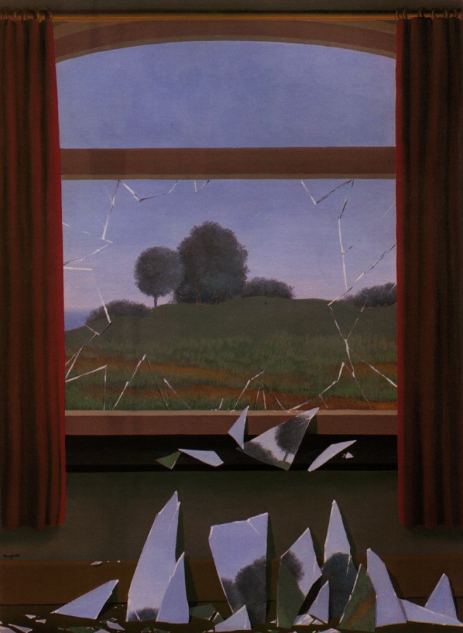
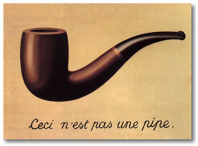
Personally I think Magritte is a central figure in understanding Millar’s large, leaning, oddly shaped stretchers. His Door to Freedom with its broken fragments is an obvious connection – albeit perhaps coincidental. Fascinatingly, in Anthony Byrt’s discussion of Velázquez’s Las Meninas in relation to Millar, he alludes to This is Not a Pipe, another Magritte painting that Foucault once wrote a small book about. Byrt discusses in his essay the famous rendered back of a painting (‘it isn’t a painting, it’s a painting of a painting’s back’) the front of which Velázquez’s figures are admiring, elaborating on the spatial tunnelling and blistering out that Velázquez is expert at – and comparing it eventually with Millar’s markmaking and the effect her painted ‘props’ will have on the La Maddalena space sculpturally – comparable with the illusionistic feats of Tintoretto, Tiepolo and Veronese.

The conversations between Paton and Millar about her visits to Venice and Turin are particularly interesting, especially in relation to the densely ornate architecture of the Scuola Grande di San Rocco in Venice which is crammed full of works by Tintoretto, whose technical wizardry and manipulation of illusory space made him the George Lucas of his day. His paintings helped make her aware of the possibility of physical intervention with architecture.

The history of Millar’s ‘shard’, or ‘Giraffe’ shape is also intriguing, coming from a spatial experiment where in an earlier possible venue last year, she cut into some painted canvases, slotted them into a row of windows and projected them out into the room. She liked the shape she discovered.

Leonhard Emmerling’s text has an interpretative conclusion totally at odds with the other writers. His five part essay is revolves around the distinction between the two Renaissance taxonomies of form, imitatio and inventio, using them to examine possibilities of the autonomy of an artwork (its relationship to the world and society) as elucidated by Frankfurt School philosophers like Adorno. It looks at how the images of Millar’s installation are constructed and how they are located within those questions.

Unlike Millar’s paint Emmerling’s writing doesn’t flow easily. (It’s dense with obscure footnotes, is tortuously longwinded, and needs an experienced, English-speaking editor – somebody like Paton – to shape it and make the vocabulary less monotonous). After considering all variations of Giraffe-Bottle-Gun’s relationship to the world, he eventually concludes that it does not meaningfully interact with it, being independent and in parallel, and not in opposition either – not opening up ‘a privileged view of the world’, nor a ‘utopian alternative’. It is inventio, not imitatio, in its disposition – and hermetic.

As I’ve tried to show, these two Millar books ‘bounce’ nicely off each other. Having only one of them is pointless, because the most informative text is probably Gross’s yet the better images (in terms of Millar’s handling of paint) are found in the bigger hardback. Its reproductions allow the reader to closely examine her painted on /wiped off marks and their internal textures and striations. The design work of this publication though is a little peculiar, individual paintings sometimes being butted together in pairs to make a larger third, or cropped irritatingly at the edges, while all three essays start with first paragraphs entirely indented, the second entirely justified, and third and rest with conventional indenting – confusing because they appear to start with a quote.

So, to summarise, if it is just Millar’s paintings that grab you, go for the thicker book; if it is her installation projects you like, take the skinny one. And if you like seeing how four different writers describe her working process, and how they respond to the marks, get both.