Nau mai, haere mai, welcome to eyeCONTACT, a forum built to encourage art reviews and critical discussion about the visual culture of Aotearoa New Zealand. I'm John Hurrell its editor, a New Zealand writer, artist and curator. While Creative New Zealand and other supporters are generously paying me and other contributors to review exhibitions over the following year, all expressed opinions are entirely our own.
Showing posts with label Judy Millar. Show all posts

Wednesday, May 12, 2010

Judy Millar currently has a show at Hamish Morrison's in Berlin. Anthony Byrt tells us all about it.


Every year, Berlin’s galleries team up to coordinate Gallery Weekend: three days of openings that attract curators, critics and collectors from all over Europe. This year, people flew in for what promised to be a pretty exciting few days. There was a buzz about the fact that some of the biggest names in the art world were having shows in the city: people queued almost round the clock to get into the new Olafur Eliasson show; and out on Heidestrasse, crowds gathered outside Damien Hirst’s opening, trying to get a peek at some of the works he didn’t sell at his Sotheby’s auction in September 2008. Other big names, though not quite as stratospheric, were also opening around town: Gursky, Wallinger, Bonvicini and Peyton among them.

In the middle of all this hype (and right next to Hirst’s exhibition), Judy Millar opened at Hamish Morrison Galerie. Millar’s show, A Better Life, is her first major installation since representing New Zealand at Venice last year. As with Venice, she hasn’t backed away from either the high-profile context or the size of the space she’s been given: it’s an all-or-nothing project, for an all-or-nothing weekend.

Extending the concerns of her Venice show, giant strips of billboard material printed with her blown-up marks collapse over each other and spill through the gallery. There’s more colour than at Venice. Complex negative curves make the piece more dynamic too, and there’s a sharper interplay between form and content. In the past, I’ve written that at ten times their actual size, her marks become graphic rather than expressive. But here she’s managed to make them architectural too, designing them to follow the curves of the structures that support them. She’s also resisted the temptation to put too many paintings on the walls, so there’s nothing to distract viewers from the main event; as one artist said to me at the opening, the work is like a single breath through the gallery.

I’ve worked with Millar many times before: so people can take or leave the fact that I think it’s a great exhibition. The more important issue is what it represents for her career. It’s no secret that the New Zealand art world has had an uneasy relationship both with her international rise and with her work for a while now. I think this is caused by three factors. First, her work demands time, and a lot of people either don’t want to, or don’t think they need to, give it the extended attention it asks for. Second, there’s a fixation with the idea that her work is primarily about abstraction, which it isn’t, and it’s therefore written off as decorative and out-of-date. Third, and perhaps most importantly, it looks out from New Zealand rather than in, participating in a global conversation about the relationship that painting has with the real world it both seeks to represent and be a part of. While there aren’t many artists in New Zealand exploring similar ideas, there are plenty of very good ones around the world who are: Katharina Grosse, Sterling Ruby, Arturo Herrera, Thomas Scheibitz and Richard Wright, to name a few. I’m not suggesting that these artists have exactly the same motivations as Millar, but there are parallels.

The fact that Millar is now participating in this conversation points to her own determination to be part of it. But it also says something about the platform that Venice has given her. Like her predecessors et al, Michael Stevenson and Peter Robinson, Venice has brought her work to the attention of international curators, collectors and writers. That’s why this exhibition with Hamish Morrison is so important: it’s her first chance to confirm that Venice wasn’t a one-off, and that she really does belong on a big stage.

There’s also a lot riding on the show for the gallery. Expatriate New Zealander Morrison was one of the first gallerists to move to Heidestrasse, which is now one of Berlin’s most important gallery strips. Over the past few years, he’s built up a diverse stable of artists including: Iceland’s Gabriela Fridriksdottir (also a Venice veteran); The Netherlands’ Ronald de Bloeme; Dresden-based painter Paul Pretzer; Britain’s Andrew Cranston; Australia’s Mikala Dwyer; and Millar. Morrison has taken a leap of faith by giving Millar the Gallery Weekend gig – one of the two most important slots in Berlin’s art calendar (the other is the start of the gallery season in September, which he’s given to Dwyer). But if reaction at the opening is anything to go by, the gamble is paying off.

Morrison, and Millar’s other dealers Mark Müller (Zurich) and Gow Langsford (Auckland), will all have been perfectly aware that once Venice was over it was up to them to push the artist’s career forward. This raises a challenging question for CNZ though, about who benefits most from their massive investment in the bi-annual event. Obviously the artists do well out of it. Their dealers do too: Venice, for any artist from any country, still serves as a quality-mark for collectors. However, there might still be questions about the value it creates for New Zealand; the old ‘home or away’ debate that causes CNZ – and New Zealand artists based overseas – endless amounts of grief. The anachronistic ‘national’ structure of Venice doesn’t help. But the harsh truth is, this national angle doesn’t really matter much any more. In a global art world, there’s nothing inherently interesting about an artist being from New Zealand: it only becomes interesting when that artist harnesses their point of cultural difference to make work that contributes in a worthwhile way to international conversations. This is exactly what Millar has done, and what et al, Stevenson and Robinson did before her.

Millar’s show with Hamish Morrison then, is exactly the sort of thing that CNZ should be pointing to as a positive outcome from their investment in Venice. A Better Life, and the results that will likely come from it – museum shows, big collections, residencies – illustrate that there is life after Venice for New Zealand artists, even if that life doesn’t play itself out at home.

Images courtesy of the artist and Hamish Morrison Gallery

Sunday, February 28, 2010

Bringing It All Back Home: Part One

Judy Millar: Giraffe - Bottle - Gun
New Zealand at the 2009 Venice Biennale
Te Papa Tongarewa
26 February – 15 August 2010

Most people in New Zealand’s art world snort when you mention the galleries of Te Papa, namely the long skinny corridor on Level Five that has ended up partially replacing the many varied spaces of the old National Gallery. How odd then that for this show, involving the bringing home of the two exhibitions representing this country last year in Venice, that that same narrow space looks apt, even superior, to the original Italian venues.

Even though the ceiling is tilted, the projects have been placed in – what best can be described as - modernist ‘shoe boxes’, long rectangular rooms: divided into three with an artist at each end and in the middle, an account of the history of Aotearoa New Zealand exhibitions in Venice.

Te Papa’s austere white spaces, with their direct straight planes and ‘clean’ lines, are completely devoid of baroque ornamentation, undulating surface, religious ambience and competing Italian artists. They are much much simpler than the Venetian interiors. And it works beautifully.

In their psychological impact on the viewer the two shows are direct opposites. Therefore, instead of making point-by-point comparisons, I'll discuss Upritchard's contribution in Part Two.

Millar’s Giraffe - Bottle - Gun is overwhelming in its scale. It doesn’t aggressively and confusingly compete with the architectural interior of the venue as it did in Venice, forcing the viewer to move close to the outer walls, but is focussed instead on Millar’s huge sculptural objects that are covered with photographically enlarged, dramatic paint marks. These undermine the solidity of the forms’ surfaces. The massive baroque-inflected arabesque lines have on occasion dissolving edges, a quality you don’t get with paint but do with enlarged photocopies.

This display draws out Millar’s debt to Richard Serra, especially the huge central cylinder that curls within itself and is raised up and gently tilted to one side. Its curved surfaces dominate the room, and provide an intriguing foil for the leaning and overlapping rectangular and trapezoid forms, and of course the various ‘giraffes’, ‘bottles’ and ‘guns’ – the unusual right-angled shape Millar has invented with its distinctive concave, inner edge.

There is a strong sense of the sublime here, for the puny size of the viewer is accentuated. It is extroverted work that sucks the visitor’s attention away from themselves and out into the flame or water-like parallel lines, layered clusters of specks and exploding angular scrapes dwelling on the stretched skin surfaces.

What is impressive is the stunning physicality of Millar’s presentation. It shows what a great idea her use of digitally enlarged paint marks has turned out to be when mixed with architectural intervention. However her inclusion of four conventional ‘subtractive’ paintings on paper, and framed under glass, is a backward step. They are admittedly gorgeous but ruin the effect of the bigger digital components, and should have been omitted. They don’t fit in at all well into the space.

It is extremely rare to have an installation as immersive as this in Te Papa, one that is also optically painterly and bodily sculptural. It is not perfect – the four works on paper prevent that – but it is easily the most significant achievement of Millar’s career so far.

The above images are not in situ but made from preparatory models.

Monday, January 25, 2010

Two Millar publications


Judy Millar: Giraffe-Bottle-Gun
With an essay by Jennifer Gross and an introduction by Jenny Harper
Ed. Leonhard Emmerling
This catalogue was published for the Judy Millar exhibition of the same name at the 53rd Venice Biennale
56 pp, coloured images of the installation, English text
Kerber softcover 2009

Judy Millar: You you, me me
Two essays by Anthony Byrt and Leonard Emmerling, also with Judy Millar in conversation with Justin Paton
Editor Leonhard Emmerling - the exhibition's curator.
Translated by L. Emmerling and Anita Goetthans.
Again, published in coordination with the exhibition Giraffe–Bottle-Gun in Venice.
182 pp, coloured illustrations of her paintings, English /German texts
Kerber hardcover 2009

These two books are quite different. One is specifically about last year’s Judy Millar Venice Biennale exhibition inside the domed apse of Chiesa La Maddalena, the other about Millar’s practice in general as it led up to that show. If we use them to think about Giraffe-Bottle-Gun (I never got there so I’m really curious about this installation) then the Gross essay is the most useful, after that the chattier Byrt, and then the contextually informative Paton /Millar contribution.

So, looking at the smaller book: Jennifer Gross is a contemporary art curator at Yale who obviously wrote her essay after seeing the installation when it was up, unlike the New Zealand–based writers in the thicker hardback. Alongside the included on-site photos she gives a clear sense of Millar’s aims behind her project, though in my opinion her discussion of Italian artists like Michelangelo and de Chirico is of little benefit.

Overall Gross’ essay is good because she zeros in on how Millar’s installation confronts the religious architecture and subverts the space – physically and politically. This Millar achieves in a number of ways: Firstly by obstructing the centre of the church with a large tilted, wide cylinder that restricts viewer movement to clinging to the outer curved walls. Secondly by referencing a shattered (modernist) picture plane with towering stretchers that are Giraffe-Bottle-Gun shaped like shards of smashed window glass. Thirdly to have amongst the many associations (Gross’ prose describing them is quite ‘purple’) created by the wiped off - but photographically enlarged – paint, the licking flames of Hell. They disturb inside a church. Fourthly, by creating a knowing and self conscious exhibition in a church for an art biennale which will attract thousands of ‘art believers’, a work that is not ironical or anti-art.

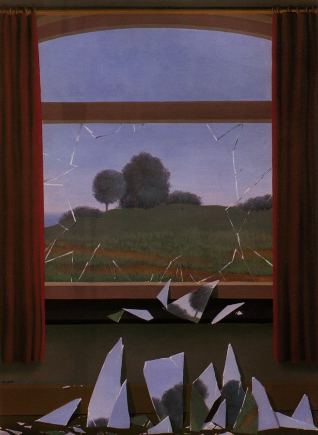
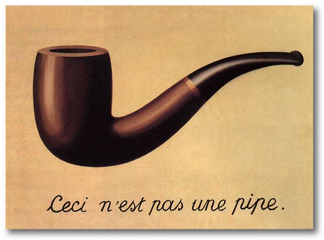
Personally I think Magritte is a central figure in understanding Millar’s large, leaning, oddly shaped stretchers. His Door to Freedom with its broken fragments is an obvious connection – albeit perhaps coincidental. Fascinatingly, in Anthony Byrt’s discussion of Velázquez’s Las Meninas in relation to Millar, he alludes to This is Not a Pipe, another Magritte painting that Foucault once wrote a small book about. Byrt discusses in his essay the famous rendered back of a painting (‘it isn’t a painting, it’s a painting of a painting’s back’) the front of which Velázquez’s figures are admiring, elaborating on the spatial tunnelling and blistering out that Velázquez is expert at – and comparing it eventually with Millar’s markmaking and the effect her painted ‘props’ will have on the La Maddalena space sculpturally – comparable with the illusionistic feats of Tintoretto, Tiepolo and Veronese.

The conversations between Paton and Millar about her visits to Venice and Turin are particularly interesting, especially in relation to the densely ornate architecture of the Scuola Grande di San Rocco in Venice which is crammed full of works by Tintoretto, whose technical wizardry and manipulation of illusory space made him the George Lucas of his day. His paintings helped make her aware of the possibility of physical intervention with architecture.

The history of Millar’s ‘shard’, or ‘Giraffe’ shape is also intriguing, coming from a spatial experiment where in an earlier possible venue last year, she cut into some painted canvases, slotted them into a row of windows and projected them out into the room. She liked the shape she discovered.

Leonhard Emmerling’s text has an interpretative conclusion totally at odds with the other writers. His five part essay is revolves around the distinction between the two Renaissance taxonomies of form, imitatio and inventio, using them to examine possibilities of the autonomy of an artwork (its relationship to the world and society) as elucidated by Frankfurt School philosophers like Adorno. It looks at how the images of Millar’s installation are constructed and how they are located within those questions.

Unlike Millar’s paint Emmerling’s writing doesn’t flow easily. (It’s dense with obscure footnotes, is tortuously longwinded, and needs an experienced, English-speaking editor – somebody like Paton – to shape it and make the vocabulary less monotonous). After considering all variations of Giraffe-Bottle-Gun’s relationship to the world, he eventually concludes that it does not meaningfully interact with it, being independent and in parallel, and not in opposition either – not opening up ‘a privileged view of the world’, nor a ‘utopian alternative’. It is inventio, not imitatio, in its disposition – and hermetic.

As I’ve tried to show, these two Millar books ‘bounce’ nicely off each other. Having only one of them is pointless, because the most informative text is probably Gross’s yet the better images (in terms of Millar’s handling of paint) are found in the bigger hardback. Its reproductions allow the reader to closely examine her painted on /wiped off marks and their internal textures and striations. The design work of this publication though is a little peculiar, individual paintings sometimes being butted together in pairs to make a larger third, or cropped irritatingly at the edges, while all three essays start with first paragraphs entirely indented, the second entirely justified, and third and rest with conventional indenting – confusing because they appear to start with a quote.

So, to summarise, if it is just Millar’s paintings that grab you, go for the thicker book; if it is her installation projects you like, take the skinny one. And if you like seeing how four different writers describe her working process, and how they respond to the marks, get both.

Saturday, November 14, 2009

Must painting require a painted surface?


Judy Millar
Gow Langsford
11 November – 5 December 2009

With this current Judy Millar exhibition we get the chance to look closely not at the actual works of her Venice installation (it comes down in a week) but at some ‘unshaped’ rectangular works made at the same time, using the same scanning technology.

There has been a certain amount of controversy around Millar’s methodology here. Some feel she has abandoned the surface qualities of painting, and that she is somehow cheating by scanning a small painted image that is then considerably enlarged to suit the spatial and architectural circumstances of each venue. That by using digital and photographic techniques the claim to be painting is forfeited. That she should have used very big brushes like brooms, or assistants for muscle-power if needed, to make the whopper subtractive ‘paint-marks’ she displayed. That small paintings on paper used for scanning cannot possibly provide anything like the fine grained texture of directly applied viscous paint when enlarged.

The counter-argument I think would go like this. The above comments are fair enough if Millar was trying to work in the same tradition as say Bernard Frize, where the boundaries of the notion of manual control in mark-making are being extended – but she is not participating in that discussion. Her work’s methodology is really akin on one hand to Roy Lichtenstein’s pretend comic-book brushstrokes which are enlarged drawings of brush marks, and on the other, the digital scanning technology that somebody like Christopher Wool often uses. The notion of the wiping hand or sweeping arm correlating to 1:1 ratio sized marks is not so relevant now – though it was of course earlier on.

Millar’s priorities have changed because she is concentrating now more heavily on architectural intervention – an interest she first proclaimed with her Robert Leonard curated show at the New Gallery in 2005. This the Gow Langsford presentation clearly and brilliantly demonstrates. The planes of the two very large stretchers and the marks their ‘fake’ surfaces bear calculatedly thwart the palpable real space of the room – to the extent of one even being jammed between a white column and wall so that a section is hidden, and the other being suspended out towards the centre of the room away from the wall surface. The canvas is an object to be played with as a movable barrier as well as a depth-laden illusionistic ‘window’.

Apart from methodology, a second issue is surface, the lack in the enlarged images of the different matt and gloss sheens detectable in her older ‘proper’ painting. I imagine Millar could have faked these qualities if she had wished, by screening strategic lines of glossy varnish over parts of the digital images – particularly mark ‘edges’ - but she decided not to bother. She let them stay consistently matt.

Let us consider the fact that some painters varnish their image surfaces (the whole picture plane), not for reasons of physical protection but to integrate the surface qualities of different media – to provide a less optically disruptive uniformity, especially with dark tones. The scanned works have those qualities as given, and Millar could have varnished her smaller works to match them

The problem she has with her Auckland show is that she is mixing up her painting-surface types and that jeopardises her aesthetic rhetoric – it undermines her argument. She should be consistent, take a definite position and stick to it. The small conventional, non-scanned works could be matt varnished over their entire surfaces to correlate with the large stretchers, or the whoppers could have fake glossy streaks or edges superimposed to mimic the smaller ‘authentic’ paintings. Or else have all works placed under glass - as one work on paper is.

Millar is hesitating when I think she should be more theatrical, treating surface with the same lack of preciousness that she treats architectural space. She needs to tease her audience even more than what she is doing already. What if she scanned all her works and rejected surface qualities altogether, making the two sorts indistinguishable. By abandoning any interest in tactile surface she could focus entirely on site, forget the historically entrenched mores of painting and concentrate totally on it as an idea without a past, concentrating on ‘pure’ installation as architectural intervention instead.

Wednesday, December 10, 2008

Brmmm, brmmm


Group Show: Clock the Ton
Gow Langsford
9 December - 30 December 2008

Nifty title this, for those determined to race down country roads at more than 100 mph. An unusually hoony moniker for a Xmas show. It also means you can count 100 works here, each no bigger than 600 square millimetres. It postulates the premise that size is not the same as scale, that formal and emotional impact can’t be measured with a ruler or light meter. Really though it is about sales not perception. Who’d dream otherwise?

Represented here are eighteen artists: Ball, Cotton, Cousins, George, Frizzell, Gimblett, Hight, Hughes, Ingram, Maddox, Maguire, Maugham, McWhannell, Millar, Murado, Nitsche, Paterson, and Pule. Though they average out at five works each, some in fact only have one (McWhannell, Hughes and Cotton) and others eighteen (Antonio Murada).

I normally hate salon hangs and I especially hate Christmas shows. But this seems like one work, a particularly crazy composite by some deranged artist influenced by Killeen. The odd thing is that the randomness and density of the hang is perversely entertaining. It is not easy to compare, say, all the Gimbletts or Murados, or Maddoxes. You have to concentrate to find them and then come up with an opinion about which work would best represent that artist, should that item somehow appear in your fantasized ideal Christmas stocking at the end of your bed.

It also allows you to ferret out recent changes in artists’ practices. You can examine say James Cousins’ optically unpredictable, zigzaggy fields, or the peculiar aluminium shapes Judy Millar is now working on that have a concave contour included. These edges pointedly enclose as a negative form, the plane of the supporting wall - and seem to indicate the underpinning architectural context.

If you want to temporarily forget your aesthetic sensibilities - and be like me a nosey parker when it comes to artists - check out this show and indulge your drifting, wandering eye.

Tuesday, September 9, 2008

Putting it on, taking it off


Callum Innes
Jensen Gallery
26 August - 20 September 2008

In this country the additive and subtractive processes of using materials to create artworks haven’t received the analytical attention as you might suppose they deserve, but in recent years ‘subtraction’ has been increasing its profile, in painting as well as sculpture.

Before I get to Innes I’m gong to meander a little. The links between the three artists I discuss here are obvious.

I first came upon the notion of ‘subtraction’ in the first Billy Apple work I ever experienced, a print room in Christchurch’s CSA which Billy had emptied out in 1975 as one stop on his national tour – all light fittings, switches, drawing pins – every superfluous item removed. Not only was the natural light and austerity very beautiful, but I was particularly impressed by Wystan Curnow’s wall statement:

The result of subtraction is absence. But absence cannot be defined as the result of subtraction. The reason being that absence does not necessarily imply there was anything there to begin with.

I really like this statement because it deals with what is visually evident. It insists that you think about what is before you – and what might be missing.

Judy Millar is another artist who employs subtraction, not as sculpture (like Apple) but as part of a painting process that is meant to exemplify irony. In her 2003 catalogue How to Paint Backwards, Anthony Byrt in an essay discussing the wiping off processes claims that her paintings ‘carry that sense of the viewer being able to penetrate the fluid surface with relative ease and it’s this fluidity that creates a desire for immersion rather than just surface contact.(p.5)’

So what is the significance of this ‘immersion’? I'm probably over simplifying but Byrt talks about the ‘weird spatial relationships between gesture and ground’ that cause underlying blocks of colour to ‘appear to be overpainting above her marks (p.6).’ The ‘painting backwards’ process is intended to deconstruct any expressionist connotations by acting out the role of making gestures ‘of expressive self’ instead of making marks that functioned sincerely as ‘an expressive act of self (p.3)’.

Yet in Millar’s work, like Apple’s, the process is not readily apparent. Though talked about as ‘looking back’ and embodying ‘inside–out-ness’, the material evidence is hard to perceive. The viewer needs a textual or verbal guide to understand a method that is so subtle it would reveal itself more by touch than by eye.

Not so for the related processes in Scottish painter Callum Innes’ production. The principles involved are comparatively detectable, though the number of turpentine washes needed to remove brushed on paint would be impossible to ascertain from the smudgy exhibited traces. Sometimes he leaves no traces at all so that some once paint-covered surface areas look completely untouched.

On Jensen's ground floor there are 15 works. If we analyse there are basically five sorts of painting:

(1.) The well known Exposed Painting series where the stretcher is divided up so that one rectangle of horizontally brushed on oil paint is left untouched. Some areas of white gesso look totally virgin, while the rectangle below shows traces of repeated vertical dribbles and thin stains of diluted pigment. Sometimes plummeting down from the bottom righthand corner of the painted rectangle is a solitary, smoky, curving, linear lick of dissolved pigment. Enigmatic and gorgeous.
Often there are varied treatments of oblong edges too.

(2.) The diptyches. Each is a stretcher divided in half; one side painted and left intact, the other with partially paint removed, so that the canvas looks smudged with faintly blurry traces. Sometimes the sides of the stretcher reveal paint remnants.

(3.) Two metre high works on paper that are framed and under glass. These look like bark patterns, like some sixties Australian ‘tree-based’ abstractions. Dramatic vertical rectangles, they have rows of repeated negative ‘brush’ lines erased into the paint.

(4.) Large smoky canvases covered with vertical lines that are sometimes so fine they even look scraped. They are powerfully evocative, beautifully composed with large portions of stained, ’removed’ canvas. The angular shapes make them vaguely reminiscent of the American artist Clyfford Still. They could initially be mistaken for charcoal drawings.

(5.) These speckled canvases have painted on shellac that has then been dissolved to leave specks and little crumbling islands of solid matter. They (the islands) seem thrown onto the canvas but are not. The surface has been painted first and then a solvent thrown on, I suspect, to leave eventually untouched grains of residue.

Innes’ trademark rivulets, stains and trickles are very seductive, especially when he combines his processes with careful placement of solid or semi-dissolved rectangles. Like those of Bernard Frize and Alexis Harding, Innes’s shows are a treat. It is always a pleasure to engage with the pigment application processes and procedural logics such innovative painters invent.