Nau mai, haere mai, welcome to eyeCONTACT, a forum built to encourage art reviews and critical discussion about the visual culture of Aotearoa New Zealand. I'm John Hurrell its editor, a New Zealand writer, artist and curator. While Creative New Zealand and other supporters are generously paying me and other contributors to review exhibitions over the following year, all expressed opinions are entirely our own.

Thursday, January 28, 2010

Five artists at Tim Melville's


Sunblock
Tim Melville Gallery
26 January - 27 February 2010

Tim Melville has organised this group show of Elliot Collins, Annika Roughsey, Linden Simmons, Joyanne Williams and Wayne Youle. There is lots of work by Collins, with two from Simmons (same works as recently seen in Snowwhite), and one each from Youle and the two Australians, Williams and Roughsey.

Simmons’ two delicate and meticulous watercolours are based on newspaper photographs, something I never realised when I last saw them at UNITEC – usually of natural disasters or horrific man-made tragedies. They spot-light the nature of desensitisation – whether of the casual reader perusing the Herald over morning tea at work, or the visitor looking at these works in a gallery, or the artist himself perpetuating it via ‘beauty’ and a visual ‘sensitivity’. One watercolour is based on a photo of an air crash, another of an atomic bomb cloud – perhaps generating the exhibition’s clever title. In other words it speaks of blocking out radiation, or avoiding unpleasant thoughts – as much as escaping the effects of summer sunlight.

The vertical canvas stretchers of the two Aboriginal painters reference ancestral creatures, possibly their body surface-coverings like scales (Williams) or feathers (Roughsey), or even aerial views of landscape and ancestral homelands. William’s painting has a wonderful sensitivity where the thin white brushtip marks let the black background peek through the dry transparent liquid.

Wayne Youle’s small painting is a gorgeous little flat abstraction that has three vertical pharmaceutical capsules lined up in a horizontal row. Their curved ends press gently against the upper and lower edges while their three alternating white halves pulse against the soft pink-gray background. The title, A bitter pill to swallow, seems at odds with the seductive nature of the work, as if it were an epiphany, some newly arrived-at but shocking revelation Youle was quietly pondering. Perhaps an unpleasant truth about the nature of art itself.

The Elliot Collins works are of two types: bisected abstracted landscapes, and texts. The former seem from a distance to be like impeccably smooth Bryce Mardens but when you get closer you realise they are painted on hessian. That coarsely woven material means you think of McCahon (especially with the biggest work that has a wonderful cow-shit green for a sky – a witty reversal), and Fomison and Clairmont. You see the texture under the paint surface as well as the occasional hole. And memories of those seminal artists interfere with your viewing of these painted rectangles that cannot remain formally pure but reek of New Zealand art history.

That interest in narrative is the key to Collins’ sensibility, his love of language as a material being like the paint he often agitates beneath it. He is getting better and better at putting words together in entertaining and sometimes truly moving arrangements.

How about this for spell-bindingly slippery inventiveness:
I was walking along the beach yesterday and saw a man with a dog who was fighting a stick and the whole event fell into a beautiful superlative, in the universal scene. You know. Small, smaller, smallest.

I can read that over and over and not tire of laughing - as the ambiguous/confusing words turn into a movie that pulls back away from the tormented walker and his frisky animal.

What about this one about the sudden simplicity, relief and exultation of newly discovered love:
Here I give thanks that falling in love with strangers is not inappropriate or weird.

These contemplative paintings are interesting with their flipped-back and interwoven mental sequences, and subtly interfering painted backgrounds that vary from churning brushmarks to galaxies of toothbrush-flicked white on black specks.

Collins’ play between mental picturing and viewed text goes well with the tension that Linden Simmons achieves with his seductive watercolour fineness and disturbing sources, or the flipping to and fro of Youle’s pill abstraction, and Williams and Roughsey’s animal surfaces and birds-eye landscapes. Though sometimes Melville hangs different works too closely together on the two main walls of his rather intimate space, this thoughtfully assembled exhibition is quite exceptional.

Artists’ images in descending order: installation of back wall; Simmons; Simmons; installation in main space; Williams; Youle; Collins; Collins.

Andrew Paul Wood has been squizzing at some nudes in Christchurch

The Naked and the Nude
Curated by Justin Paton
Christchurch Art Gallery Te Puna o Waiwhetu
18 December 2009 - 18 April 2010

Just as once upon a time the conscientious English teachers at my Catholic high school drummed into me the difference between ‘sensuous’ and ‘sensual’ (one is dirty and the other isn’t – but I can no longer remember which is which), there is a difference between ‘naked’ and ‘nude’. One is naked in the bathroom belting out show tunes in the Zen satori of a hot shower, but one is nude when one welcomes the gaze of another on one’s unclothed self. Therefore all works in Christchurch Art Gallery’s skin show The Naked and the Nude must be, by definition, nudes.

Admittedly, from the very beginning, there has been a certain resistance to nudes in art in New Zealand (ithyphallic carvings of Maori ancestors aside). The emphasis was historically on another kind of rapacious, possessive gaze – that of the colonial landscape. One recalls talented Dunedin amateur watercolourist William Hodgkins (father of the infinitely more famous Frances) joined Girolamo Nerli’s lessons in figure painting – but such was his sense of propriety (the model was nude), or else his embarrassment at his inadequate ability, he kept it quiet. Frances wrote to her sister Isabel in April 1894:
For several evenings Father has gone out ostensibly on business but has always returned with a large portfolio which he instantly secreted in the most mysterious manner in his study. I was most curious and yesterday I solved the mystery and I confess it gave me a bit of a shock. It turns out that he is attending a nude class at Nerli’s studio and he is much too ashamed to own it.
Given Frances was twenty-five at the time, her shock is a little difficult to understand – she was hardly unworldly. Perhaps it’s different when it’s your sixty-one-year-old father. His reticence in revealing the lessons might have more to do with Frances’ tendency to be a scathing about his abilities. She must have been a terrible trial for him. When Frances wrote to her mother about her father’s activities, she took a deliberately innocent tone, no doubt to wind her mother up: “Father has developed into quite a figure painter and has actually persuaded Dr Scott to join the life class they are both quite enthusiastic about it”. Bitch.

Even when the western nude crops up in New Zealand art at its most brazen and direct in the first quarter of the twentieth century, it still feels awkward. Louis John Steele was responsible for what is perhaps the earliest example of imaginative Maori-themed cheese-porn, Spoils to the Victor (Auckland Art Gallery, 1908), also after the style of the French Orientalists, depicting a buxom young wahine captive, décolleté fully exposed, bound to column - politically deeply incorrect by today’s standards, and fairly outré then as well.

Hell, I remember being confronted by a wall of roly-poly pinkness in the form of a Reubens hang at the Neue Pinakothek in Munich – and I didn’t know where to put my hands (I had to run outside for a cigarette). Let us, then, examine the CAG show.

It would all be worth it just for the decadent inclusion of dirty old Australian Norman Lindsay, a Picasso etching/drypoint of Minotaur attacking an Amazon (1933, and really that ‘attacking’ should be ‘raping’) and two exquisite Van der Veldens. I didn’t even know Goldie had ever done a nude – evidenced here as a young European women in modest shadows à la Ingres, circa 1898. There is even what can only be described as Swedish postcard porn in the form of the photograph Water nymphs by Anders Zorn (1918).

It is also good to see no less than three works by the much underrated Martin Whitworth – an artist with a deft line and an obvious reverence for Kitaj. And for all of those who always found Richard McWhannell a little on the dull side, there is a major shock as he goes gonzo channelling Francis Bacon and De Chirico in the triptych Holy Holy Holy (1987).

Of course nudes and erotica are not exactly the same thing – although some of the great canonical works are quite capable of inducing discomfort of the trousers. Clearly, though, the nude can also convey a broad gamut of concepts from modesty to vulnerability. Joanna Braithwaite’s monkey-headed victim, Little monkey (1997), crouched in a foetal position in some dark and indefinable place of incarceration, is a quasi-scientific subject – a product of genetic experimentation cast aside. One is reminded of Ursula K. Le Guin’s 1973 short story “The Ones Who Walk Away from Omelas” in which a utopian community’s perfection is leavened by a dear price – every citizen knows that in a windowless, subterranean cell is a single prisoner (one of their number, incarcerated in childhood), whose grim fate is to sacrificially bear the squalid burden of all the community’s wretchedness and suffering. Such is the price of utopia. There is also the fictional city of Perinthia in Italo Calvino’s Le città invisibili (1972): a city built to astrological calculations intended to reflect heaven. The streets are filled with dwarfs, hunchbacks and bearded women, but the worst can only be heard as grunts and growls from cellars and lofts. The astrologers must therefore decide whether to admit that they made a mistake, or that the gods are monsters. Substitute ‘genetic engineer’ for ‘astrologer’ and Braithwaite’s message is much the same.

Far from attractive is Steve Carr’s A Shot in the Dark (The Bachelor) (2008) – bared hairy beer-belly (like those awful, tedious whistling stomachs of Telethons of yore) transformed into a moose face by the placement of hands. I do not particularly care for Carr’s brand of grunge-esque slackerism, but it does demonstrate the versatility of the nude theme. The nude in Grahame Sydney’s etching Evening in the Studio (1987) is virtually invisible in the shadows, but is still demonstrably a nude. For similar reason’s it is not entirely clear as to why our own editor, John Hurrell’s Updike slo-mo (1994) is included – one of his alphabet soup word paintings – except that it reproduces the text of one of John Updike’s cringe-inducing sex scenes (one thing the creator of Rabbit was never very good at). Another of these ‘nude that wasn’t there’ (sort of visual versions of the mystery of the dog that didn’t bark in the nighttime) is Jude Rae’s Clérambault’s dream (1994) – a trompe l’Œil drapery that alludes to the psychologist G. G. de Clérambault (1872-1934), who had a fetish for photographing fabric draped over mannequins.

Then there is the downright odd, like Barry Cleavin’s etching/aquatint Girl with no head on a swing (1971) – which pretty much does what it says on the tin in a ghoulishly Goya-esque way.

Other works like Di Ffrench’s The life-drawing class (1990) and Richard Killeen’s About drawing a woman at the centre (1984) are straightforward responses to the feminist construction of art as primarily concerning the male gaze. The Killeen is a bit of a cheat, because the abstractly represented woman is in fact clothed. Retroactive cultural norms are a bit of a bore. Personally I think the idea of an exclusively male gaze is a laboured one because male artists have never exclusively looked possessively at just women (cf. Michelangelo, Leonardo da Vinci, Caravaggio); and though rare, women artists are historically represented in the record (Artemisia Gentileschi, Angelica Kaufmann); and in many instances that arguably the female nude seems to exert an imperious power over the viewer (and presumably the artist). The latter is very much in evidence in Manet’s Olympia.

It seems everyone has had a revisionist crack at Manet’s reclining courtesan Olympia, itself an ironic paraphrase of Titian’s Venus of Urbino. George Baloghy’s Antipodean Olympia (1981) is merely the artist inserting himself in the family tree of western art. This kind of postmodern magpie pick-‘n’-mixing is very much a product of its time. Leonard Booth’s The awakening (Vanity) (c.1927) likewise represents the self-referential nature of art, though this sumptuous odalisque is much more straightforwardly academic and from life, and owes more to Velázquez than Manet.

There are also the uncomfortable moments of recognition. Anyone familiar with the South Island art world will immediately recognize the subject of Christine Webster’s Blood (1992).

One day, when I have time and patience enough, I intend to write a monograph on the homoerotics of New Zealand art, and certainly some of the works in this show give me pause for thought over my port and stilton.

An obvious example is a Paul Johns contribution of a Warholian prettyboy masquerading as a Flemish dead Christ. There are also the classical allusions in a fragmentary sculpture torso from the Vatican collections, sketched by Bill Sutton. I don’t give a rat’s arse what side Sutton’s bread was buttered – although Pat Unger feels the need to include an appendix on the subject in her third biography of this gentle doge of Canterbury art – but a certain tension in its asymmetrical composition is undeniable.

In the late 1920s and early 1930s, while other Canterbury artists (especially the women) were painting landscapes, Evelyn Polson was painting nudes, moving in the 1940s to cityscapes. Eventually she married the musician Frederick Page. Evelyn Page was a pioneer of the nude in New Zealand, drawing the ire of the prudes in 1926 when Figure Out of Doors was exhibited in Auckland, and arguably Summer Morn (1929) is the most outstanding of these. Although rendered in a French impressionistic manner, there is something of the Victorian painters of classical scenes like Lawrence Alma-Taldema and Lord Leighton. There is something defiantly idyllic – a sun-dappled riverine or lacustrine scene (possibly Karamea) of three healthy young women mucking about. The image is more sensuous (as we were once taught to carefully distinguish at school) than sensual. Eroticism is there, but it is not overt. The viewer becomes a voyeur, an Acteon intruding on Diana’s bath. What a peach.

The style suggests an interest in French Impressionism and post-Impressionism, Monet perhaps. The dominant figure is the female nude, standing on a tree branch, perhaps about to dive into the water for a swim. Her pose – one hand on hip, the other hand holding on to the sparkling green curtain of foliage, probably the willow found on the banks of many South Island rivers, a symbolic nod to the velvet and bullion-fringed drape of the academic study – suggests an invitation or challenge to the two more timid, clothed girls in the boat. It is very much a New Zealand scene, but perhaps with just a barely suggested hint of suppressed Sapphic eroticism which was shocking to audiences at the time. The dominant figure in the composition is an Edwardian Antipodean Venus with intimations of classical statuary.

Even despite our modern ambivalence, this is a fairly brave exhibition for a public gallery, and a highly enjoyable one.

Monday, January 25, 2010

Two Millar publications


Judy Millar: Giraffe-Bottle-Gun
With an essay by Jennifer Gross and an introduction by Jenny Harper
Ed. Leonhard Emmerling
This catalogue was published for the Judy Millar exhibition of the same name at the 53rd Venice Biennale
56 pp, coloured images of the installation, English text
Kerber softcover 2009

Judy Millar: You you, me me
Two essays by Anthony Byrt and Leonard Emmerling, also with Judy Millar in conversation with Justin Paton
Editor Leonhard Emmerling - the exhibition's curator.
Translated by L. Emmerling and Anita Goetthans.
Again, published in coordination with the exhibition Giraffe–Bottle-Gun in Venice.
182 pp, coloured illustrations of her paintings, English /German texts
Kerber hardcover 2009

These two books are quite different. One is specifically about last year’s Judy Millar Venice Biennale exhibition inside the domed apse of Chiesa La Maddalena, the other about Millar’s practice in general as it led up to that show. If we use them to think about Giraffe-Bottle-Gun (I never got there so I’m really curious about this installation) then the Gross essay is the most useful, after that the chattier Byrt, and then the contextually informative Paton /Millar contribution.

So, looking at the smaller book: Jennifer Gross is a contemporary art curator at Yale who obviously wrote her essay after seeing the installation when it was up, unlike the New Zealand–based writers in the thicker hardback. Alongside the included on-site photos she gives a clear sense of Millar’s aims behind her project, though in my opinion her discussion of Italian artists like Michelangelo and de Chirico is of little benefit.

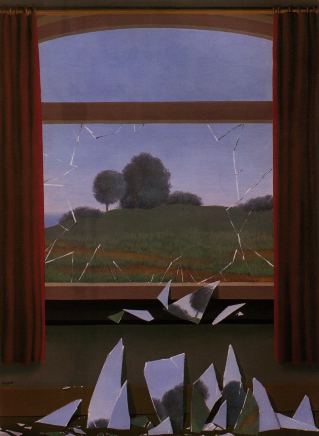
Overall Gross’ essay is good because she zeros in on how Millar’s installation confronts the religious architecture and subverts the space – physically and politically. This Millar achieves in a number of ways: Firstly by obstructing the centre of the church with a large tilted, wide cylinder that restricts viewer movement to clinging to the outer curved walls. Secondly by referencing a shattered (modernist) picture plane with towering stretchers that are Giraffe-Bottle-Gun shaped like shards of smashed window glass. Thirdly to have amongst the many associations (Gross’ prose describing them is quite ‘purple’) created by the wiped off - but photographically enlarged – paint, the licking flames of Hell. They disturb inside a church. Fourthly, by creating a knowing and self conscious exhibition in a church for an art biennale which will attract thousands of ‘art believers’, a work that is not ironical or anti-art.

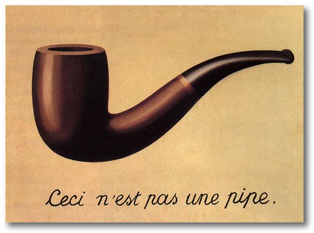
Personally I think Magritte is a central figure in understanding Millar’s large, leaning, oddly shaped stretchers. His Door to Freedom with its broken fragments is an obvious connection – albeit perhaps coincidental. Fascinatingly, in Anthony Byrt’s discussion of Velázquez’s Las Meninas in relation to Millar, he alludes to This is Not a Pipe, another Magritte painting that Foucault once wrote a small book about. Byrt discusses in his essay the famous rendered back of a painting (‘it isn’t a painting, it’s a painting of a painting’s back’) the front of which Velázquez’s figures are admiring, elaborating on the spatial tunnelling and blistering out that Velázquez is expert at – and comparing it eventually with Millar’s markmaking and the effect her painted ‘props’ will have on the La Maddalena space sculpturally – comparable with the illusionistic feats of Tintoretto, Tiepolo and Veronese.

The conversations between Paton and Millar about her visits to Venice and Turin are particularly interesting, especially in relation to the densely ornate architecture of the Scuola Grande di San Rocco in Venice which is crammed full of works by Tintoretto, whose technical wizardry and manipulation of illusory space made him the George Lucas of his day. His paintings helped make her aware of the possibility of physical intervention with architecture.

The history of Millar’s ‘shard’, or ‘Giraffe’ shape is also intriguing, coming from a spatial experiment where in an earlier possible venue last year, she cut into some painted canvases, slotted them into a row of windows and projected them out into the room. She liked the shape she discovered.

Leonhard Emmerling’s text has an interpretative conclusion totally at odds with the other writers. His five part essay is revolves around the distinction between the two Renaissance taxonomies of form, imitatio and inventio, using them to examine possibilities of the autonomy of an artwork (its relationship to the world and society) as elucidated by Frankfurt School philosophers like Adorno. It looks at how the images of Millar’s installation are constructed and how they are located within those questions.

Unlike Millar’s paint Emmerling’s writing doesn’t flow easily. (It’s dense with obscure footnotes, is tortuously longwinded, and needs an experienced, English-speaking editor – somebody like Paton – to shape it and make the vocabulary less monotonous). After considering all variations of Giraffe-Bottle-Gun’s relationship to the world, he eventually concludes that it does not meaningfully interact with it, being independent and in parallel, and not in opposition either – not opening up ‘a privileged view of the world’, nor a ‘utopian alternative’. It is inventio, not imitatio, in its disposition – and hermetic.

As I’ve tried to show, these two Millar books ‘bounce’ nicely off each other. Having only one of them is pointless, because the most informative text is probably Gross’s yet the better images (in terms of Millar’s handling of paint) are found in the bigger hardback. Its reproductions allow the reader to closely examine her painted on /wiped off marks and their internal textures and striations. The design work of this publication though is a little peculiar, individual paintings sometimes being butted together in pairs to make a larger third, or cropped irritatingly at the edges, while all three essays start with first paragraphs entirely indented, the second entirely justified, and third and rest with conventional indenting – confusing because they appear to start with a quote.

So, to summarise, if it is just Millar’s paintings that grab you, go for the thicker book; if it is her installation projects you like, take the skinny one. And if you like seeing how four different writers describe her working process, and how they respond to the marks, get both.

Saturday, January 23, 2010

Negotiating institutional space


Infinite Leave to Remain: Richard Frater, Patrick Lundberg, Susie Thomas
St. Paul St Gallery - foyer and outer streetfront window
21 January - 12 February 2010

In this unusually located exhibition utilising ‘dead’ viewing space around and about (and not properly within) St. Paul St Gallery, three artists cleverly explore the theme of control of visual material, the space itself, and ideational ownership. With the huge Gallery One empty, they use its street frontage as a saluting ‘tip of the hat’ to the Window gallery at the Auckland University library, a couple of blocks downtown.

Thomas’s two lightboxes in the foyer next to Gallery Two are legally binding licensing agreements between herself and the institution exhibiting the work, where the material under discussion is the genetic information (DNA data) in two strands of her hair. The contract is elucidated in detail with graphs at the top of the two glowing squares. These drawn images are not identical, and the sequencing of the upper letter groupings also varies, as does the spacing below of the horizontal measuring digits. The work seems a comment on image ownership, deliberately paralleling copyright stipulations where the artist/creator (Licensor) has control of the reproduced image, not the owner or exhibiter (Licensee).

In the window of Gallery One Richard Frater has a creased, unfolded, white sheet pinned by its top corners to the back wall of the shallow space. In front of it he also has a life-size greyish blue photograph of another sheet printed onto a third sheet, attached by magnets to the front glass. The two hanging rectangles sag in their middles, causing baggy wrinkles at their bottom edges that catch the natural light bouncing in off the street. The imposed photographed sheet seen through the thick glass looks wet and sticky, with trapped v-shaped air bubbles bulging under the thin cotton. Inevitably the tonally dramatic front image tends to obscure the much subtler, more delicate piece of fabric behind it that almost dissolves in the reflected glare.

Patrick Lundberg has a pencil drawing on the back wall, presenting eight lead lines (replicable on tracing paper) that look like part of some dotted or continuous cursive script. These slightly ornate (slightly Celtic) glyphs can be interpreted in a number of ways. They can be indexical references to planar borders within the space. On occasion they can be vectors pointing at some quality nearby for directional emphasis. They also can be staked-out declarations that occupy parts of the space, like flags, graffiti or pegs – saying ‘Lundberg was here.’ They even interact with Frater’s loose white sheet, mimicking its lower edge, or going behind the fabric so the line becomes hidden.

This is a shrewd show because the three artists have more in common than you might suppose. The negotiation stated by Thomas is also alluded to in the front window by the two others using that space. Just as her lightboxes have a conversation together as well as with the institution, there is an amusing dialogue between the works of Frater and Lundberg about control of the narrow site and its dominant versus submissive options. This is highlighted by the need for viewer accessibility through the gallery interior as a supplementary countering alternative to only peering through the front glass.

Wednesday, January 20, 2010

Lye’s working methods and theory


Roger Horrocks: Art that moves: the work of Len Lye
258 pp, b/w and colour illustrations, plus DVD
Softcover
Auckland University Press 2009

Roger Horrocks is well known for his fascinating biography of artist Len Lye, and properly much admired for that. This second Lye book he uses to elaborate on some aspects not elucidated earlier for reasons of space. He examines in close detail the concepts behind Lye’s movement-fixated practice, describing in detail his camera-less films and kinetic sculpture and many of their underpinning ideas – much of it centering on the viewer’s body. To do this Horrocks has recapped some of the biographical details around Lye’s production, put them alongside relevant portions of his writing and then often expanded on the various scientific theories that the artist was attracted to, as well as other research that has been developed since his death.

There are five chapters: one on the intellectual tradition Lye is part of that focuses on how we think about movement, another on his amazing life, and others on his distinctive films and sculptures. The third chapter on Lye’s artistic preoccupations overall is particularly rich in ideas, and the highlight of the book. This is because Horrocks is presenting new material that often comes from neurological research and other fields.

In this chapter Horrocks looks closely at Lye’s interest in the notion of bodily empathy: how we can be subconsciously influenced by the movement of objects or people in space we observe around us, like for example swaying trees, or people playing sport or dancing. We can be impelled to involuntarily mimic their movement. This muscular activity Horrocks links to mirror neurons, cells that assist us in acquiring learning skills by copying. Lye wrote about his conscious ability to get inside ‘the shoes of anything that moved, from a grasshopper to a hawk, a fish to a yacht, from a cloud to the shimmering rustle of icy leaves on a brick wall.’ (p.112), so it is interesting to wonder about this type of projection.

Let me digress a little. In a book published for last year’s exhibition of conceptual art The Quick and the Dead that Peter Eleey curated for the Walker Art Centre in Minneapolis, he interviews the cognitive neuroscientist Olaf Blanke about the human sense of bodily location, and outer body experiences such as autoscopy (seeing yourself). In this conversation they discuss works like Magritte’s famous painting La reproduction interdite (1937),  and also Bruce Nauman’s video installation Live–taped video corridor (1970) where the viewer sees themselves moving down a long narrow space.

Blanke then talks about an experiment using virtual reality technology where the subjects are stroked on the back with a paintbrush while witnessing it happening to an avatar, a projected image of themselves two metres in front of where they are standing. When asked where they were bodily located they said a foot in front. The visual stimuli overruled the touch stimuli and the usually dominant proprioceptive (intuitive body location) and vestibular (internal balancing) senses.

This experiment seems to tell us about the power of the visual and also (in the case of Lye) the visual imagination: that the body’s sense of self-location is not as fixed as we might have thought – whether viewing itself or (as in Lyelike empathy) seemingly entering something else that moves. And perhaps Lye’s claimed hyper-intense empathy was something like the synaesthesia experienced by Kandinsky and others, a very unusual ability that certain artists possess.

Horrocks’ book is very good, methodically going through the main thematic threads of Lye’s working methods such as the importance of images from the deeply intuitive ‘old brain’, the process of carefully selecting specific patterns of movement, or his refusal to separate brain from body - and elaborating on them with great precision.

In book’s final chapter, Horrocks tells his readers the history and purpose of the organisation that posthumously creates Lye’s work and which promotes it internationally – the Len Lye Foundation. He explains its aims in carrying out a programme of preserving, restoring and constructing Lye works. He even sets out some of the issues raised by Lye Foundation critics – such as the view that a dead artist cannot maintain the same close scrutiny and quality control over their work as when alive, even when that posthumous task is delegated to admirers and close friends. Various key individuals in the work’s production like John Matthews, Evan Webb and Tyler Cann are all introduced, the crucial roles they play carefully explained.

Horrocks is probably the most lucid ‘hardcore’ intellectual New Zealand’s art world has, an unusually outward looking writer with a constant clarity that never indicates any compromise of idea (no matter how complicated). He also has a huge knowledge of many seemingly disparate fields (within the arts and far beyond), accompanied always in his expression by a sense of his own excitement. The Lye biography was very very compact with snappy short chapters, and that resolute focus was part of its appeal. This book in comparison is less so, particularly at its end, for the Foundation chapter could have been a separate smaller publication. Nonetheless the longer more detailed discussions of Lye’s art are an immensely valuable absorbing read, and the interpretative richness of the work is such that Horrocks and his updated research will invariably not have had the last word.

Tuesday, January 19, 2010

Painted drawings and drawn paintings


Drawing on Paint: Amber Wilson, Anna Rankin, DJN, Elliot Collins, Linden Simmons
Snowwhite, UNITEC
30 November 2009 - 22 January 2010

Drawing On Paint carries on from a related earlier exhibition Painting on Paper at RM last year that looked at the relationship between painting and drawing. Though the short essay (written by Linden Simmons) that accompanies this new show presents the view that drawing is investigative research whereas painting is less concerned with process and searching and more to do with a fully resolved final statement, this show like its predecessor blurs the two. It has some completed drawings made entirely for their own sake, and paintings that function as tentative exploration. The display is smart, compact and sprightly.

Maybe also a pinch prissy – there’s nothing too rough or wildly dirty because as the title suggests it is mostly watercolour - not crumbly charcoal, crayon or smudgy soft black pencil. It is not likely to be graphic or tonally moody. Instead it is dominated by lettered language, liquid colour and pattern. Yet though paper as a support is ubiquitous, there are surprises: some of these drawings (they are mostly painted drawings) are on supports of board (Rankin); another consists of three lengths of painted timber, leaning on each other and the wall.

This last work, Superlative, by Elliot Collins, plays on one syllable adjectives having comparative and superlative forms, and so the three illustrative measures in wood lean vertically - with the tallest painted piece (a black ‘superlative’) against the wall, the shorter white ‘comparative’ on that and then the runty pale blue ‘adjective’ on the outside. It also casually plays with space outside of grammatical parts of speech, teasing out the tonal conventions of drawing and use of foreground versus background. You could say it is a painting in three parts that examines some of the linear properties of drawing.

Collins’ other work is eighty differently coloured sheets bearing the hand lettered phrase ‘You will last forever’ – drawn in felt-tip marker –and displayed like a thick pad on the wall. The expression could refer to an artist’s wish to be remembered forever, or it could refer to the fading properties of the unstable felt-tip ink – both drenched in irony.

Anna Rankin’s contribution consists of three somewhat clumsy watercolours of fantasy worlds in contained in bottles or glass hearts, and a more successful typed list of posthumous albums by Hank Williams added to other releases by his very much alive son, Hank Williams Jnr. The 53 items in chronological order play on the confusion between the music of both.

The best language works here though are written in stencilled inked letters and stained in sump oil. These drawings by DJN are not working studies but fully complete. They ironically refer to the market as a barometer of quality, and grimly joke about McCahon and the recession, and the power of curators as gatekeepers, using streaky dribbles of car oil that run away from the letters - from bottom to top - within each page, inverting the sense of the texts.

The two blue watercolours by Linden Simmons impress with their chromatic restraint, rich textured detail, intimacy and general ambiguity. One is of sky forms over an agitated sea and the other of puddle reflections on a muddy road. The nearby works by Amber Wilson are delicately patterned but not so compelling, despite their warm mosaic of restlessly fidgeting shapes.

This is a well assembled exhibition, though its curator is disappointingly unstated - it could be gallery manager Mary-Louise Browne or essayist Linden Simmons. The five artists interconnect well. There are similarities between Wilson and Rankin (images of colourful food on tables), Collins and DJN (with their stencils), and DJN and Simmons (related brushwork), and with the essay by Simmons, they make a good catalyst for debate around this topic. It’s odd because sculptors generally seem far more interested in investigative drawing than painters, despite the overlap between drawing and say watercolour painting. It’s a good theme to examine.